Week 1 | Week 2 | Week 3 | Week 4 (No Post) | Week 5 | Week 6 | Week 7
Hi There!
If this is your first time visiting, welcome! I’m Erika Ward, owner and principal designer of Erika Ward Interiors. Our Atlanta-based firm uses our concierge-level interior design services to help busy professionals make their homes their sanctuaries. This is my second season participating in the One Room Challenge where we are designing our presentation room, my personal office, and the butler’s pantry. I’m thrilled to reveal the first completed spaces today and hope you will follow along on Instagram and Facebook for future updates!

Before I get into the big reveals, I have to take a moment to thank Linda Weinstein, the founder and organizer of the One Room Challenge (ORC) and writer of Calling It Home blog for inviting us to participate. As stated on their website, “The ORC is not a competition, but rather a celebration of creativity, inspiration, and original ideas.” Linda’s vision for us documenting our design process over the last eight weeks has given us a welcomed distraction from the heaviness we are experiencing in our world right now. While I’ve focused on my business environment, my fellow featured designers, guest participants, and fans have transformed their homes into beautiful safe havens. I can’t think of a better time than now to create nurturing spaces.
I bid a heartfelt thanks to the official sponsors who partnered with me on this season’s projects, Lifecore, Pacific Design International, Hudson Valley Lighting, Hansgrohe, Schaub and Company, and Fabricut. Your support and generosity will never be forgotten!
So without further ado, here’s our new Presentation Room…
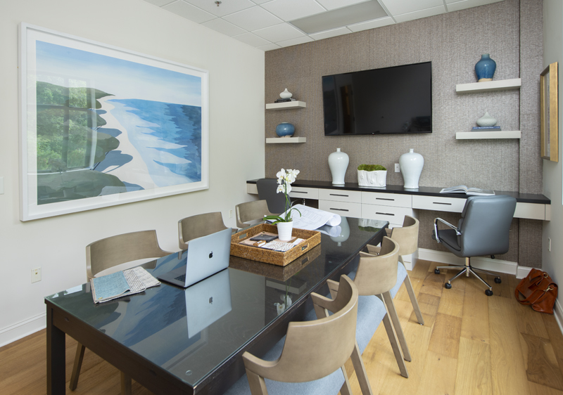
Inspired by Summer
As you can probably guess, the artwork was the inspiration for this room. Entitled Saturday Morning, it’s pretty much where we want to be most of the time—somewhere relaxing on the beach. Because life is not a beach and sometimes you have to be in a conference room, we’ve created a lovely intersection between work and play.
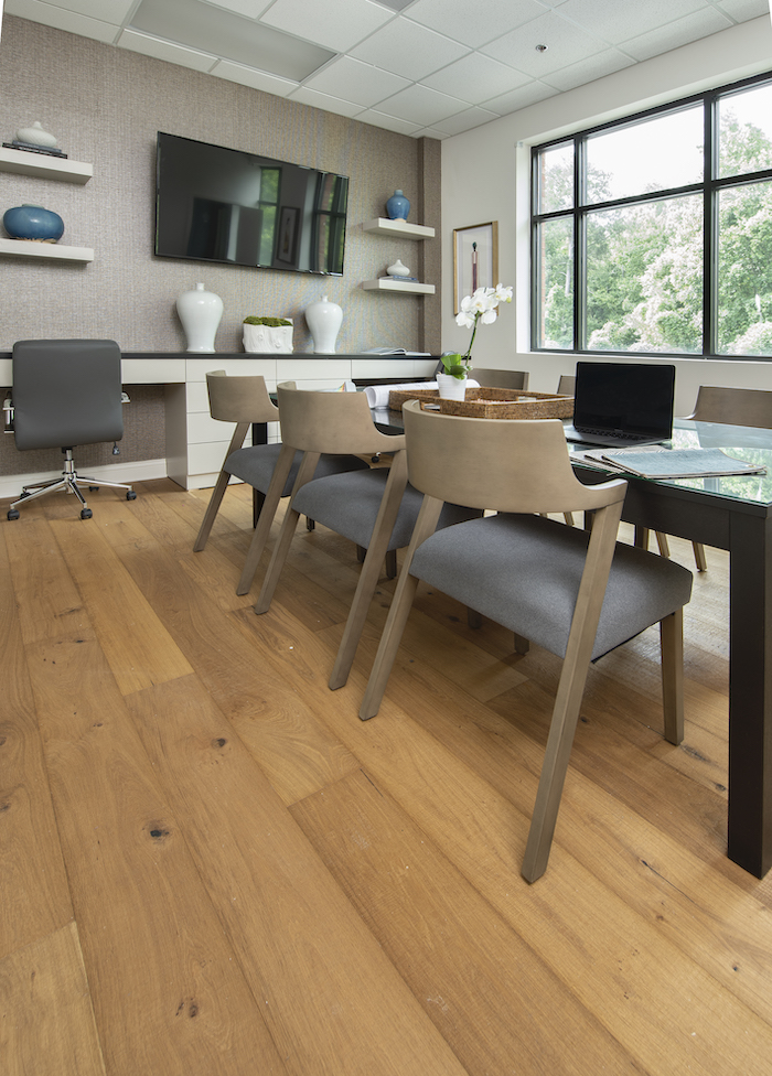
Natural oak flooring, rustic yet versatile!
The sawn marked oak hardwood flooring creates a warm foundation from the front of the showroom to the back in our Presentation Room. After experiencing Lifecore Flooring products in my own home, I had to have them installed in our new showroom. We spend just as much time at work as we do at home so it was important that we thrive in an environment that is both beautiful and healthy. There’s no formaldehyde or harmful chemicals used in manufacturing and the stunning finish is low-VOC. We look forward to offering this product, also available in other styles, to our clients who appreciate beautiful, sustainable flooring as much as we do.
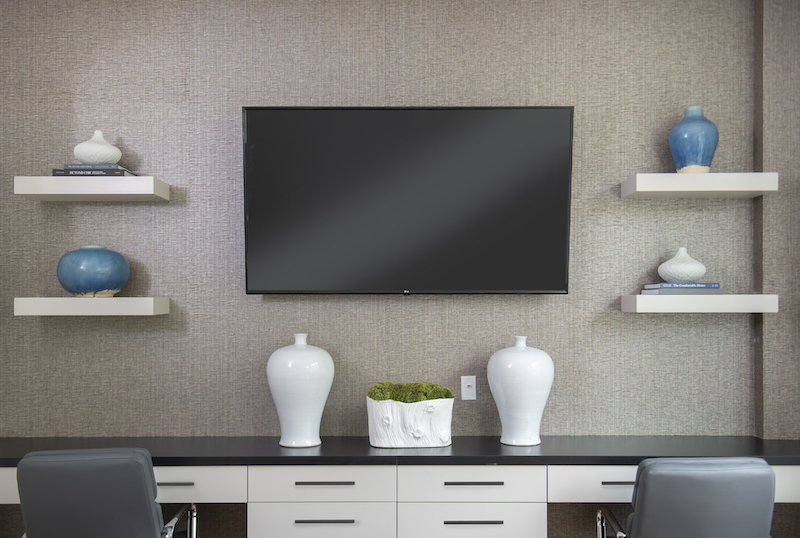
Texture as a focal point
Upon entering the Presentation Room, your eyes are immediately drawn to the tv wall—and not because the tv is on. Our well dressed focal wall attracts attention from clients and contractors thanks to the textural, grasscloth wallcovering from Pacific Designs International. From their vast selection of enticing grasses, I finally chose this one from the Shenzhen collection because of its sophisticated mix of black, gray, and taupe grasses on top of a metallic background. How’s that for rustic and luxurious?
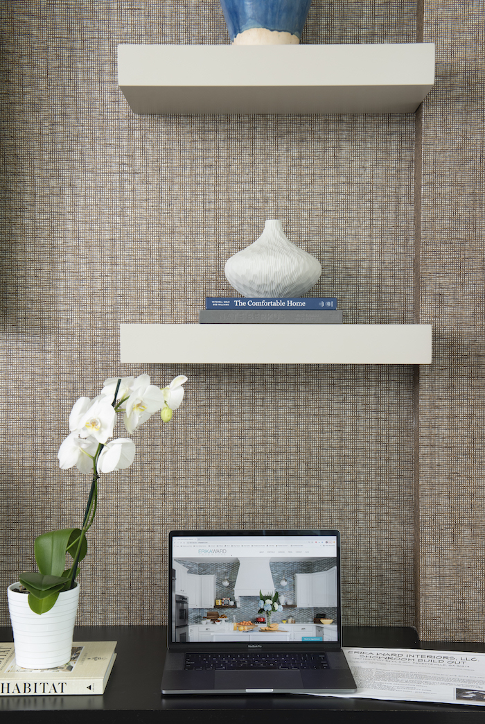
Art inspired by Mother Nature
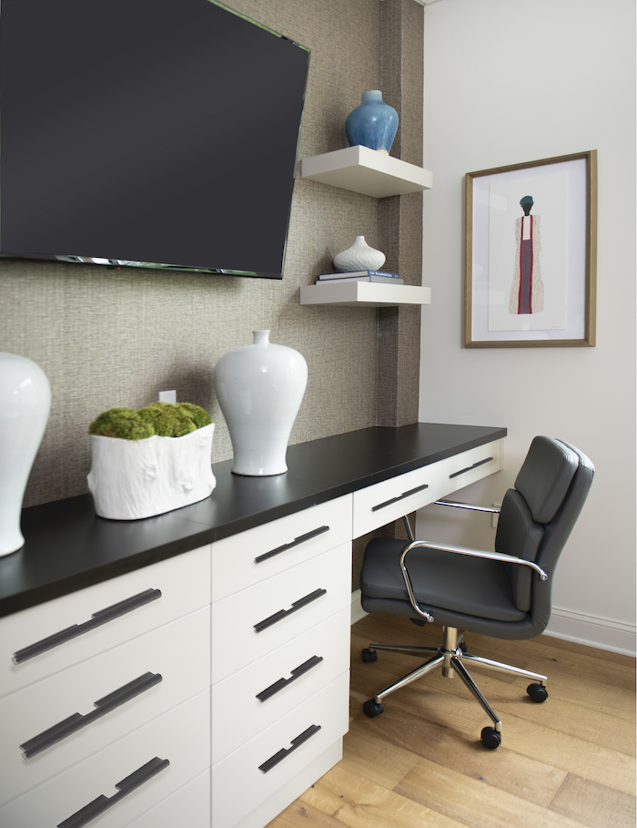
A close up of one of the workstations further reveals that this wallcovering is sensational! Because it’s a natural material, no two rolls are exactly alike. However, I believe the real beauty lies in its organic properties. Instead of using art on this wall, we kept decor simple with books and an assortment of both new and vintage vases.
Unstated, yet chic custom cabinetry and hardware
I’m so pleased with the results of our custom cabinetry made by Bergeron, Inc. Highly functional and fashionable, it boasts two workstations and generous storage drawers in between. The cabinetry is painted a warm gray (Anew Gray by Sherwin Williams) and continues the soft neutral palette from the grasscloth wallcovering. Each drawer is fashioned with linear Matte Black Pulls by Schaub and Company. They are low-profiled, sleek, and more modern that any pull I’ve chosen in the past. However, I love that it brings a bit of edge and interest to the flat front drawers.
Tabletop accessories in a presentation room? Yes, please!
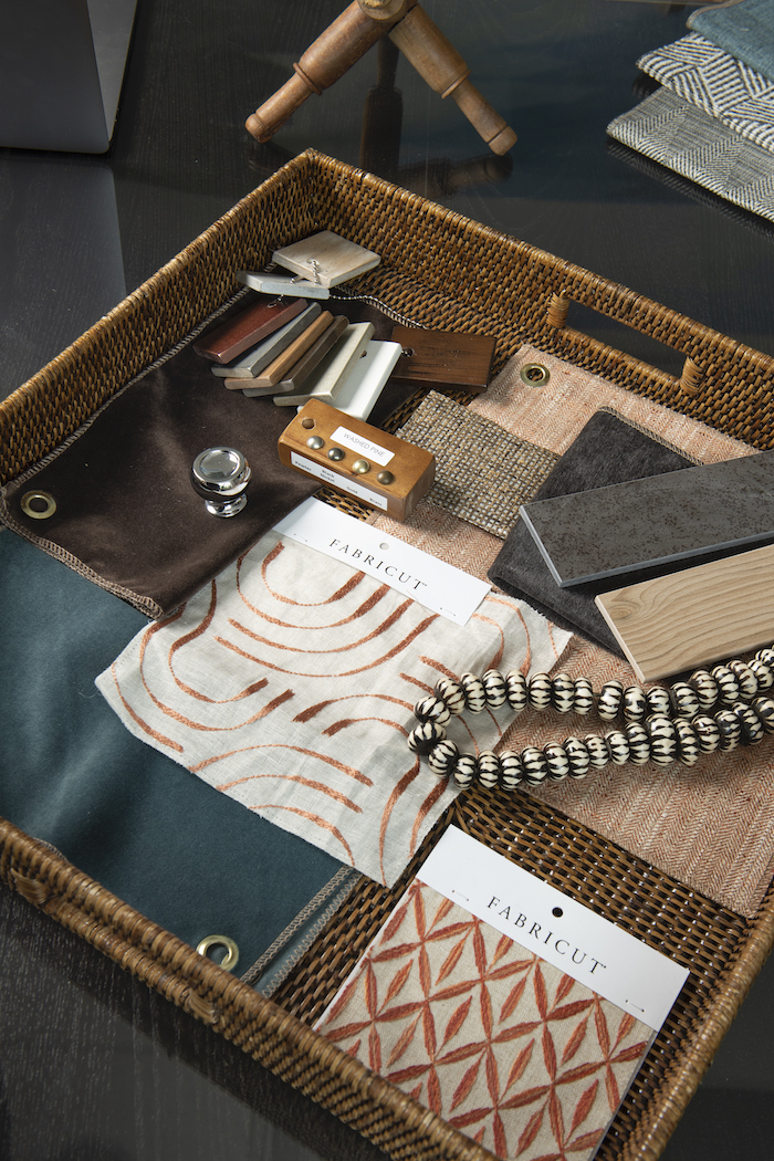
A oversized woven tray contains the overall mood for a design project at any given time. What you see here is the makings of a current condo decorating project located in Atlanta’s Virginia-Highlands neighborhood. We are using textiles by Fabricut, one of our ORC sponsors, for custom draperies and pillows.
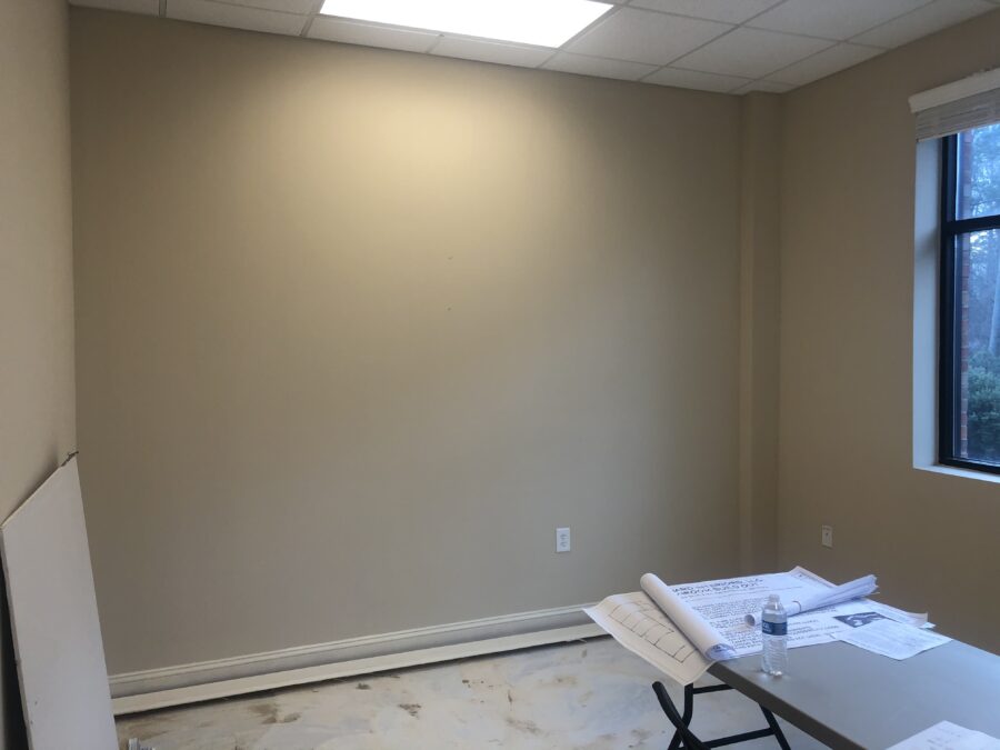
Here’s a reminder of what the presentation room looked like before.
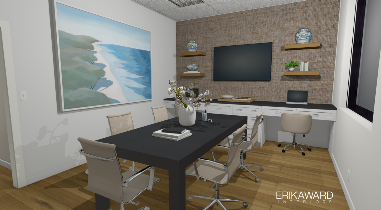

Our new, well-appointed conference room is open and ready for deal-closing client presentations! On to the next room, shall we?
Drum roll please…
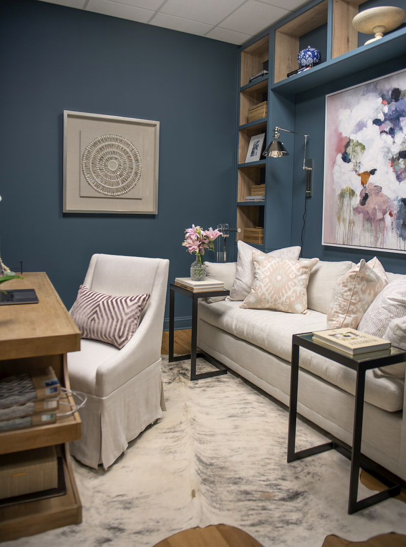
Here is my brand new office! What do you think?
“Too comfortable to be called an office,” it’s what my general contractor said at first glance.
He was politely instructed to remove his boots before entering. HA! I feel so fortunate to call this space my own and has all that I need to be both productive and creative. Let’s take a look around.
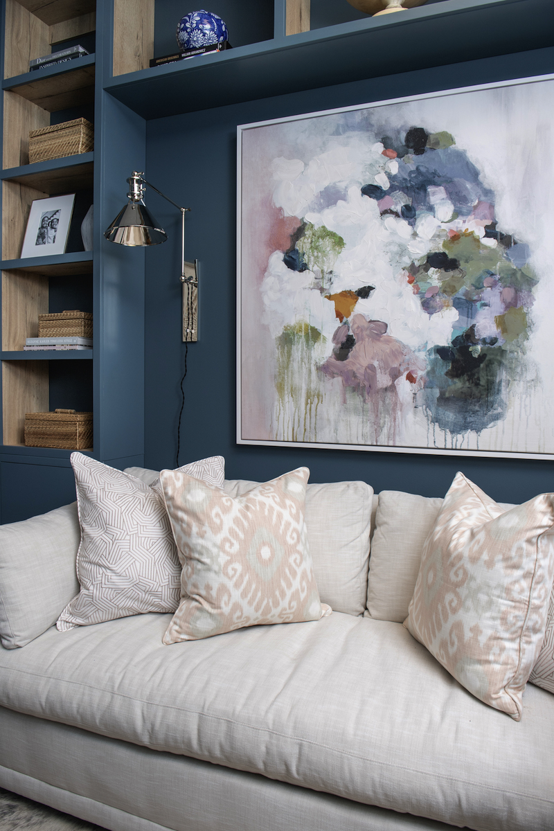
Creativity requires rest.
Nothing says sit and stay like custom throw pillows! Custom throw pillows are a quick way to add personality or even change the personality of a room. We paired two Trend fabrics (Fabricut), a geometric and an ikat pattern in blush for lush experience in relaxation and rejuvenation. Having a sofa in my office was a top priority, not just for guests but for a noon time nap. You may not have noticed that the Sylvie Sofa by Robin Bruce is the same sofa from the reception area in our old office, no naps were taken there, but I will make up for it here.
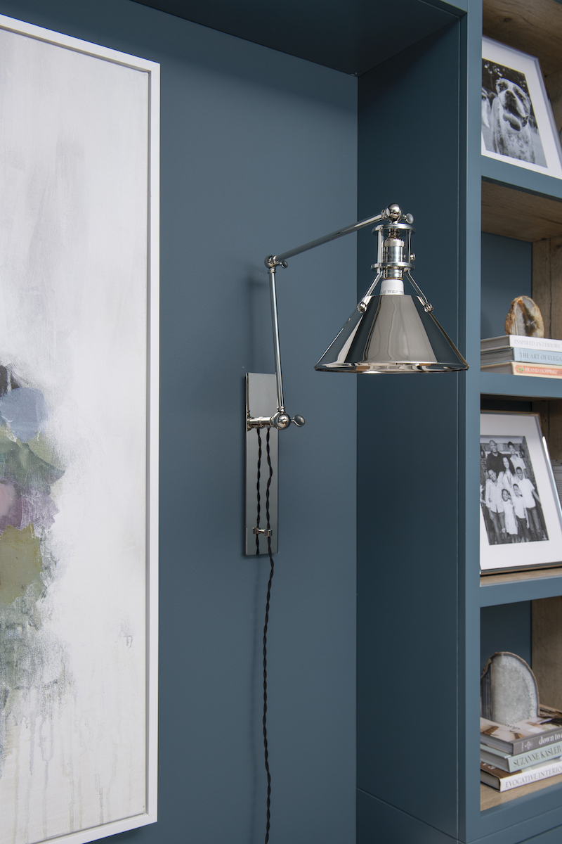
Accent lights as a focal point
A pair of polished nickel wall sconces flank the sofa adding to the warm and welcoming atmosphere. The Metal No.2 wall sconces not only save precious floor space, but they can also be plugged into the sockets if you prefer not to hardwire the fixtures.
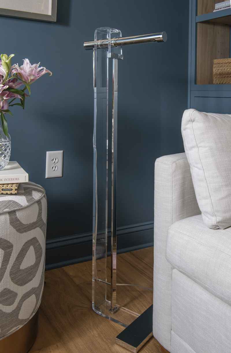
Portable lighting as a conversation piece
So chic it hurts, the HILLCREST floor lamp performs double duty as a light and art. Constructed from metal and acrylic, this floor lamp feels more like. a modern sculpture. Remarkable in form, it is a versatile piece that plays well with almost any design style.
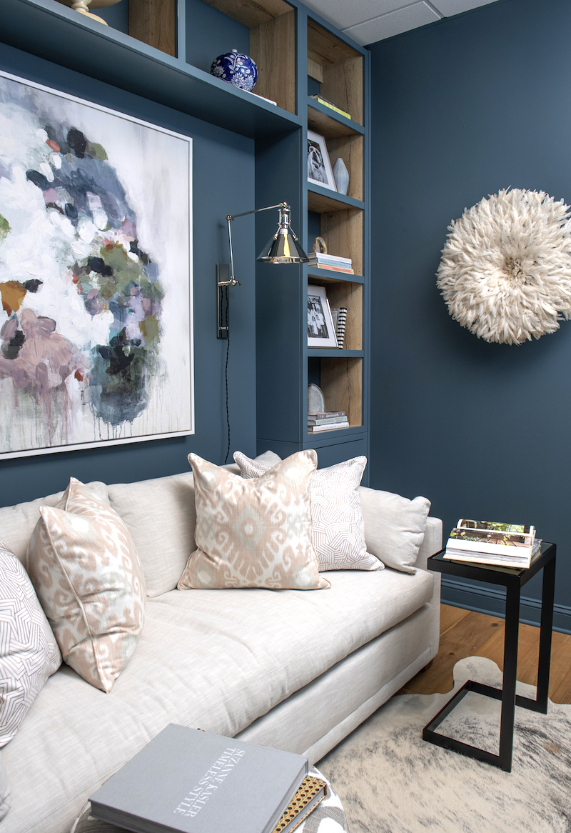
Custom cabinetry makes this room soar.
This space is only 11′ x 9′ but there are several design tricks used in this room that makes it feel more expansive. The floor to ceiling, wall-to-wall custom cabinetry is one of them. The width of this wall unit was dictated by the sofa, however, the sky was this limit concerning the height. Painting the unit the same color as the wall also gives it an uninterrupted flow and the illusion that the unit is built into the wall.
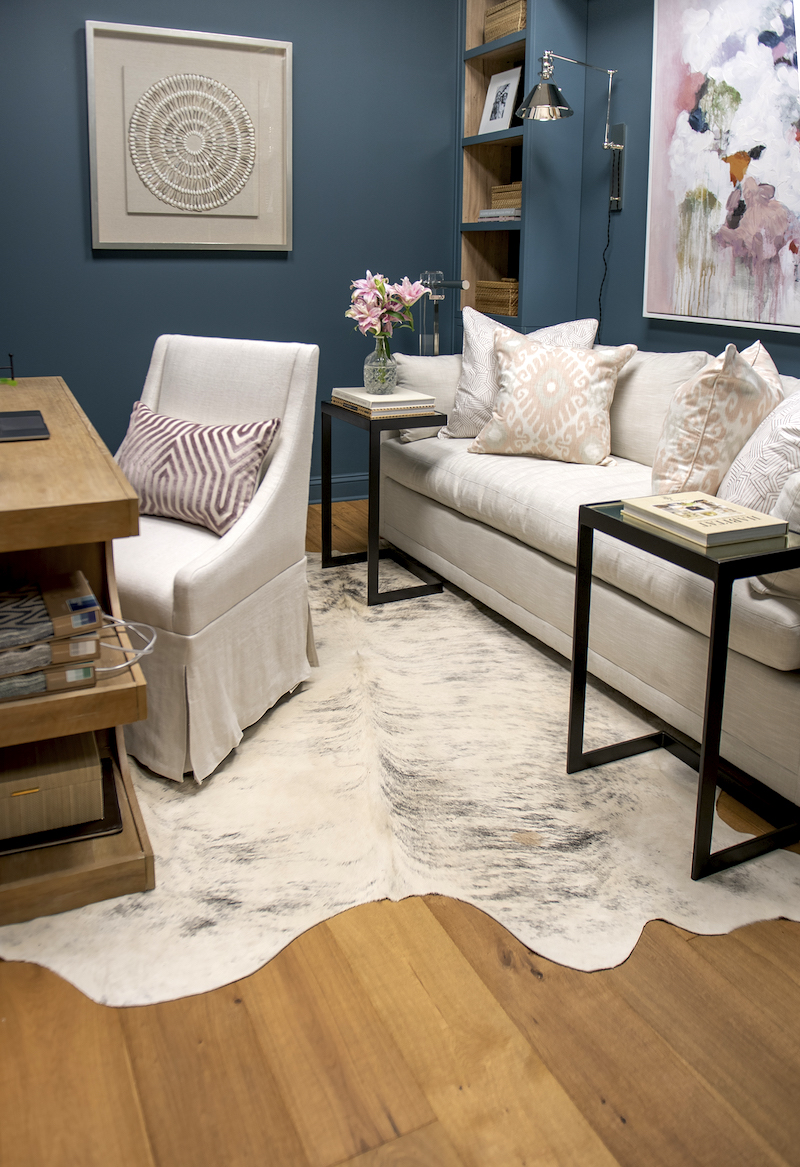
Protecting my investment
As stated before my new “Fresh Aire” hardwood floors by Lifecore set the foundation for beauty in every single room. Just behold the wonderful marriage of the wood and hide rug together. The hide is perfect for its organic shape and fully protects the floors against scratches from the casters on the desk chair as well as potential scratches from the iron accent tables.
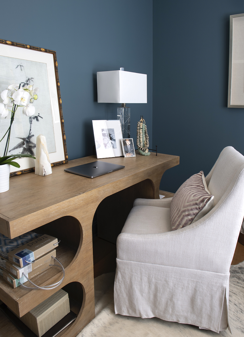
Making desk duty desireable
Opposite our custom unit is the Dune desk from our vendor partners, Rowe Furniture. This isn’t your traditional executive desk. Since most of my files are digital, this is the perfect way to work while also using the shelves to display some of my favorite things.
So what’s next?
The butler’s pantry of course! “Good things take time,” is what I repeat to myself as we wait on the final elements to present a full reveal. The countertops are promised to be installed either Thursday or Friday so I hope that will get us make a strong(er) finish. I will add the after photos to this same post. Just be sure to check back here within a week.
I hope you’ve enjoyed the reveal and be sure to visit my fellow featured designers for their unveiling! As always thank you for your support!!
Best,
Erika
A Glass of Bovino | Beginning in the Middle | Beth Diana Smith | Clark + Aldine | Coco & Jack
Deeply Southern Home| Design Maze | Dwell by Cheryl | Erika Ward | Home Made by Carmona
House of Hipsters | Hunted Interior | Kandrac & Kole | Kate Pearce | Katrina Blair | Liz Kamarul
Veneer Designs | Rambling Renovators | Renovation Husbands | Studio Plumb | Media BH&G
AMAZING! Can I come and hang out in that gorgeous space? I would feel so creative in there. Love the soft colors! It’s a stunning and functional space,a nd I LOVE the conference room chairs
Thank you Veronica! You know that you are always welcome in my business and my personal home.
Erika, you rocked this ORC, as usual!! Your new conference room/office is simply beautiful. I love every inch. My favorite pieces are the acrylic floor lamp, your desk (is to die for), and the overall palette.
The floor lamp is pretty amazing, isn’t it? I love how everyone who visits likes to turn it on. It is an object of intrigue!
Okay, that office is so good! I love the wall colour, especially on the outside of the custom cabinets (with the contrasting wood inside). The artwork really pops in there, too 🙂
Thank you Nicole. I couldn’t be more thrilled with how the cabinetry turned out. You’d be surprised at how much bigger it makes the room feel!
Erika, this office space is drool worthy! It’s the wall color, JuJu hat and floor lamp for me! I too know what it’s like to have a beautiful, functional office that makes you inspired to work. I just wish I had room for a sofa like you because naps are a must! (Hahah)
Thank you Rhonnika! For a long time it was a “head on desk” situation when I needed a quick snooze. Now the problem is I have to try not to snore too loudly. That could pose a problem 🙂
Perfection…as always:)
Thank you! I appreciate you and your support. Unmatched. xo!
Both spaces are lovely and look so functional. I’d sleep on that office couch for sure. Congrats on completing the challenge and getting the new studio digs!
My husband came by earlier this week and didn’t want to leave. Ha!
Amazing!!!! Just beautiful!!! I’m sure you’re excited and ready to work!! ✨
Yes! I’m mostly on the road, but will savor the moments in our studio for sure!
Beauty and function. Love all of your choices. Well done!
Thank you Brenda. We’ve had clients in already who are raving about what they’ve seen so far. I’m so grateful.
It’s absolutely beautiful! I especially love the office. I sure wish I had an office like that. Well done!
Thank you Janelle! What you couldn’t experience from this post was the wonderful aroma from my fresh flowers! Ahh, heavenly.
Both spaces are so inviting and just beautiful. I particularly love the large pieces of art. What makes the spaces for me are all the different textures and how beautifully all the choices in textiles, colors, patterns relate to each other. The sum total is greater than the parts. That is why one should hire a designer like you!!
Absolutely gorgeous!
Beautiful, Erika! Excellent work creating an inspiring work environment! Bravo!
Oh that office is SPECTACULAR! The colors, the art, the sofa… Congratulations on your beautiful new spaces!
So beautiful. I adore how your presentation room and office have a comfortable and residential feel.
These spaces turned out not only beautiful but so functional! Oh, and dying for the grasscloth backdrop!
LOVE he wall color, Beautiful!!
This is so gorgeous! I love how it’s sophisticated yet welcoming! The art and wall color are just too good!
This is the most beautiful office and presentation room! You did an incredible job. I am loving the grasscloth and that gorgeous color in your office!