

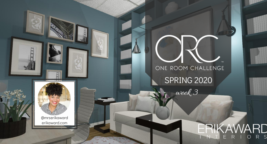


Hi There!
If this is your first time visiting, welcome! I’m Erika Ward, owner and principal designer of Erika Ward Interiors. Our Atlanta-based firm uses our concierge-level interior design services to help busy professionals make their homes their sanctuaries. This is my second season participating in the One Room Challenge and I’m glad you are here for the ride!
After weeks of waiting for the custom cabinetry in my office, I’m pleased to announce that it is absolutely GORGEOUS. A combination of both painted and stained wood, as it was being installed I chuckled to myself knowing I was keeping a big secret from you all. I broke one of my top rules regarding paint If you open up the “Erika Ward Interiors” decorating rulebook then you’d see this rule listed in the top five.
NEVER PICK YOUR PAINT COLOR FIRST.
Yes, I know people do it all the time and it’s a big fat no-no especially if you’re not a seasoned decorator.
Can you see me waving my finger? I’m so serious about this one.
When decorating, design decisions like artwork, rugs, or fabrics should be made first. When renovating, flooring, countertops, and tiles come first—paint is the last decision.
Why is that?
Think about it this way, it’s much easier to find a paint color that coordinates with your artwork or fabric than it is to find the right art to go with a $50 gallon of paint. The mistakes get even more costly when you have to repaint a room, or the entire house, because you’ve picked a neutral with a conflicting undertone. Most people don’t spend the money to correct it and move on to the next decision. Later after a thousand of other decisions are made on the top of this one, your paint color still looks wrong.
Erika, now that you’ve broken the rule, how can you make the color work?
After choosing paint color first, there’s still a promise of success by choosing one of these options.
REPEAT THE COLOR ELSEWHERE, or USE ONE OF THESE BASIC COLOR SCHEMES
If you’ve painted the room your favorite shade of blue, then take the next step and repeat that color in your throw pillows, artwork, and accessories. You can also use the same advice but instead us its complementary colors, split complementary colors, analogous colors, or triadic colors. Here’s a further breakdown below:
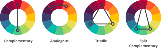
complementary colors: start with the main color and select its complement on the opposite side of the color wheel. For example: blue and orange, or red and green.
split complementary colors: start with the main color and match it with two colors next to its complementary color. For example: blue, red-orange and yellow-orange.

analogous colors: these are three colors next to each other on the color wheel. For example: blue, green, and blue green.

triadic colors: any three colors that are spaced equally apart on a color wheel. For example: green, purple, and orange.

Can you guess which color scheme I’m using in my office below?
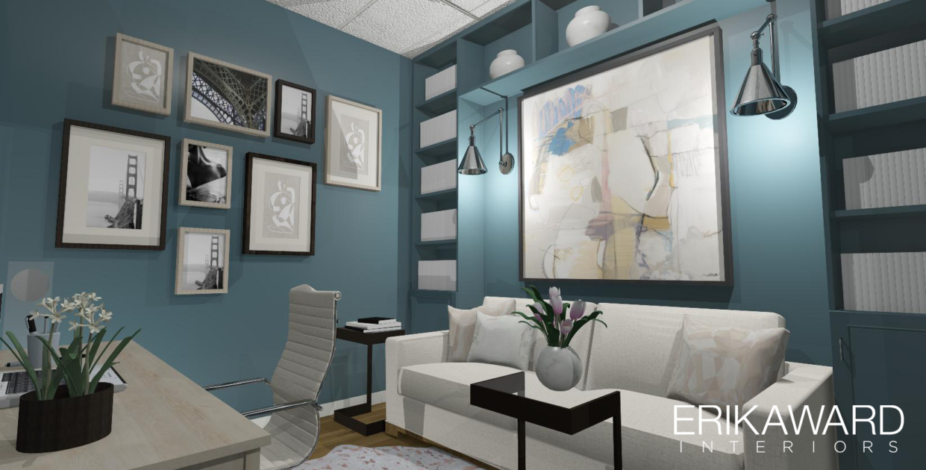
If you guessed a triadic color scheme, you are correct! This room has three colors—blue, pink, and yellow.
The oversized artwork is the only piece that features all three colors and that’s perfectly fine!

The softest of pinks will also appear in the custom throw pillows made from 04472 Dusty Rose and 04478 Cameo both fabrics from One Room Challenge Official Sponsor, Fabricut. If there were windows, then I would have easily chosen one of these fabrics for custom drapery panels as well.
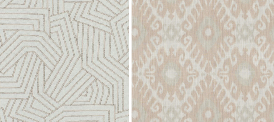
I’m also excited about using this rug by Couristan, an ORC Official Sponsor. A traditional lady at heart, I would have chosen a solid white hide but the metallic hints found in the rose gold Moo-Nstruck hide is an unexpected way to add sparkle to the overall design.

Barely there pinks soften the intensity of wall color much like the white sofa and the hide area rug. And speaking of color intensity, I often find that COLOR LOVERS FORGET THAT SATURATED COLOR MUST BE BALANCED WITH NEUTRALS. This gives the eyes a place to rest in the room and allows you to appreciate the color even more.
This room’s color choice has been a discussion topic among the contractors in the showroom. One of the electrician asked me why I used such a dark color in a room without windows. I’m sure some of you may have had the same questions—it’s a great one!
DESIGN TIP
Using a light-colored paint in a window-less room won’t always make it feel larger. In fact the wrong shade of white could make it feel dingy. Who wants a dark and dingy room? Instead I embrace the room for what it is and let a dark room be dark, but fabulous. If the room had a smooth ceiling instead of ceiling tiles, then I would’ve painted it the same color as the walls to create an even cozier envelope.
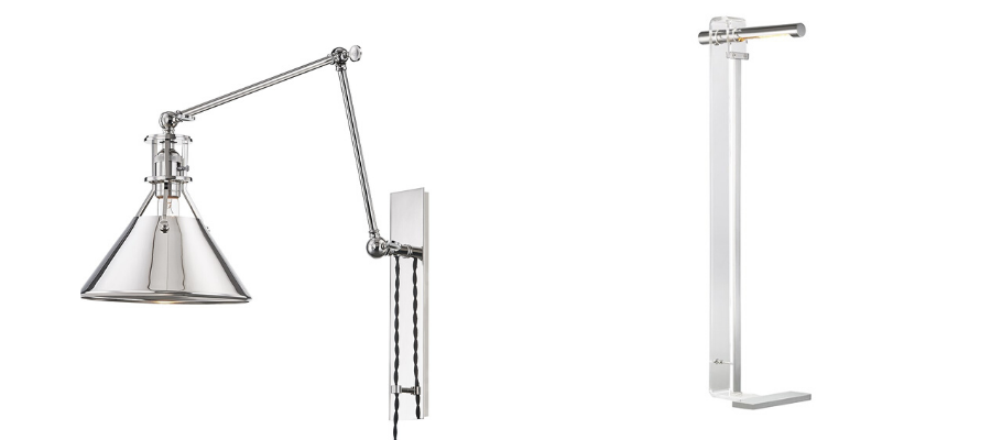
In a dark room you can have fun installing beautiful mood lighting. In addition to the overhead lighting, I’ve also got two Metal No. 2 plug in wall sconces going in above the sofa. On the opposite side of the room, the HILLCREST floor lamp will provide task lighting without taking up precious surface area on my desk. The polished wall sconces and the edgy floor lamps are both made by Official ORC Sponsor Hudson Valley Lighting. I used their products in my ORC FALL 2019 kitchen and still can’t get over how much they elevated the overall design.
There are just a few more items to check off my list (bookcase accessories and photos for the gallery wall) and I’ll be sitting pretty in my NEW office before the presentation room and wet bar are complete. I CANNOT WAIT!!!
WANT MORE INSPIRATION AND DESIGN TIPS! Visit the other featured designers, links below, as well as guest participants. I heard guest participants are here in record numbers and have some beautiful progress to share, too!

A Glass of Bovino | Beginning in the Middle | Beth Diana Smith | Clark + Aldine | Coco & Jack
Deeply Southern Home| Design Maze | Dwell by Cheryl | Erika Ward | Home Made by Carmona
House of Hipsters | Hunted Interior | Kandrac & Kole | Kate Pearce | Katrina Blair | Liz Kamarul
Veneer Designs | Rambling Renovators | Renovation Husbands | Studio Plumb | Media BH&G


The office is looking so good! And this was a wonderful review of color scheme development!
Thank you Niki! I sure hope it helps others whether they are just starting their process or fixing a color mistake.
I love the idea of embracing a dark room and going floor to ceiling with a bold color. I can’t wait to see those light fixtures up!
[…] + Aldine | Coco & JackDeeply Southern Home| Design Maze | Dwell by Cheryl | Erika Ward | Home Made by CarmonaHouse of Hipsters | Hunted Interior | Kandrac & Kole | Kate […]
What’s the color and paint used in the office? I really love this as it matches my shoppers in my boutique, great job