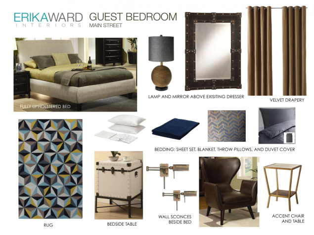
I’ve got designs with major deadlines ahead, but having repeat clients who trust my vision helps it all come together in a flash. Case in point, I’m working with a couple who I assisted last year in transform the first floor of their town home. However months later they found a great deal on new home and decided to move. The new house is probably three times the size of their previous residence so go easy on the purse strings, we’re going to finish the house one room at a time. The area that needs immediate attention is their terrace level guest room. I whipped up this plan last week and look to install within the next ten days.
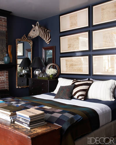
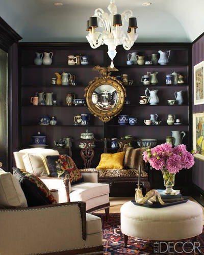
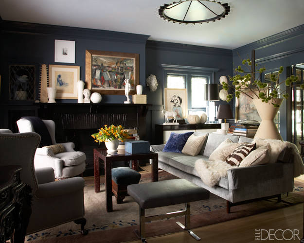
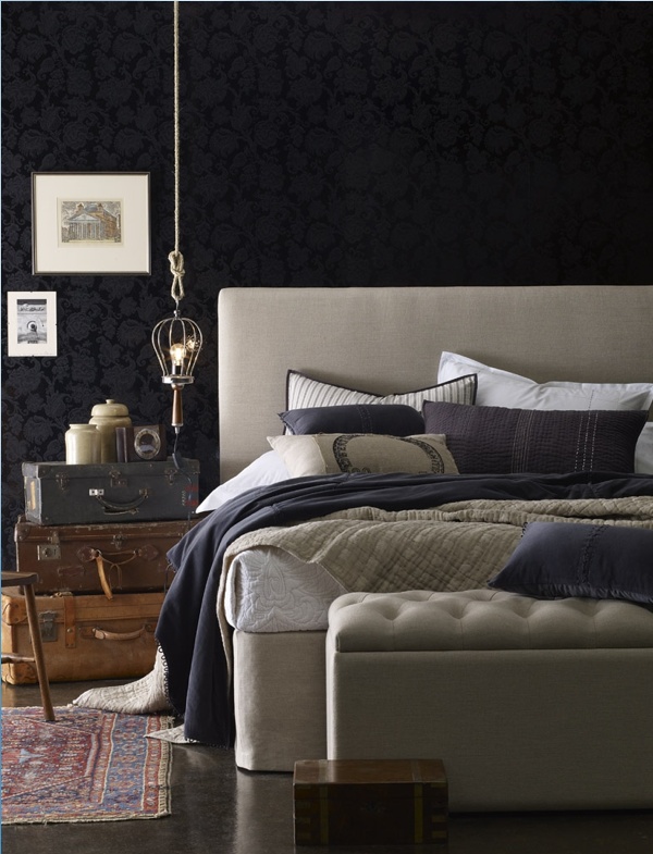
The overall feel for the newly designed room is a collected look, yet with a youthful touch. Upon moving in, we had the room painted Naval (SW-6244) by Sherwin Williams. The existing space is naturally dark and will be a dark space no matter how much lighting or white paint you add. My theory is to capitalize on the physical condition of the room and make it moody, comfortable, and stylish.
Here Trent Wisehart’s apartment feature from Elle Decor helps illustrate my point.
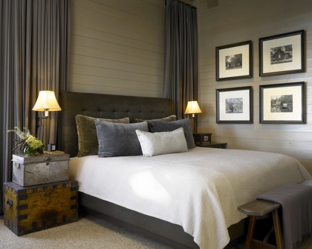
Light colored furnishings and white accessories help to brighten the space.
A vintage chest will be used as a nightstand which will provide needed storage and add character to the space.
So back to my design plan:
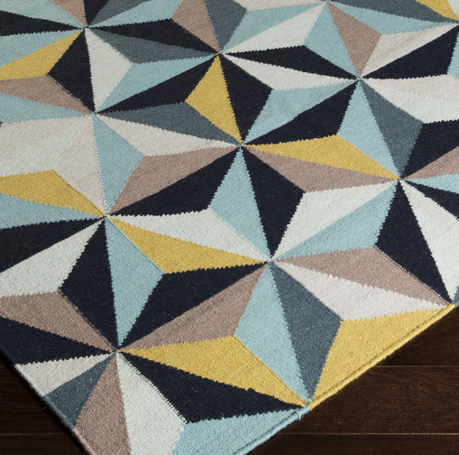
I instantly fell in love with this rug and decided to use it as the jumping off point for the design.
I love the graphic impact it brings and it provides an instant color palette!
Instead of using a wooden bed in conjunction with their existing wooden dresser, I’ve opted to go with an fully upholstered bed. I love how the linen color looks again the dark blue wall. Brass lighting warms the space as well as the handsome leather side chair. The bedding is kept simple and I’m toying with the ideas of a white duvet instead of the gray one pictured. Just be sure to stay tuned to see how this all comest together!
I’m seriously considering providing e-design services over the summer, please let me know if this is something you’d be interested in! Feel free to email me info@erikaward.com
Looking forward to hearing from your soon!
Make it a great day!
Erika
Image credit: Erika Ward Interiors | Elle Decor | Hickman Interiors | Cooper Grey
+ show Comments
- Hide Comments
add a comment