So here we are in Week 2 and I’m pretty satisfied with our progress.
However, after posting WEEK ONE, I realized something was missing, a project nickname.
Before we start the design process in a home, we give each project a nickname. For example, our Tuxedo Project was called “Organic Sophistication”, while our Clifton Road project was called “Today’s Traditional Design” Naming each project helps us stay focused and true to the overall aesthetic.
I realized I had yet to do this for my own home. The truth is I was procrastinating and afraid to commit. Seeing so many beautiful things everyday it’s easy to get distracted and not stay true to what you love.
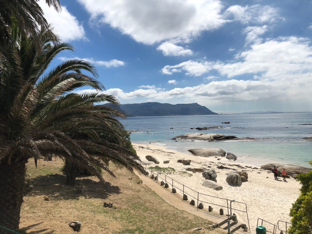
Our family loves the coast—I even take a solo trip each year to the beach to decompress. What we love is the simplicity of life while on vacation and of course the scenery. Staring at this photo relaxes me and I sought materials for our kitchen that evoke a similar emotion.
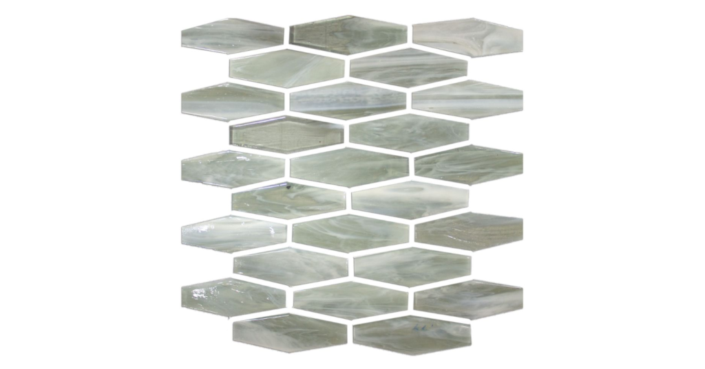 Redmond Bombay Glass Mosaic Tile, The Tile Shop
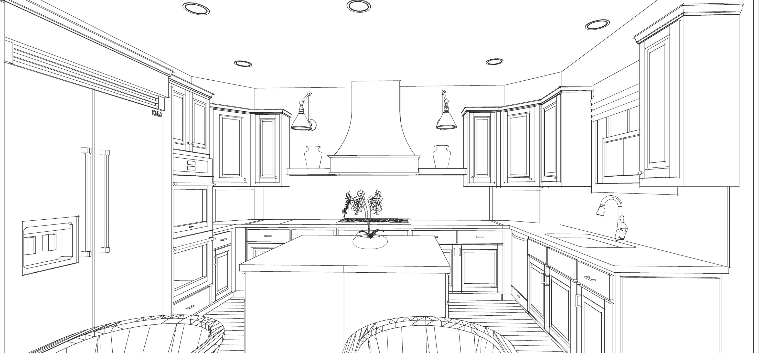
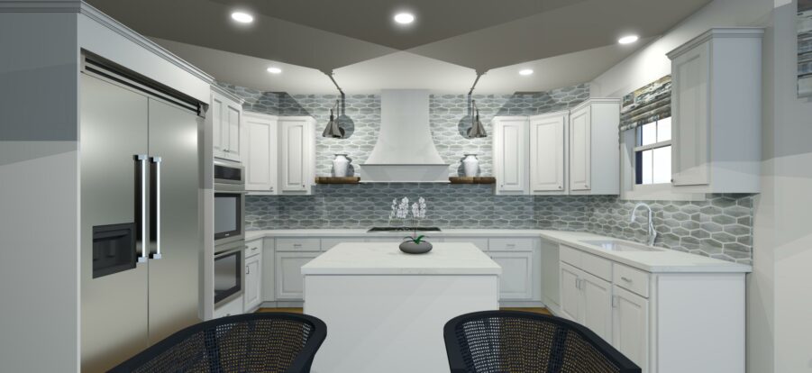
The backsplash tile kicked off the color inspiration for the design. This shimmering, glass mosaic tile from The Tile Shop had me smitten from the start. Featured on the kitchen’s primary focal wall, it pretty much echos the ocean views, no?
Also on the focal wall are two reclaimed wood shelves reminiscent of the treasures found at Driftwood Beach on Jekyll Island. The worn wood will warm up of the kitchen alongside the sea of white cabinetry.
Speaking of cabinetry, my painter Miguel did a phenomenal job of refinishing the existing cabinets. He does all of my client work and I knew he’d give them a flawless factory finish! Benjamin Moore’s White Dove is what you see here and will also be the same color on the walls, trim, and ceiling. We’ll talk about more about the “why” behind this decision next week.
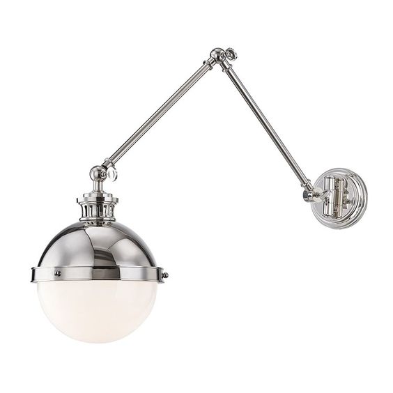 Latham Sconce, Hudson Valley Lighting
The lighting, oh the lighting…it’s what brings the sparkle and polish into the room. All of the lighting you see here is courtesy of Hudson Valley Lighting. Flanking the vent hood are the Latham Sconces. These stylish fixtures with articulating arms add both increased light and depth to the back wall.
I decided against additional lighting over the island. One reason is that the existing cans provide what we need there. Then I also didn’t want to interfere with the sight lines leading to the range hood elevation.
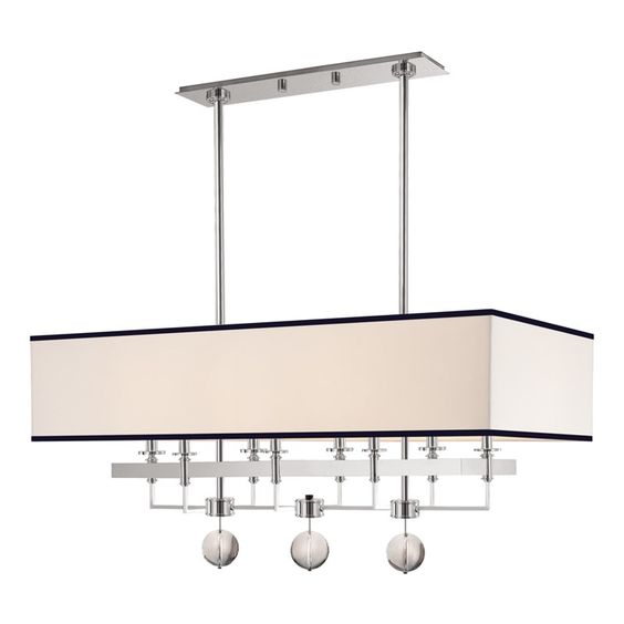
Gresham Park Chandelier, Hudson Valley Lighting
Opposite the range hood wall is the where we have the 7-foot kitchen table. It’s rustic in nature but I love the juxtaposition it create with the Gresham Park Chandelier. See where we are headed?
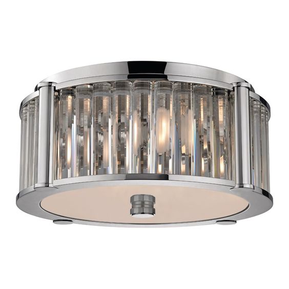 Hartland Flush Mount, Hudson Valley Lighting
The secondary light—there are two—one in front of the bay window, leading in from the garage is the Hartland flush mount light. It feels a little ridiculous calling them secondary lights because they are indisputable showstoppers. The Hartland complements both the Latham Sconce and Gresham Park Chandelier so beautifully, you’d think they were in the same collection.
There’s so much more in store in the upcoming weeks. I’m trying to figure out how to cram it all in without writing a book for each post.
So what’s this project’s nickname?
Western Cape Classic
Timeless and classic is what I’m all about. You won’t be able to put a date stamp on this kitchen. It’s forever relevant. And the Western Cape part? Last spring I took a voyage to South Africa and fell head over heels for Cape Town. The landscape brought tears to my eyes. Never did I expect to see the bluest of turquoise waters and rugged terrain coexist beside a flourishing, creative, artsy city!
This kitchen is dedicated to the inspiration I found on my pilgrimage to Africa and it’s a pleasure to have you guys along for the ride to watch as we watch beauty unfold!
Let’s go see what my comrades are up to this week!
At Charlotte’s House | Design Addict Mom | Erika Ward Interiors | Erin Kestenbaum | Girl & Grey
Gray Malin | Hommeboys | I Spy DIY | Jewel Marlowe | The Learner Observer | Making it Lovely
Nicole White Designs | Old Brand New | Oscar Bravo Home | Place of My Taste | The Rath Project
Room for Tuesday | SG Style | Undecorated Home | Veronica Solomon | Media BH&G | TM by ORC
Looking good Erika….a little glam mixed with some rustic! Whats not to like:)
Ooh this is going to be so beautiful! I LOVE that tile!
[…] Charlotte’s House | Design Addict Mom | Erika Ward Interiors | Erin Kestenbaum | Girl & […]
[…] 1 –> Week 2 –> Week 3–> Week […]
[…] 1 –> Week 2 –> Week 3–> Week 4 -> Week […]
[…] 1 –> Week 2 –> Week 3–> Week […]