If you are a web or graphic designer, then you may have used the CSS Drive Color Palette Generator tool to create captivating websites or snazzy business collateral for your clients. I first used the color palette generator when I designed my blog in 2009. It was a living room designed by Frank Roop that inspired the colors for my original blog header as well as the logo for my interior design business.
After using the color palette generator again and again when designing blogs and websites for others, I had a light bulb moment and decided to try it during color consultations with my interior design clients. Simply upload the client’s inspiration image and with one click of a button, the generator produces three color palette options.
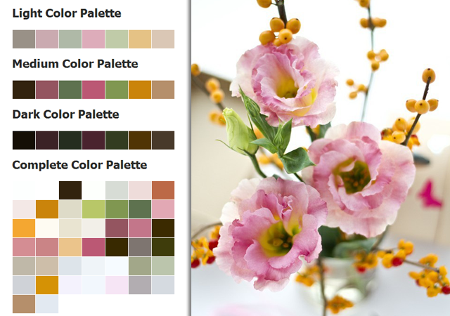
If you are decorating your own home, try it! Choose any image that inspires you. A simple arrangement of flowers, for example, can spark the color direction for a bedroom design. Depending on the mood you want to evoke in the room, select from the light, medium, or dark color palettes, or choose a combination of all three.
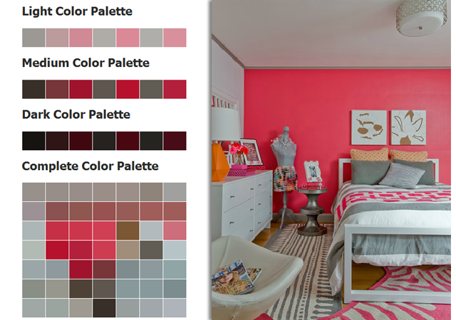
If you already have a hue in mind, perhaps salmon pink as seen in the image below, the color palette generator provides various color complements that can serve as the color direction for anything from bedding to drapery to room accessories.
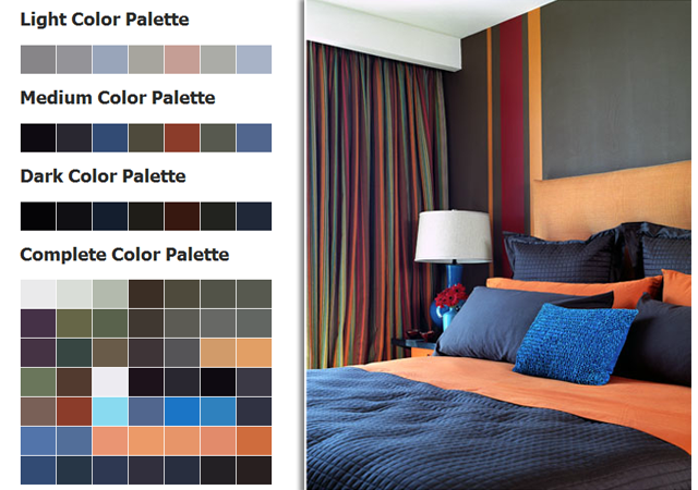
Want to create a room with a moody atmosphere? Upload an image with darker colors and see what tickles your fancy. By no means should you try to use every color shown. Use this opportunity to edit the selection and use only the colors that communicate the emotion you want to feel.
Incorporate some of the lighter colors to inject life into the space and keep the color scheme fresh. See how the white lampshade adds visual contrast to the space? It helps to prevent the colors from becoming too muddy and helps the eye to see them better.
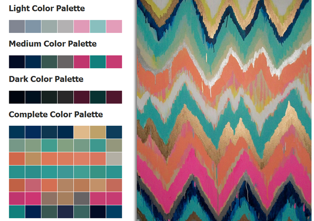
I firmly believe that your favorite piece of art can influence the color palette for your entire home. If the colors look great in the piece, they will surely work together as paint colors in your home. If this selection is too bold for you, keep a neutral palette for walls and furniture and use fabrics or area rugs featuring these colors to add spice where you need it most.
You can even use the brown tones seen in the complete color palette section to select the color of your wood flooring. Amazing right?
So before you find yourself frustrated in the middle of the paint aisle this week, take a moment and play around with this useful tool and see how it helps to influence your final selection. I’m interested in knowing how this works for you…please do tell!
How do you find color inspiration? Do you think the color palette generator will work for you?
Images via: Mowielicious.com | Ana Donahue | Deborah Wescelman | Etsy | Smitten by Jennifer Moreman


+ show Comments
- Hide Comments
add a comment