
When we got the invite to tour the 2017 Serenbe Designer Showhouse we took an extended coffee break and headed South to be inspired by our peers. The Manor, located in the Mado neighborhood, features two town-homes decked out by 12 wildly talented Atlanta design teams. With so many show-stopping interiors, this will likely be a two-part series due to the amount of takeaways I plan to share. However, this post won’t get you off the hook from touring the home yourself in person!
Here are five solid takeaways to get you thinking about changes in your own home:
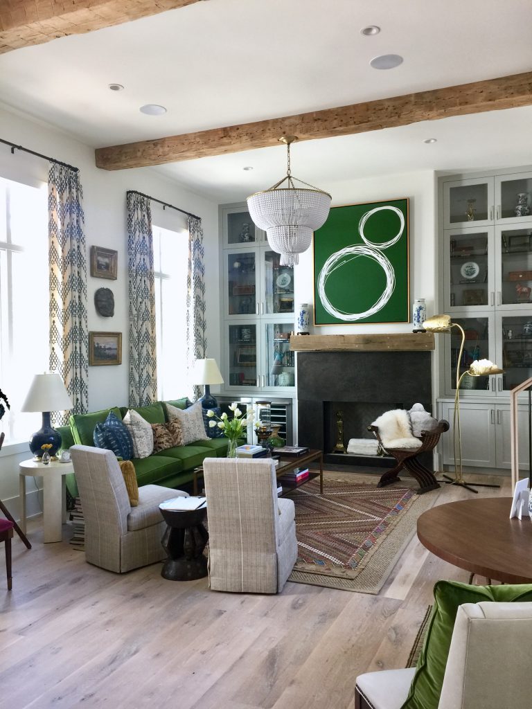
#1: COMBINE BLUE, WHITE, AND EMERALD GREEN
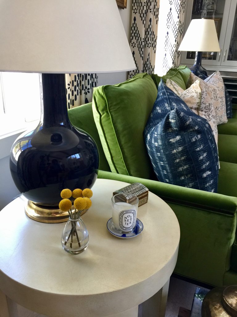
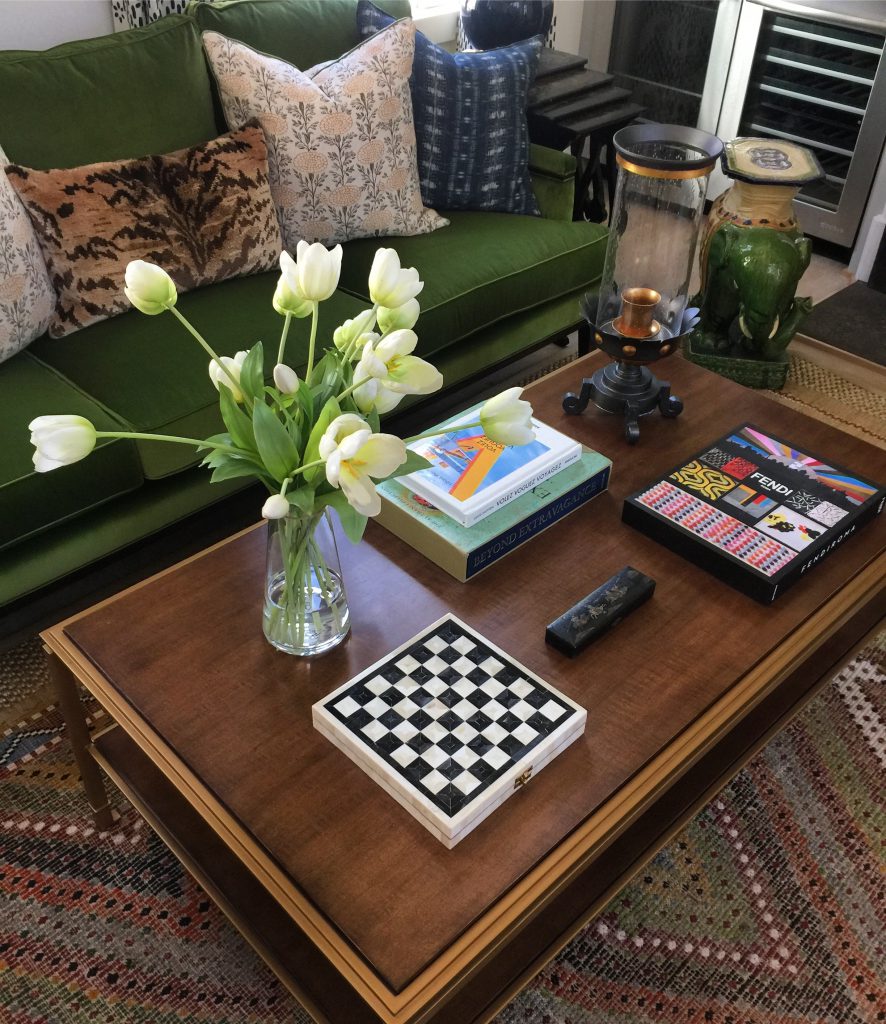
Nothing says timeless and classic than the color combination of blue and white—add emerald green and it becomes fresh, updated, and youthful. I firmly believe in upholstering a large piece of furniture in an unexpected color as seen with this emerald green velvet sofa. Neutrals are safe, but I guarantee a wild card furniture piece would quickly become your favorite.
*DESIGN TIP – WANT TO TRY THIS LOOK AT HOME? CHOOSE ONE ACCENT COLOR FOR YOUR BLUE AND WHITE SCHEME AND USE IT THREE TIMES TO MAKE IT FEEL INTENTIONAL. ANY SHADE OF PINK LOOKS AMAZING WITH BLUE AND WHITE, BUT CHOOSE ONLY ONE SHADE OF PINK AND COMMIT.
#2: MAKE USE OF EVERY NOOK
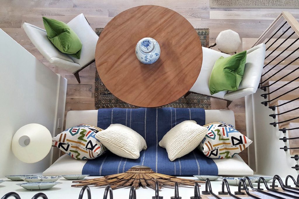
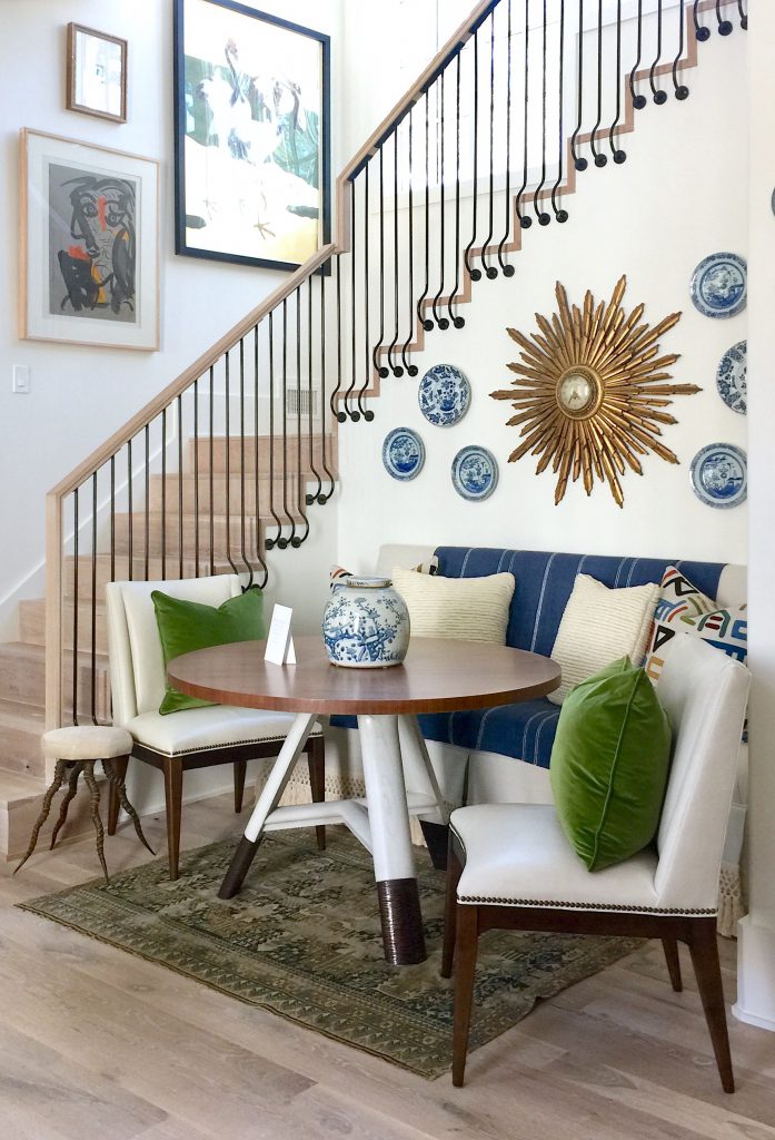
One of the most clever uses of spaces was this adorable breakfast nook carved out underneath the stair case. In this open floor plan, the breakfast area sits between the living room and kitchen and serves as a central, casual dining area.
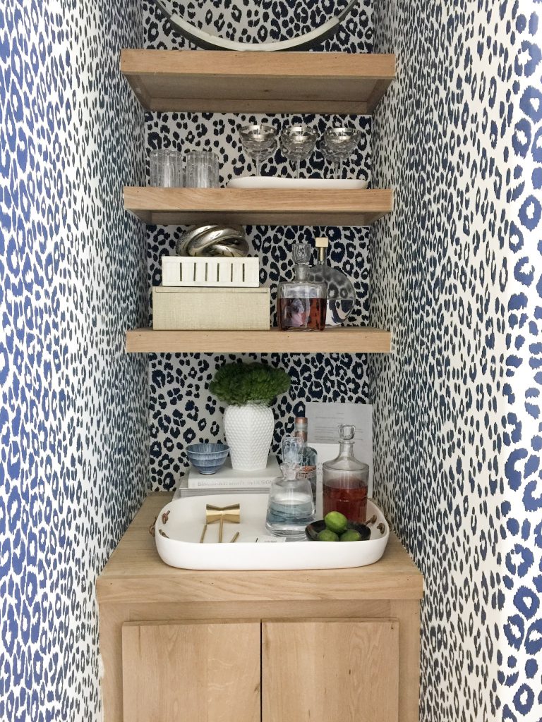
Located in the rear of the home, this area gives true meaning to the term mini bar. Outfitted with bold, high contrasting wallpaper, floating shelves, and custom cabinet, it’s a tiny space that lives large and serves a very important purpose. A quick stop for a bit of liquid relaxation when walking out to the back deck, it’s great for those who want to keep their adult beverages tucked away in style.
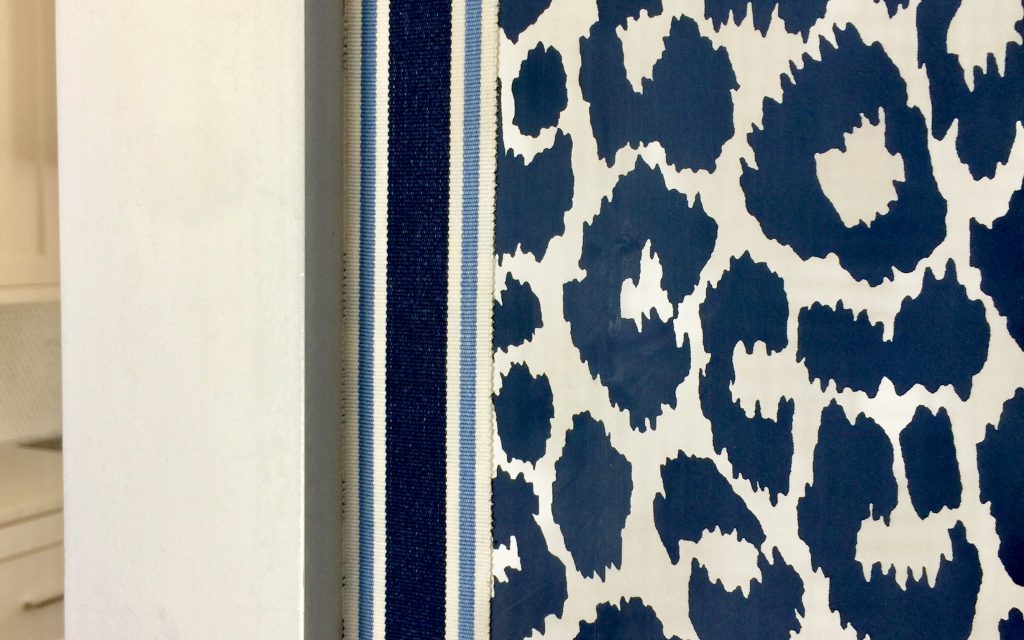
*DESIGN TIP – TAKE CHEEKY WALLPAPER TO THE NEXT LEVEL BY APPLYING WIDE GROSGRAIN TRIM ALONG EDGES.
#3: REIMAGINE YOUR KITCHEN
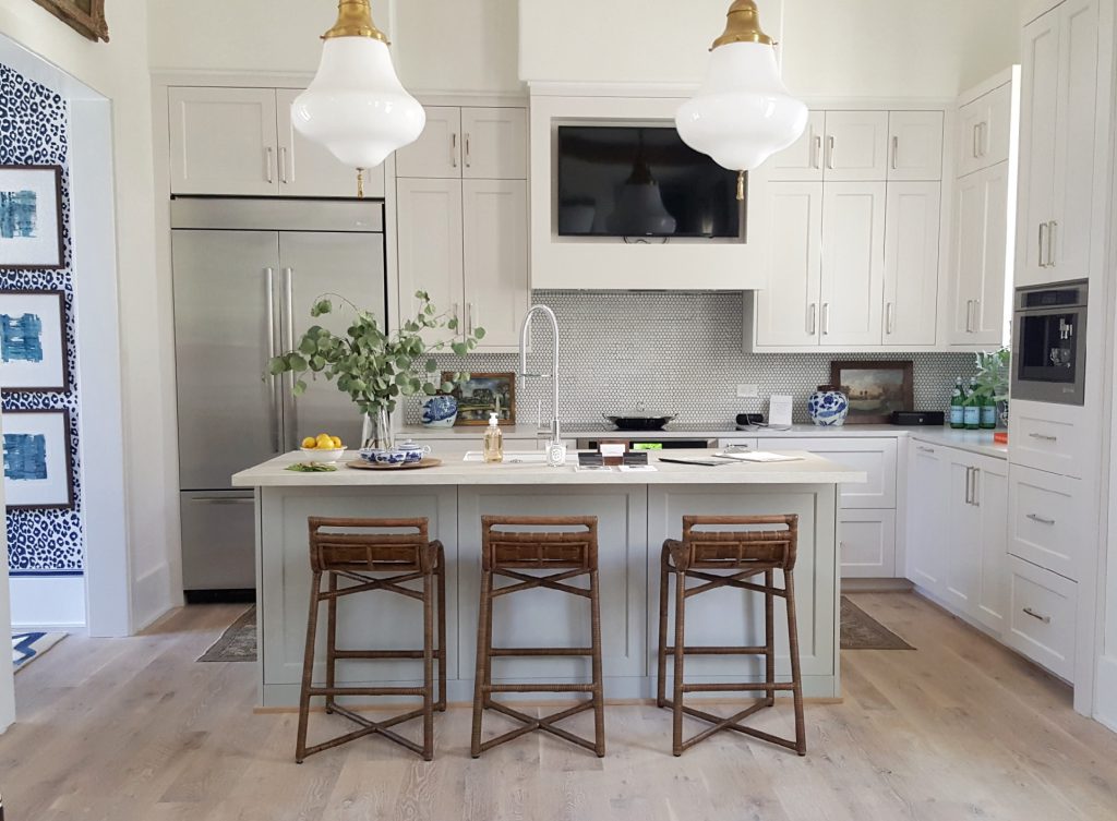
This pristine kitchen designed by Don Easterling and Nina Nash has mass appeal, but it’s the combination of countertop surfaces (you’ve got to see it in person), penny round backspash, pendant lighting, and the surprise television in the hood that makes it really cook. It’s like the car’s equivalent to the tv in the headrest. Genius!
*DESIGN TIP – TO KEEP A WHITE KITCHEN FROM FEELING TOO STERILE, INTRODUCE WARM WOOD FURNITURE INTO THE MIX.
#4: EMPHASIZE HEIGHT IN A SMALL SPACE
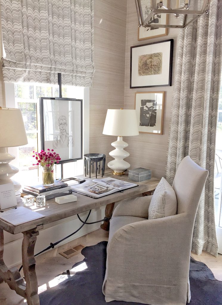
If you ask me, a light-filled study is equivalent to a corner office with a great view. Feminine and fresh, this office has a small footprint but is big on beauty. Covered in textured grasscloth wallpaper, windows adorned with custom drapery and Roman shades hung high, the height of the room is emphasized by a large lantern fixture and floor to ceiling artwork.
*DESIGN TIP – TO SUCCESSFULLY PULL OFF THE LAYERED LOOK IN A SMALL SPACE, STICK WITH A MONOCHROMATIC COLOR PALETTE. ANYTHING MORE WILL LOOK AND FEEL CLUTTERED.
#5: BREATHE LIFE INTO THE LAUNDRY ROOM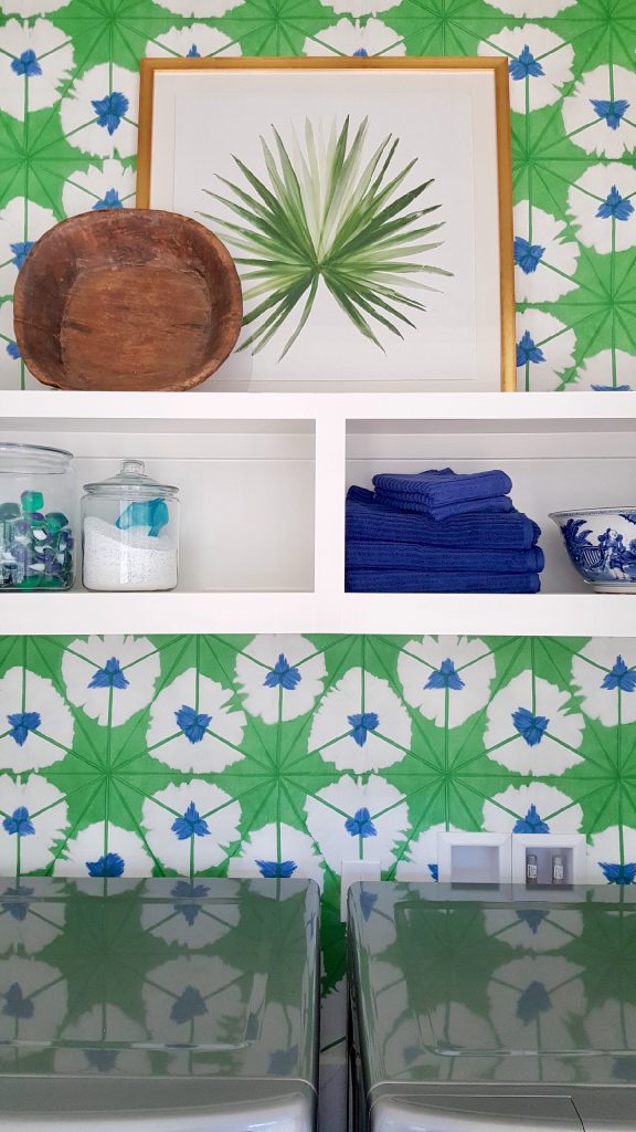
Do you love a bold wallpaper pattern but are unsure of where to use it? Try your favorite vibrant print in the laundry closet for a shot of motivation to complete a dirty job. With walls so cheerful, you may prefer to leave the doors open even if it’s not laundry day.
2017 Serenbe Designer Showhouse | September 15 – October 8th Thursday-Sunday 10am-5pm | Purchase TICKETS HERE on onsite. Admission $20.
+ show Comments
- Hide Comments
add a comment