Week 1 | Week 2 | Week 3 | Week 4 (No Post) | Week 5
Hi There!
If this is your first time visiting, welcome! I’m Erika Ward, owner and principal designer of Erika Ward Interiors. Our Atlanta-based firm uses our concierge-level interior design services to help busy professionals make their homes their sanctuaries. This is my second season participating in the One Room Challenge where we are designing our presentation room, my personal office, and the butler’s pantry. We’re excited you’ve decided to join us for the ride!
It’s Week 6 and we still standing and encouraged with the help last week’s pause.
If you missed WEEK THREE, you definitely want to go back and review the plans for my office. I’ve received several emails about how helpful it was in regard to selecting paint colors and for establishing a color scheme for any room.
This week’s focus is on the showroom’s butler’s pantry. Located In the back of showroom, it’s where we plan to offer refreshments to our staff, visitors, and to clients on presentation days. Though we have a kitchen vignette going up in the main showroom, this area will be the epitome of Southern hospitality.
Here’s the design plan:
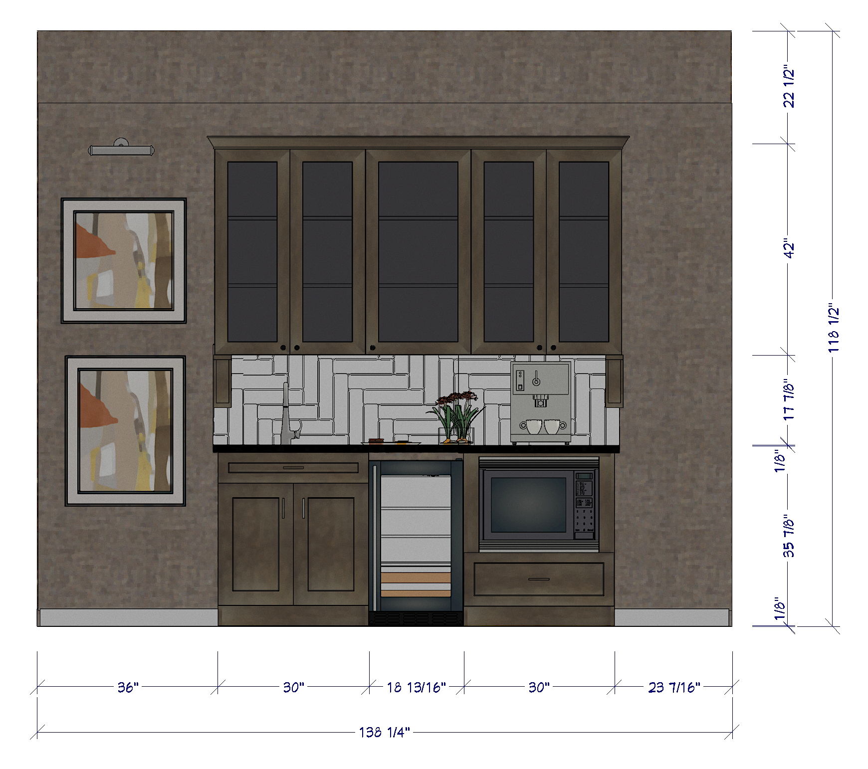
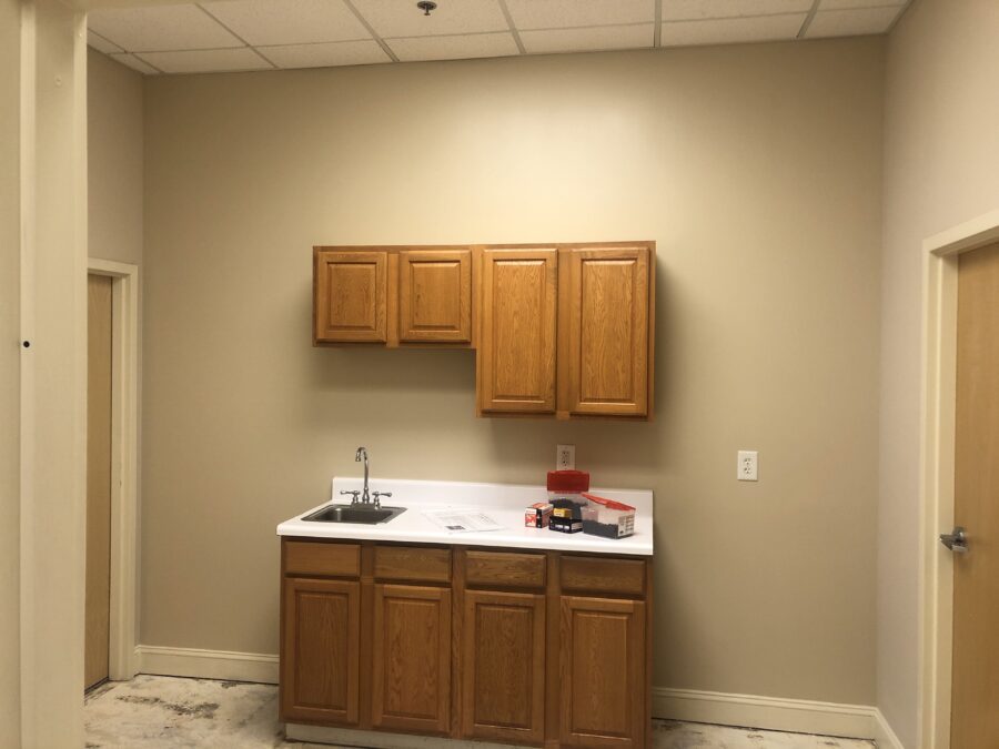
The butler’s panty sits between two restrooms. The door position of the restroom on the left prevents us from running the cabinetry all the way to both ends of the wall. The wall depth on the right side is just shy of standard cabinet depth. If we were using custom cabinets, we would have reduced the cabinet depths by 2-3″ but since this these are stock cabinets, we decided to float them in the center.
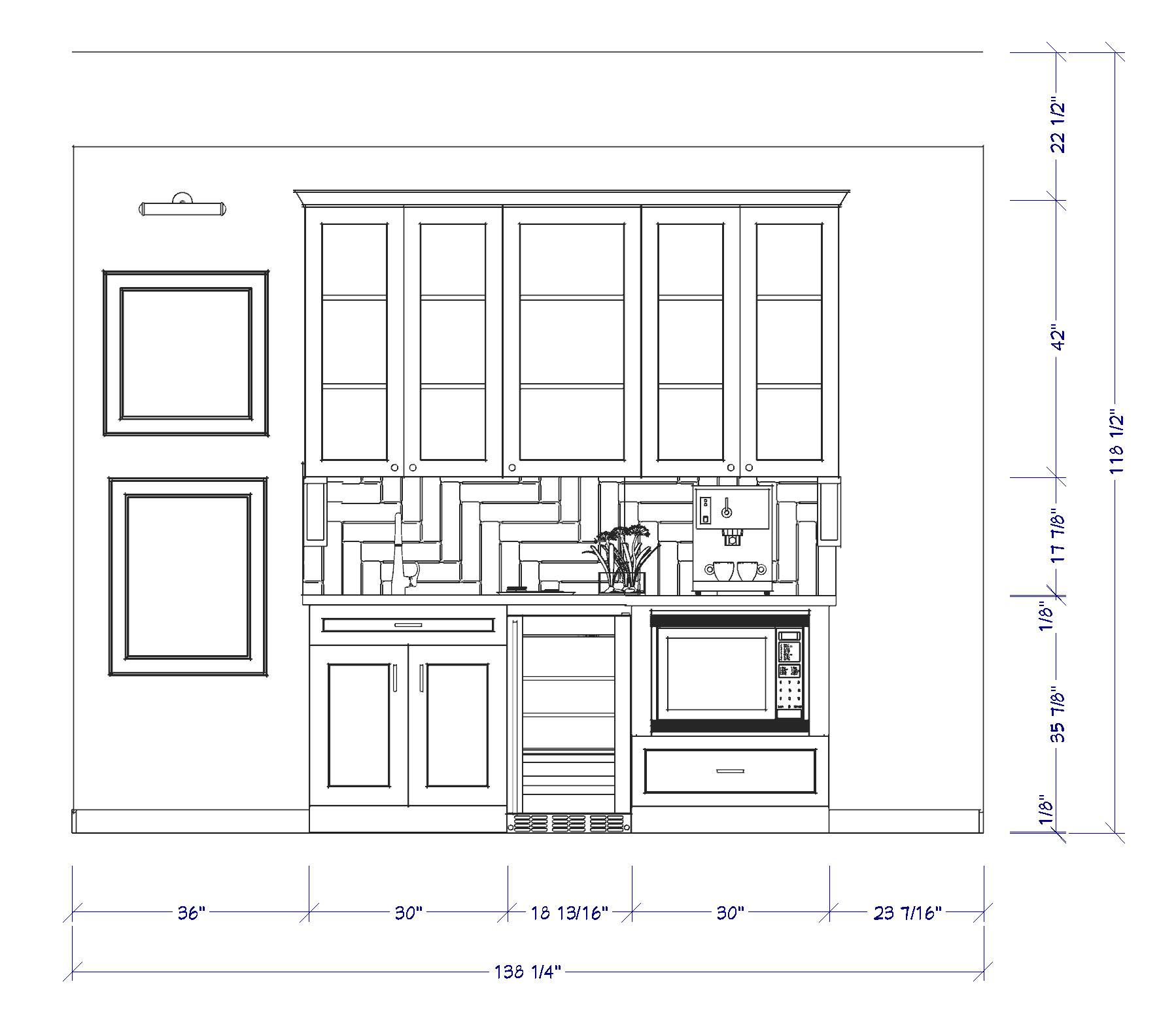
The new cabinetry layout is widened just a bit but the emphasis is placed on height. By replacing the short wall cabinets with 42″ tall cabinets, this extends the sight line up towards the ceiling and provides needed storage. Because the footprint of the butler’s pantry is relatively small, we had the doors cut for glass to keep the overall look a bit more airy. For sanitary reasons, in a public space I prefer to use closed cabinetry versus floating shelves to store glassware and plates.
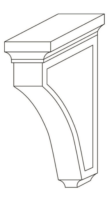
The expanse of the base cabinets was made a little wider to accommodate a beverage refrigerator and microwave. Because it doesn’t butt against a wall, we are using corbels just underneath the upper cabinets to create a clean “cut off” point.
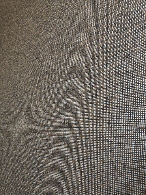
The backdrop to this semi-custom butler’s pantry is brought you by Official ORC Sponsor, Pacific Design International. We used a paper from their Shenzhen Collection which features a sophisticated mix of black, gray, and taupe grasses on top of a metallic background. I considered using a more graphic paper, perhaps one with color and pattern, but decided to keep this area fairly neutral.

In an area this small, every little detail matters. The chrome Metris Bar Faucet by ORC Sponsor Hansgrohe, combines form and function while adding a sleekness to the overall design. I love the elegant twist on the handle which also adds its sophistication.
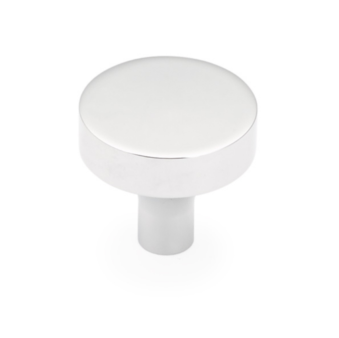
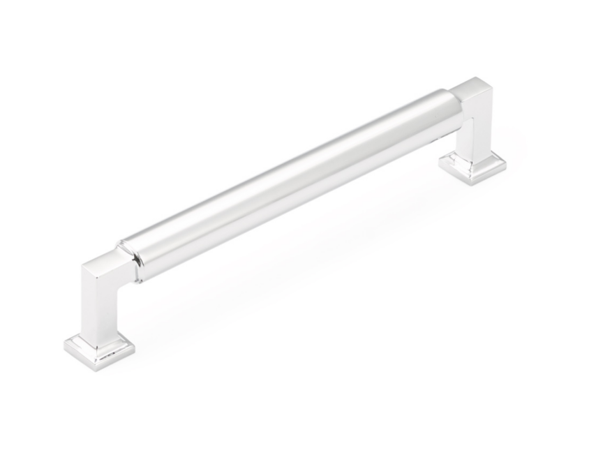
Knobs and pulls from the Haniburton Collection by Schaub and Company will also elevate the stock cabinetry with its timeless, minimal design. I tend to lean towards round knobs versus square knobs because even when they are turned, they are still centered. Known as being “jewelry for cabinets,” choosing the right fixture, color, and shape does wonders for accentuating the lines and color of your cabinets. It’s best to try a few samples and place them against the cabinet doors and drawers in order to decide which looks best.
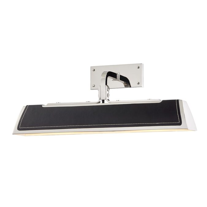
I can hardly wait to install the Holtsville Wall Sconce by Hudson Valley Lighting. I still can’t get over the handsome leather inset and white stitching. Never have I seen that level of detail on a light fixture. It’s one of the very necessary conversation pieces installed alongside the butler’s pantry.
We are still awaiting the arrival of the cabinetry. Though it was stock, modifications such as cutting the wall cabinets for glass and painting the interior of the cabinets the same color as the exterior, are delaying arrival. As they say, good things come to those who wait, but it sure is hard to exercise patience when you’re this excited, no? Keep your fingers crossed for us.
Be sure to have a look at the progress other featured One Room Challenge designers have made! One of them has already had her completed project photographed!!!! Can you guess which designer is already at the finished line?
A Glass of Bovino | Beginning in the Middle | Beth Diana Smith | Clark + Aldine | Coco & Jack
Deeply Southern Home| Design Maze | Dwell by Cheryl | Erika Ward | Home Made by Carmona
House of Hipsters | Hunted Interior | Kandrac & Kole | Kate Pearce | Katrina Blair | Liz Kamarul
Veneer Designs | Rambling Renovators | Renovation Husbands | Studio Plumb | Media BH&G
[…] Southern Home| Design Maze | Dwell by Cheryl | Erika Ward | Home Made by […]
[…] Southern Home| Design Maze | Dwell by Cheryl | Erika Ward | Home Made by […]