Hi There!
If this is your first time visiting, welcome! I’m Erika Ward, owner and principal designer of Erika Ward Interiors. Our Atlanta-based firm uses our concierge-level interior design services to help busy professionals make their homes their sanctuaries. This is my second season participating in the One Room Challenge and I’m glad you are here for the ride!
We’re back for Week 2 of the One Room Challenge, which in our case is three room challenge. In case you missed Week One’s post, we are building out the presentation room, butler’s pantry, and my personal office in our new Fayetteville, GA showroom. Check out last week’s post and before photos here.
This week we are talking about the inspiration behind the design and space planning.
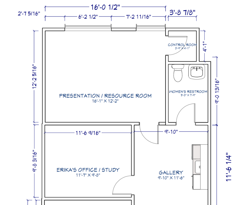
The design showroom and studio is about 1550 square feet and has been built out to resemble a personal residence. Our inspiration for the showroom echoes the mission for all of our design projects and that is to make any project we design feel like personal sanctuaries. The back of house areas, which is our focus for the ORC, will still have some of the same elements as the showroom. Organic materials such as beautiful oak, grasscloth wall coverings, linen, and seagrass will coincide with conference table, office chairs, and computers creating a serene work environment for our team.
The Presentation Room
My favorite elements in this room are the huge picture windows! Coming from a space with no windows, this feels like designer heaven. Natural light is of utmost importance when selected the best fabric and paint colors for a room which is why we chose this area for our meeting room and designer work space. I know what you’re thinking, “Where are the samples?” We have another room dedicated for fabrics, window treatments, books and such so hopefully we can manage to keep this area tidy. Fingers crossed.
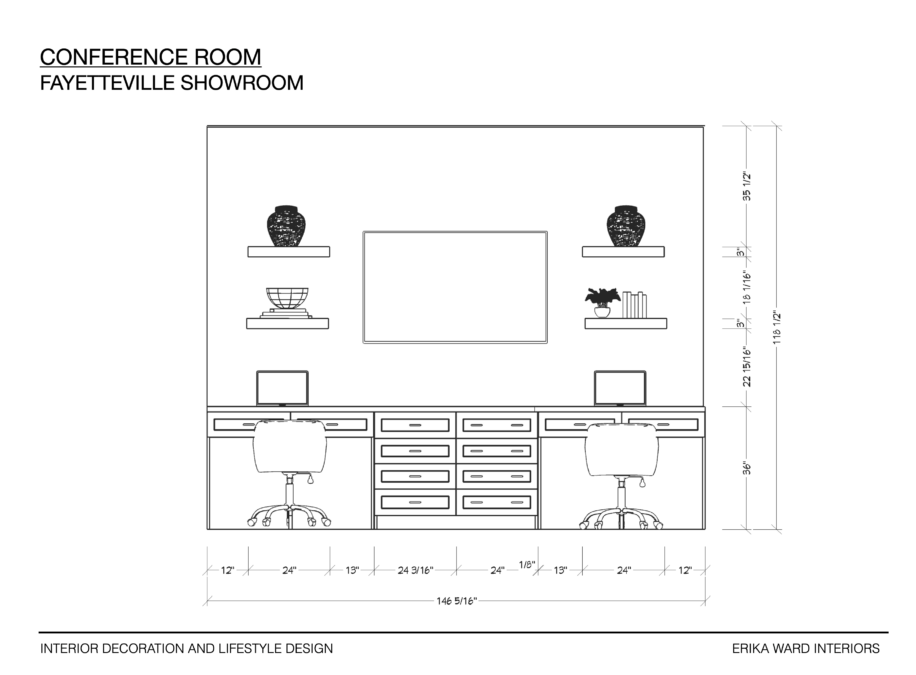
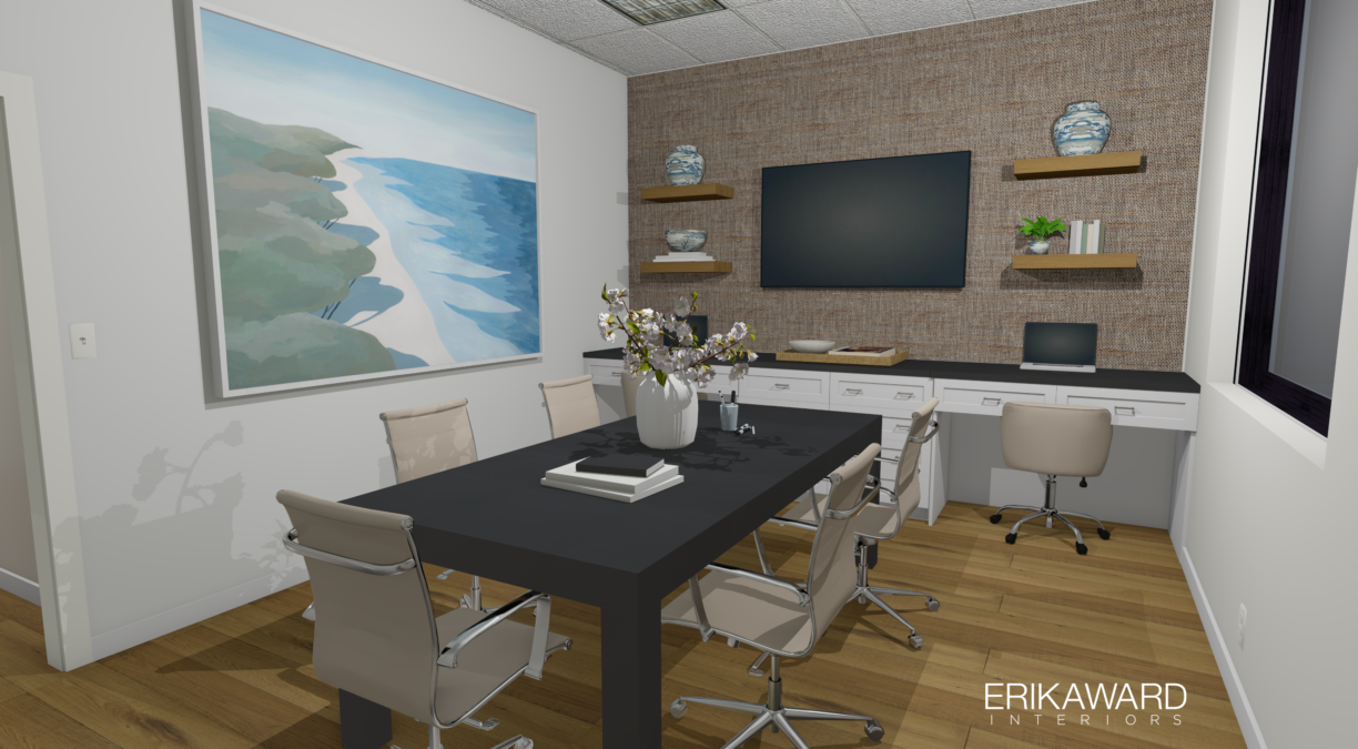
Our cabinetmaker, Bergeron, Inc., will create two workstations complete with lap drawers and additional storage beneath the television. The cabinetry will be painted one of my favorite warm grays for cabinetry, Anew Gray by Sherwin Williams. Above the workstations are floating shelves which will feature a selection of blue and white pottery and vases. This decorative feature will soften the space by giving it a more residential feel.
I’m still debating on whether or not to use office chairs or dining chairs at the table. This too could lean the room even more towards the residential side, but I want to be careful not to create the feel of another dining room which will already be in the showroom.
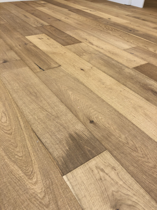
Starting with the flooring, we’ve chosen to use hardwoods from the Anton Oak Collection by LIFECORE Flooring. The chosen finish, Fresh Aire, certainly lives up to its name. We used LIFECORE Flooring, an ORC Sponsor, last season for my kitchen renovation because of its beauty and commitment to air quality and sustainability. We love the look and performance of LIFECORE Flooring in our home and wanted to bring it into the studio. Here our clients can see and experience the product in place versus on a sample board. LIFECORE Flooring carries a 15-year Light Commercial warranty which fully solidified our decision to use this product in our entire facility.
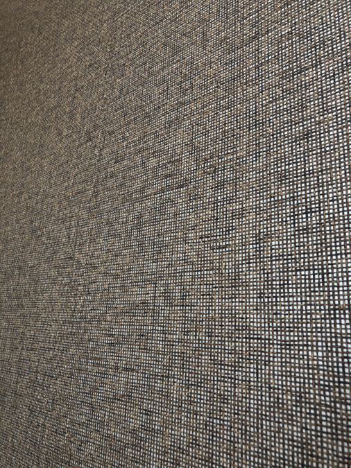
Bringing warmth into the room continues via textural grasscloth wallcovering by Pacific Designs International, also an official ORC Sponsor. I received a sample book of their latest collection, Shenzhen, and fell in love with several options. I finally chose the one below because of its sophisticated mix of black, gray, and taupe grasses on top of a metallic background. Here’s a close up photo after installation.
The Butler’s Pantry
Just outside of the presentation room, and between the two restrooms, is a wet bar aka butler’s pantry. I’ve auditioned several wallpapers and cabinet designs for the area and decided to use the same Pacific Designs grasscloth as seen in the presentation room. I could have gone bold with color and pattern, which I like to do in small spaces. However since this area is open, and won’t be changed as often as the room settings on the showroom floor, it needed to remain neutral.
I’ve also gone back and forth over the cabinet layout. This one is different from the one I showed you last week. I’m considering full height cabinet on the right side for more storage, but will I really need it? I could spend more time deciding this because we are using stock cabinetry here instead of custom like everywhere else. Just don’t tell my general contractor that I haven’t made up my mind.
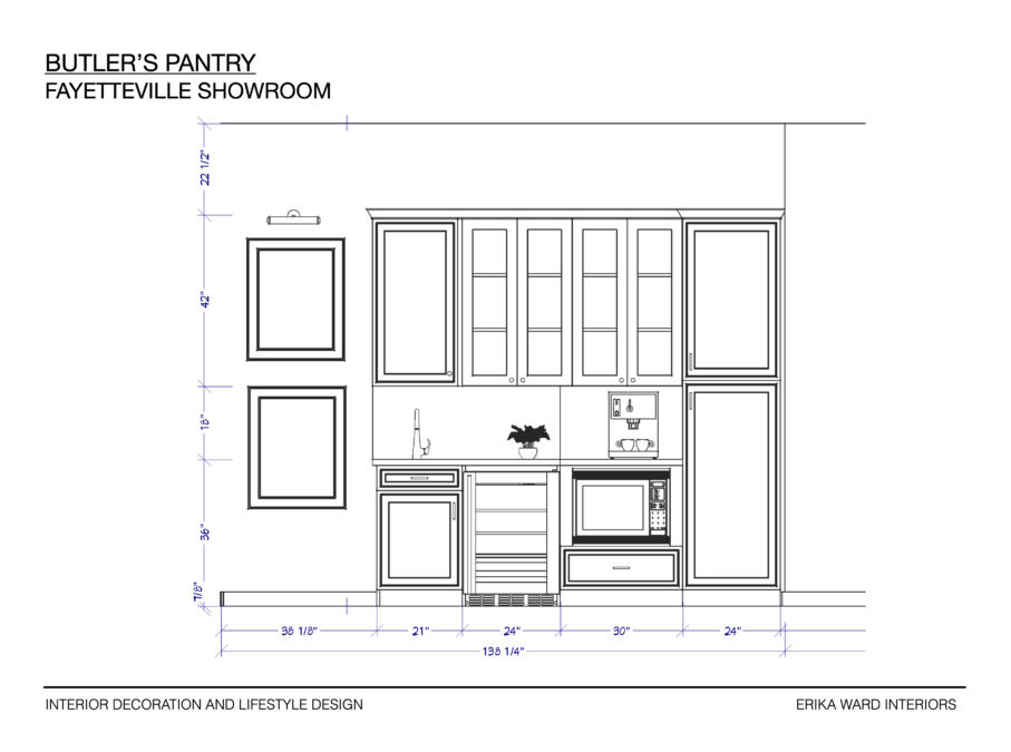
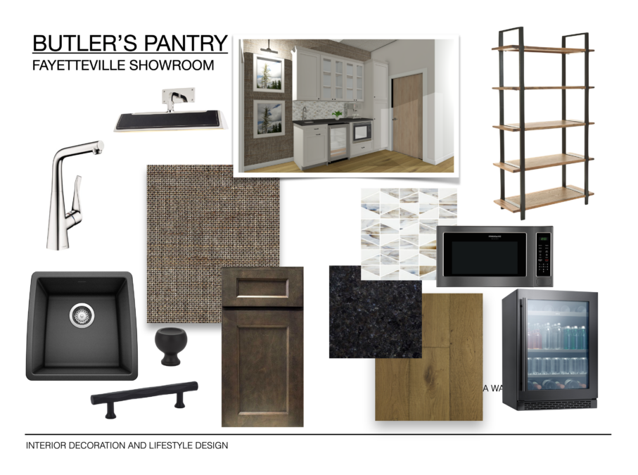
If you look closely, my design board exposes my indecisiveness. Do I choose white cabinetry or the dark stain option below? Do I use a full height cabinet on the end as shown in the rendering or do I use a freestanding shelf, or neither!? I HAVE to make a decision in the next couple of days. Hopefully Week 3 will hold the solution to this design dilemma.
My Office
Word cannot fully express how thrilled I am to finally have my own office. While I sometimes enjoy working in a community/team setting, as the principal, I often have switch gears quickly to business development, accounting, or other c-level executive tasks. I need a place where I can be alone with my thoughts and even take my lunch time nap. That 20 minutes is essential to my overall well-being just ask my team!
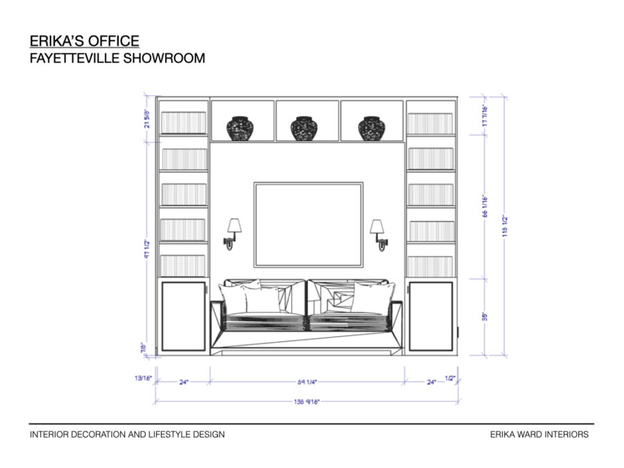
My cabinetmaker is building two stacks of bookcases that will flank my napping sofa and another shelf across the top to feature my vases. What’s extra special about this cabinetry is the contrasting finishes of both painted wood and stained wood. I’ve see this done at lot in British kitchen design and couldn’t wait to experiment with it in my studio office.
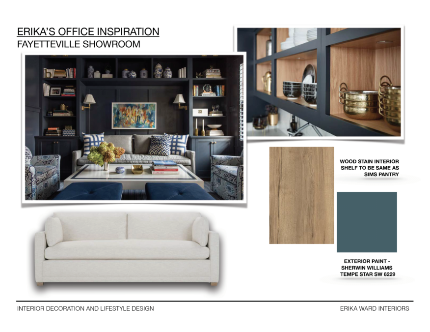
I can’t wait until next week to talk more in depth about the art and furniture selections for each space as well as lighting, hardware, and rugs. In the meanwhile, I need to make some quick decisions about the butler’s pantry because we know time is moving fast!!!
Let’s see how the other featured designers are coming along, shall we?

A Glass of Bovino | Beginning in the Middle | Beth Diana Smith | Clark + Aldine | Coco & Jack
Deeply Southern Home| Design Maze | Dwell by Cheryl | Erika Ward | Home Made by Carmona
House of Hipsters | Hunted Interior | Kandrac & Kole | Kate Pearce | Katrina Blair | Liz Kamarul
Veneer Designs | Rambling Renovators | Renovation Husbands | Studio Plumb | Media BH&G
I’m head over heels in love with the sofa nook in your office!!
love a fab studio to spark creativity and inspire clients as well. Love the dark grasscloth wallpaper and I am crazy about your office, especially with the built-in / sofa feature wall! can’t wait to see more next week!
[…] 1 | Week 2 | Week 3 | Week 4 (No Post) | Week […]
[…] Southern Home| Design Maze | Dwell by Cheryl | Erika Ward | Home Made by […]