Most times when you think of decorating with posters, a room that belongs to a popstar crazed teenager comes to mind, no?
I beg to differ.
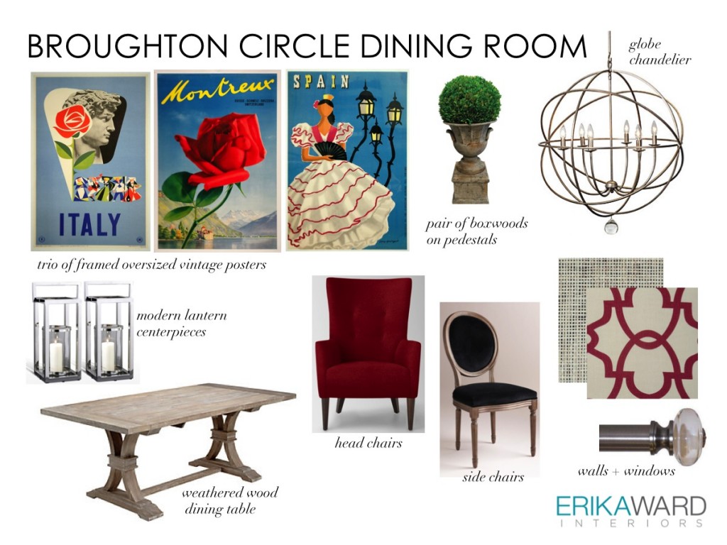
It’s all about the subject matter of the poster and it’s context within the space. In a recent design I proposed using framed vintage travel posters in my client’s dining room. We’ve already installed the dining table, side chairs, lighting, drapery, and wallpaper. The transformation thus far has been pretty remarkable. The dining room was not intended to be formal; however, the sparkle in the chandelier and drapery hardware helped to elevate it from the other rooms in this open floor plan.
What we need now is a jolt of color and artwork that provides clues to the casual use of this space. I selected travel as the subject matter because of my client’s frequent jaunts to exciting destinations!
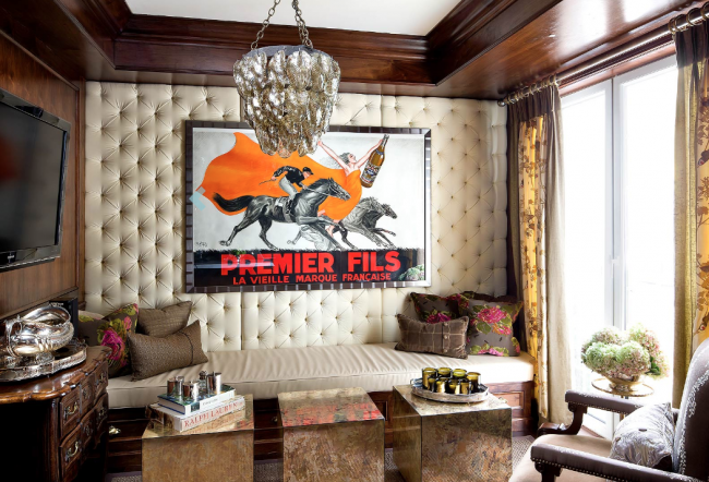
It always helps to have other visuals to show how the use of vintage posters makes an impact in a space. Here are a few examples.
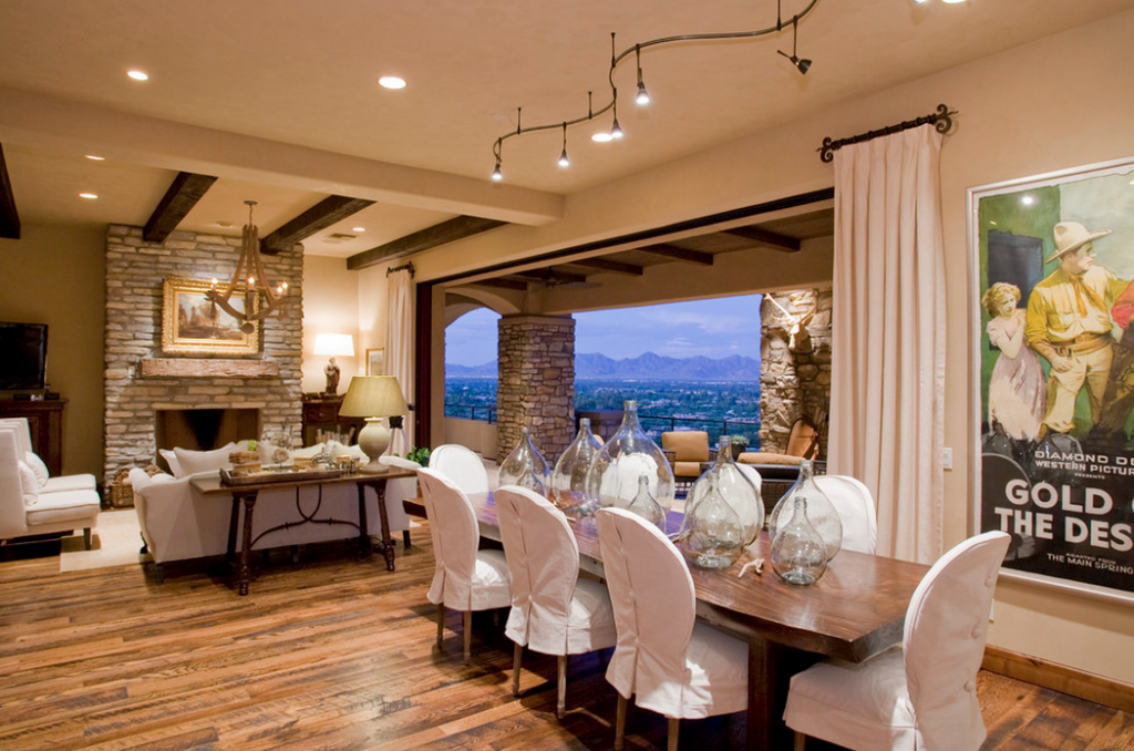
A vintage movie posters provides the color direction of this monochromatic living area. It’s presence further reinforces the relaxed feel of the space alongside the slipcovered chairs.
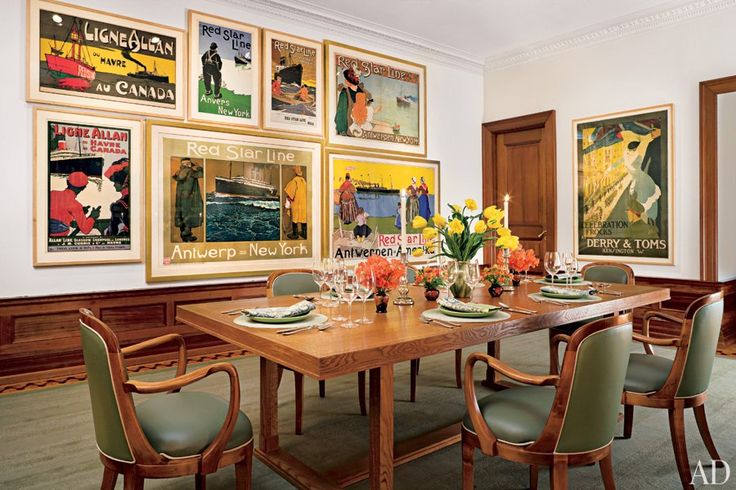
Travel and exploration sets the tone in this dining room and offers a wide selection of conversation starters and icebreakers.
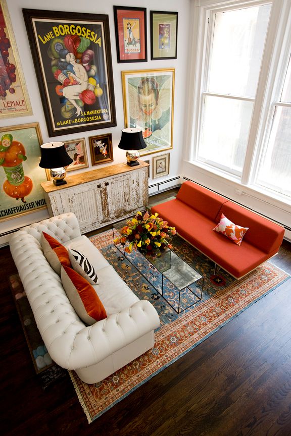
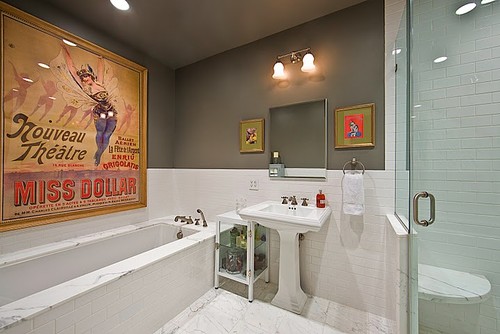
Friend to Blulabel Bungalow Amy Dragoo, has one of my favorite uses of vintage posters in her NYC loft. An avid collector she displays them in both her living area and a bath.
+ show Comments
- Hide Comments
add a comment