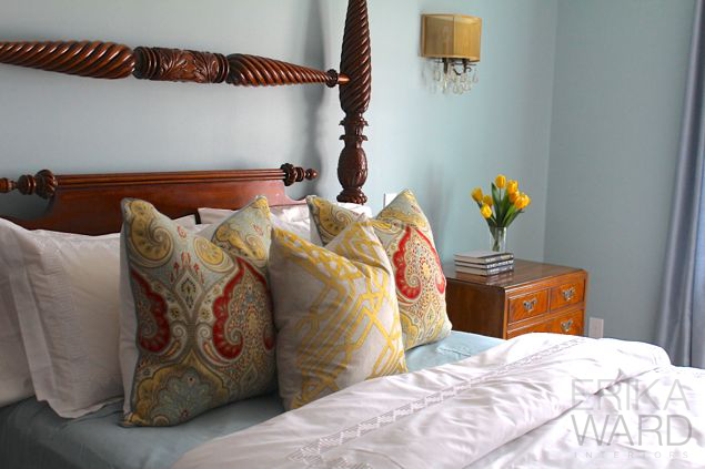
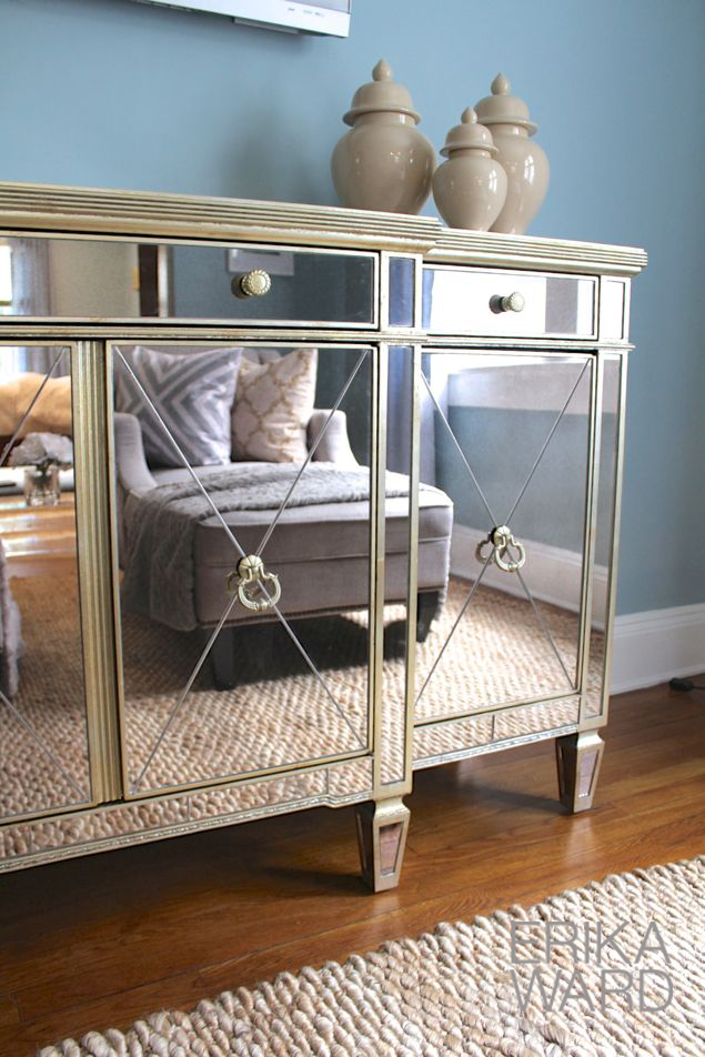
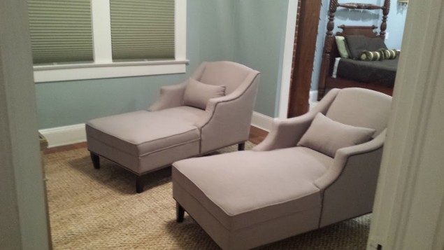
I’m super excited to show you the results of my latest project at Superior Ave. I’ve been working with the homeowners since they moved into their home back in 2010. You may remember this kitchen and the family room makeovers here and here. They are a family that loves to do it themselves, but with some professional guidance. Since July, I’ve been consulting with them on their master bedroom renovation which converted the old bedroom into a sitting room, adding on the master bedroom, and also adding a master bath. Before this makeover, we met in November to make a list of items to purchase. Over the holidays she scored some deals items I recommended like the mirrored media console and the pair of chaise loungers.
The bedroom addition also boasts the new chandelier and wall sconces they chose during the renovation. We met in again last week when she was ready to turn over the reigns and add some polish to their improved space.
Here are the final results…
One of the main goals here was to lighten up the space and create an airy feeling. There’s no upholstery in the room, just lots of heavy wood. Beautiful furniture, but it made the room feel crowded. Dreft blue ready-made drapery panels not only soften the window, but the monochromatic color helps them to fade into the wall. This allows the panels to not be a “visual disruption” in the space, but serve as a lovely compliment. Adding a pair of “aged urns” from HomeGoods emphasized the beauty of the armoire, made it feel like a welcoming piece and less of an intrusion.
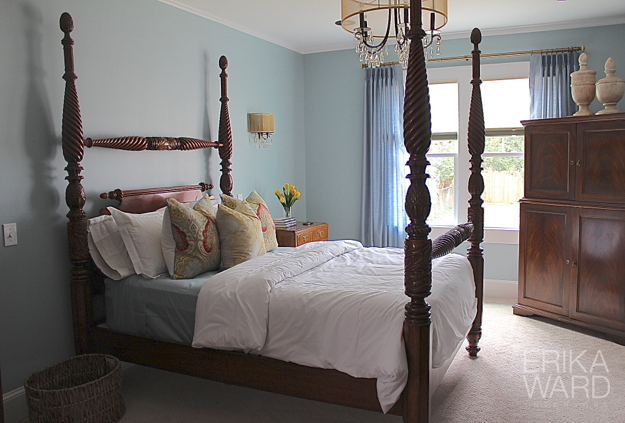
Leaning in for a closer look at the bed, you will find one of my best tricks for getting the most mileage out of your bedding budget. I cleverly combine custom pillows with retail finds. Homegood strikes again! Can you tell which pillow(s) are custom?
You guessed it. The gorgeous blue linen welting on the pillow continues to tie the blue “color thread” even onto the bed.
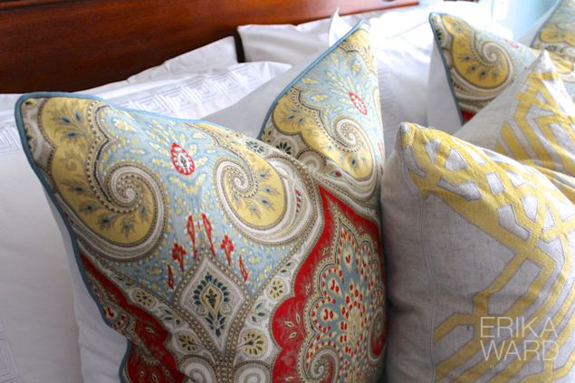
I also replaced their former brown coverlet with this pristine white duvet cover from Overstock.com. The lovely greek key detail rivals some of the more expensive coverlets from PB.

On the opposite side of the room, you see the former mirror is a great piece, but it simply adds bulk instead of beauty.
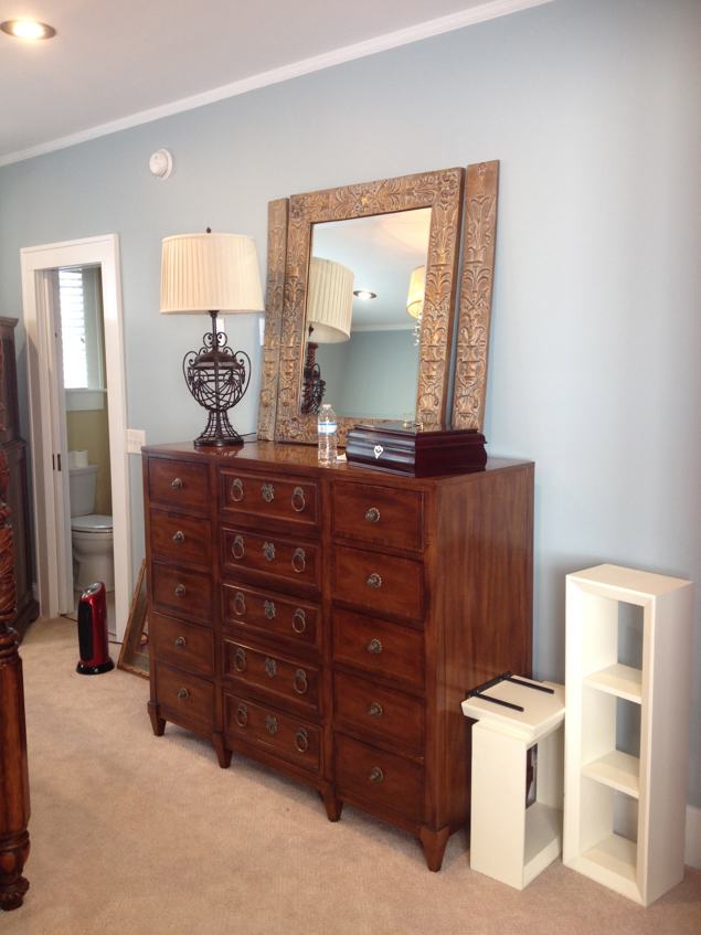
A soft abstract painting replaces the mirror and adds more visual interest.
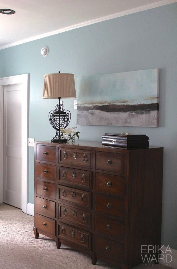
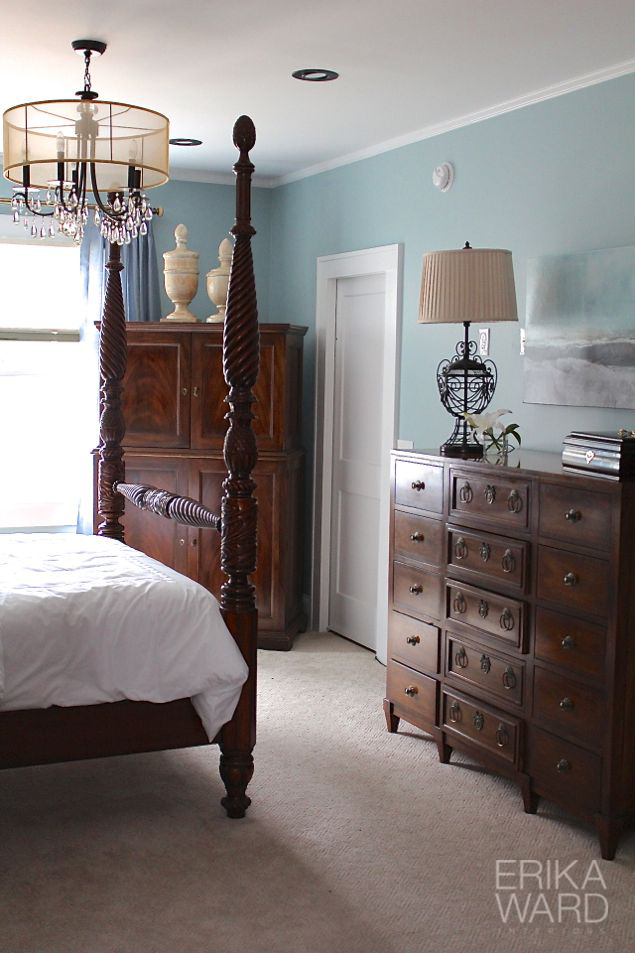
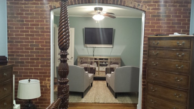
See the brick wall? That was the home’s exterior wall before the renovation. Historic homes bring so much character and create charm that cannot be duplicated.
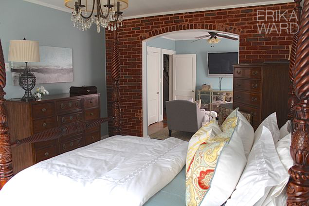
Moving into the sitting area, a separate area has been created for TV viewing.
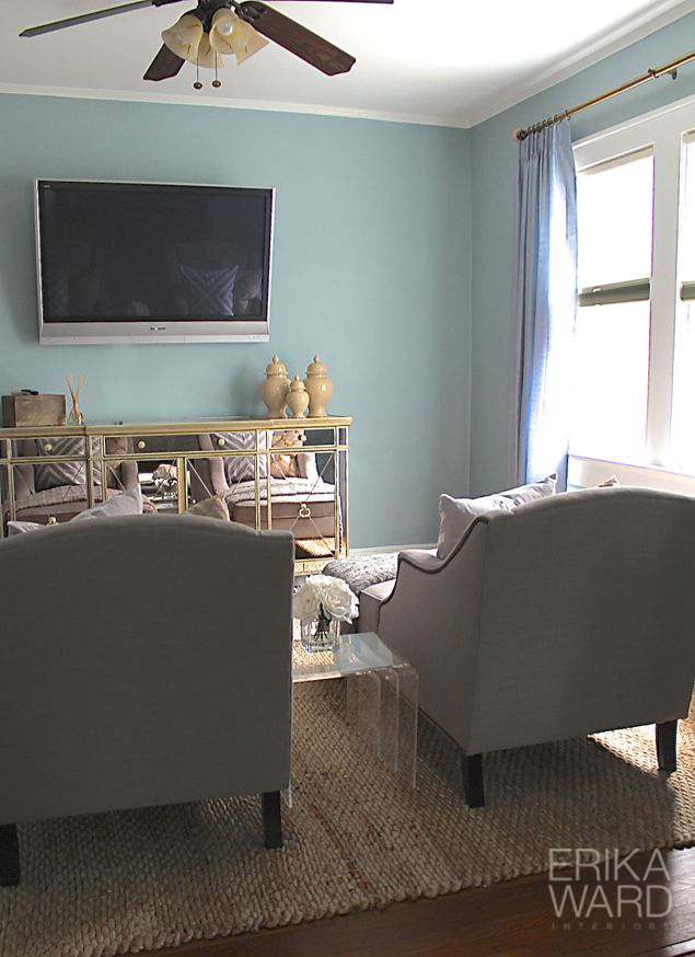
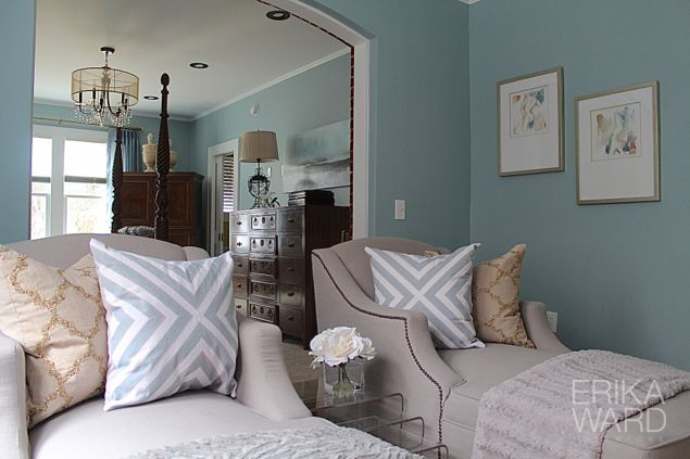
I used the same drapery panels to make both spaces cohesive. The small artwork on the left of the opening is the only piece that was not purchased at HomeGoods. This piece is by a talent artist named Linda Donohue. You can find her work here on Etsy.
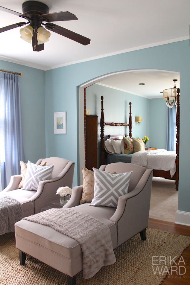
See how beautifully the rooms “speak” to each other? The accent pillows and throws create a play on pattern and texture, yet continue the theme of rest and relaxation.
I hope you thoroughly enjoyed this to bedroom tour and also receive some great takeaways. If you are interested in working with me, please contact me via email (info@erikaward.com) to schedule a 15-minute phone chat. I’d love to hear from you.
If you love what you see, feel free to share with your friends on facebook and pinterest!
+ show Comments
- Hide Comments
add a comment