


Christian Siriano’s Spring 2010 collection was my all time favorite from New York Fashion Week back in September. The inspiration for this line came from the notion of Mediterranean travel and rich coastal sunsets as seen from a yacht. This living room, featured in House Beautiful and designed by Tobi Fairley, has an understated elegance characterized by its sophisticated layers of pale blue tones and use of lush textiles.

garment Christian Siriano, room Tobi Fairley
Sumptuous spaces are created through the use of metallic finishes in furnishings and fabrics. These finishes shimmer and sparkle and give the appearance of luxury and opulence. Both ensembles have reflective qualities that really turn up the glam factor. In this bedroom also designed by Tobi Fairley, the sunburst wall decor as well as the mirrored furniture pay homage to old Hollywood glamour while this Siriano design features a shiny silk blouse paired with a metallic short and topped with a distressed sun hat…so elegant and yet so unpretentious.

garment Christian Siriano, room Tobi Fairley
Turquoise, Pantone’s color of the year, it making a statement in both residential and commercial spaces, but what I’m loving right now is this turquoise empire chandelier.
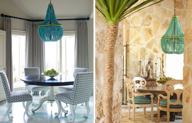 room Tobi Fairley , room Bonesteel Trout Hall
 There is even a less expensive version at Pottery Barn Teen. It’s definitely cute enough to make a style statement in a teen’s room, but not in a dining space.
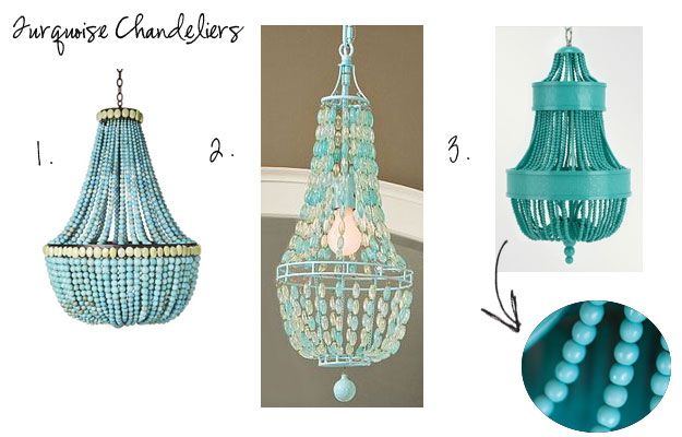 1. Turquoise Empire Chandelier, Marjorie Skouras Design 2. Glass Bead Chandelier, Pottery Barn Teen
 3. Catalonia Small Chandelier, Shine by S.H.O
Lastly, here’s a refreshing color palette using Sea Glass and two of the Pantone forecast colors, Tomato Puree and Dried Herb. Using Sea Glass in lieu of Turquoise escapes the retro look and arrives to one that is more meditative and calming. Tomato Puree replaces classic red and Dried Herb is said to be “the ultimate green neutral pairing well with all other colors.”

garment Christian Siriano, room Tobi Fairley
Do you find inspiration from the ocean and sea? How has the ocean found its way into your decor? What is your idea of Understated Elegance? Are you enjoying these posts as much as I am?


+ show Comments
- Hide Comments
add a comment