I’m often on the hunt for inspiration for two story great rooms and recently came across this one designed by Lillian August for the 2012 Hampton Designer Show House. This space has one of the very best designs I’ve seen from color selection to furniture scale to window treatments. Regardless of your decor style, there are many valuable lessons to learn from this space.
Two story rooms, though stunning, are a challenge for homeowners and truthfully some designers, too! It takes knowledge of scale and proportion and a healthy budget to bring a room this size to its greatest potential. Below I’ve listed a number of important factors to consider when decorating a space like this and hope to provide you with inspiration as well as some practical advice.
[divider_flat]
WINDOW TREATMENTS:
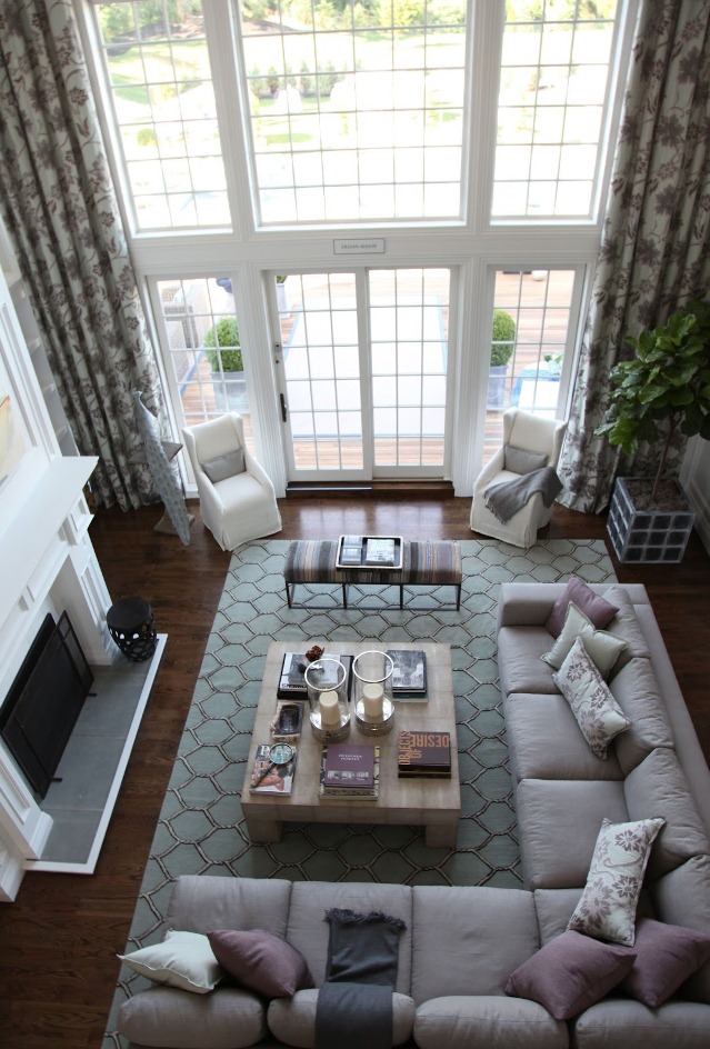
Window treatments bring the greatest amount of wow factor into a tall space primarily because they draw your eye upward. They emphasize the sheer greatness of the room and therefore NEVER should be one of the items you skimp on.
In this space, privacy is not an issue and the windows are left uncovered allowing a generous view to the outdoors. Large windows visually connect the indoors with the outdoors and as a bonus the weather sets the mood for the space on any given day.

COLOR:
Let’s first agree that regardless of the colors chosen for the space, the size alone makes it pretty impressive. A subtle palette of gray, purple, beige, and blue allows the room to breathe and its inhabitants to relax. This is a seaside home, but I love how the colors aren’t the traditional nautical or sea glass-like hues yet evoke they same feelings of calmness.
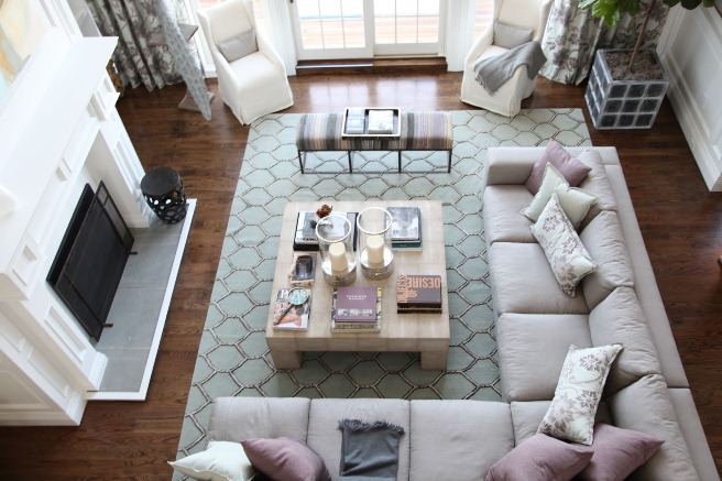
The furniture selection should be based on how you intend to use the space. The designer never intended this great room to act as a formal space. It was designed to be a casual area for lounging and conversation. The largest piece of furniture, the sectional, reinforces the idea to stretch out a bit and is a welcomed diversion from more buttoned up spaces.
The sectional borrows the most neutral hue from the drapery fabric and establishes the basis of color. A pair of chairs flank the exterior doors, but their color prevents them from distracting from the view outdoors. An upholstered bench adjacent to the sectional introduces a touch of complementary pattern to the room and provides mobile seating. Its low scale also gives clear sight lines to the room’s focal point.
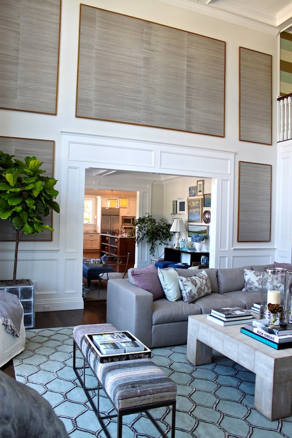
Table surfaces are kept to a minimum thanks to the generously-sized coffee table. There is also a desk behind the sofa for a moment to check emails or a bit of letter writing. Again, this space is very casual. Anything more than that would be reserved for the home office.
Here lies the answer to one of the most harrowing questions, “What to do with the walls?” The designer cleverly uses framed grass cloth wallpaper to occupy the soaring real estate. The combination of paneling and wallpaper adds another dimension to the room as well as beautiful texture. Its presence is definitely felt, and admired, yet it does not feel overpowering.
On the floor, the interlocking rope motif on the area rug is one of the few nods to a nautical theme (much appreciated) and it’s watery hue is a delicate contrast to the rich hardwood flooring.
The ever popular fiddle fig leaf tree contributes an element of life to the room while it also benefits from the streaming sunlight from the neighboring windows.
The opposite side of the room boasts modestly styled built-in bookcases. More emphasis is place on the elegant moldings than accessories and rightfully so!
This room goes down as one of the top ten spaces that inspire my own home. Comfortable, stylish, family-friendly, and spacious what more could I ask for? Well, a beach-front view wouldn’t hurt…
photo credit: Habitually Chic, Quintessence, Sag Harbor Online


+ show Comments
- Hide Comments
add a comment