Last week during a design consultation, I met a client who was afraid of commitment. Her relationship with color was a big issue. She vowed only to have a neutral base for the larger furnishings in the room, pops of color were another story. The room was pretty much empty except for a chair, media console, and entry table. Nothing in the room provided me a single clue to her color preferences.
So I asked about colors in her wardrobe hoping to find a starting point. Apparently she owned a sea of neutral colored suits and confessed to consulting with a wardrobe stylist to help her add color, yet still had no success.
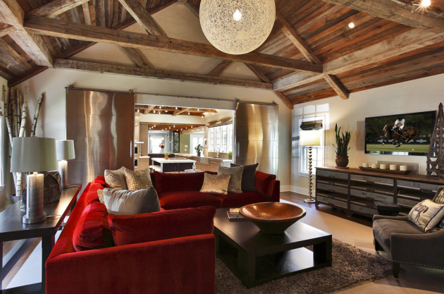
I inquired about her previous furnishings, surely after years of living in the home and entertaining, something was there before she made a clean sweep. I learned a big, red sectional once occupied the space, but was too overpowering for the room. She got rid of it. Had she called me before tossing the sofa, I would’ve suggested that she balance the strong color with neutral accessories like the photo below.
photo via Blansfield Builders
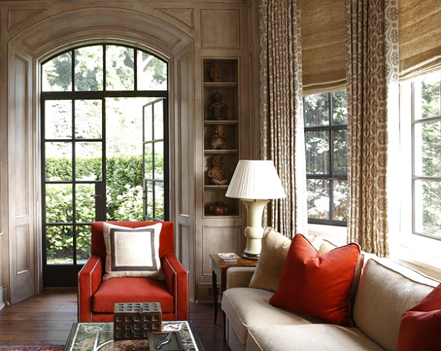
Instead I suggested she add small doses of color and pattern to the space. Since she planned on doing it herself, this was a great method for her to control the amount of color (and pattern) by simply adding or subtracting accessories. She loved it. Honey, red is your color!
photo via Beth Webb Interiors
Here are a few more examples of how I handled this dilemma with my full-service design clients…
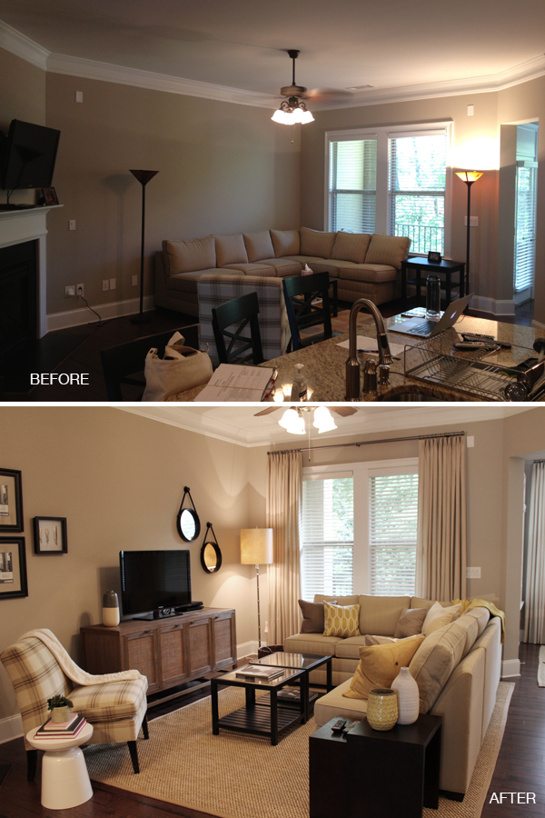
The consulting client had the Vinings living room makeover in her inspiration files.
::Sidenote: I love it when my work appears in your decorating notebooks::
Here, I took clues from a treasured yellow cookie jar (in the kitchen) as the color accent for the neighboring family room. Did I take a color risk? Not really, I played it pretty safe but got great results.

Yellow accents were introduced in small doses with throw pillows and vases. All color elements were retail purchases that could be returned if they didn’t work.
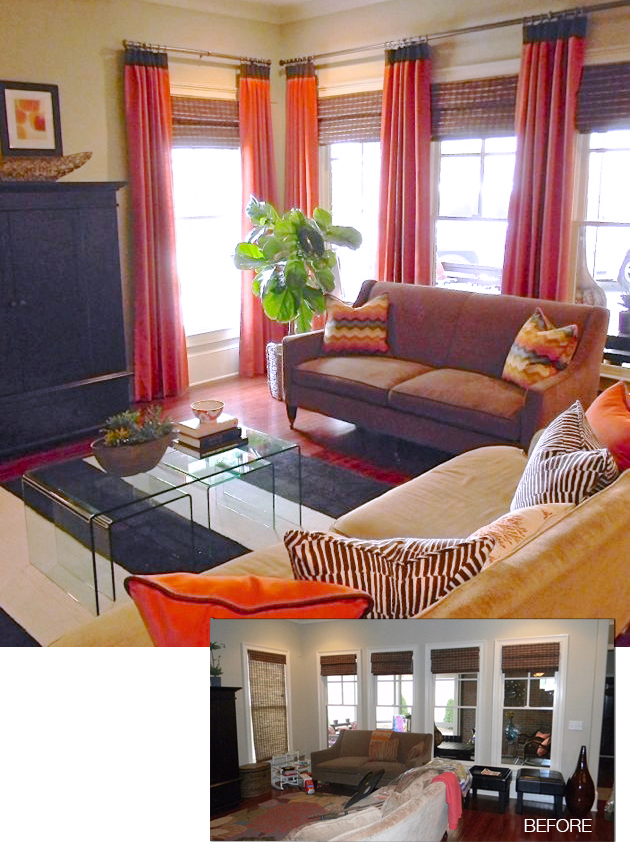
For my East Atlanta client who craved color, we took it up a few notches and made a commitment to bold color with custom drapery in blood orange.
What a dramatic transformation! I continued the accents throughout with custom pillows in the same fabric as the drapery and threw in a few fun patterns to produce an interesting mix.
Are you dealing with color paralysis? What’s stopping your from pulling the trigger on your favorite color?


I love what you have done with this place! Amazing transformation. I’m a big fan of the colour accents – pillows, paintings, vases.
[…] all, neutrals complement almost anything. I think red is my color now, Erika. Check out BluLabel Bungalow. […]
Erika, I love what you have done to all these! I would like to know where that plaid chair is from.
Hi there! I love what you did with the family room with the yellow accents. Could you tell me what brand and style that sofa is in that picture? I’ve been looking for one just like that! Thank you!
Hello Vanessa, Thanks for the complement. The sectional is the client’s own purchased from Ethan Allen.