


Every year around this time, we anticipate the Pantone color of the year announcement. This annual color selection is based on what experts believe we need as a society.
2020 is almost here and we are on the dawn of a new era, literally. With everything around us changing at a lighting speed, we depend on the familiar to bring us comfort. Classic Blue gives us just that.
Classic Blue brings a sense of peace and tranquility to the human spirit, offering refuge. Aiding concentration and bringing laser-like clarity, Pantone’s 19-4052, Classic Blue re-centers our thoughts. A reflective blue tone, Classic Blue fosters resilience.
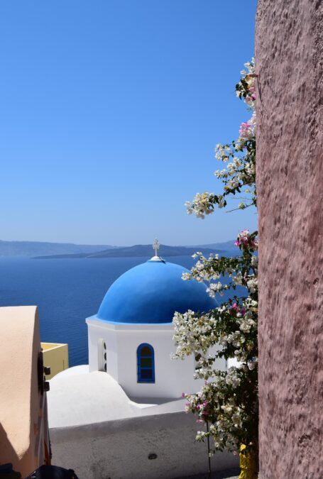
I couldn’t agree more with the above quote and wonder if it’s why I’m naturally drawn to almost any shade of blue. It’s a tried and true classic found in nature and has undisputed mass appeal. It’s our favorite pair of blue jeans, an exquisite Chinese vase, the color in our national flag and hue we associate with Santorini, Greece. Without a doubt, Classic Blue comforts, calms, and inspires.
“We are living in a time that requires trust and faith. It is this kind of constancy and confidence that is expressed by Pantone 19-4052 Classic Blue, a solid and dependable blue hue we can always rely on,” – Leatrise Eiseman, Executive Director of Pantone Color Institute.
Trust and faith feel good to me, but for those who crave something unexpected, Classic Blue is a foundation color that doesn’t mind playing the background. Think of this declaration as a crystal ball look into upcoming offerings in both home decor and fashion. Guaranteed you will see it everywhere .
How will you embrace this year’s color selection?
opening image: Francesco Ungaro


+ show Comments
- Hide Comments
add a comment