Get your creative juices flowing with these paint color combinations for your home’s most commonly used rooms.
{Sponsored by Beazer Homes, written by Erika Hollinshead Ward}
When you’ve found the perfect paint colors, it feels like you’ve found a pot of gold. Paint colors are so very important in making a new house feel like a home, especially in key rooms like kitchens, bathrooms, and master bedrooms.
However, there’s more to choosing paint than picking your favorite colors. You quickly realize this after you’ve stood motionless in front of a wall of paint swatches. Frozen, like a deer in headlights.
My friends at Beazer Homes understand your frustration and have asked me to weigh in on three color combinations for your kitchen, bathrooms, and bedroom—three rooms in which they offer free floorplan options through the Beazer Homes’ Choice Plans program.
I love options. Don’t you?
Friends, the struggle is officially over. The paint colors you need are here in this post. Here are some of my favorite colors combinations for making a new house feel like your new home. Let’s take a look.
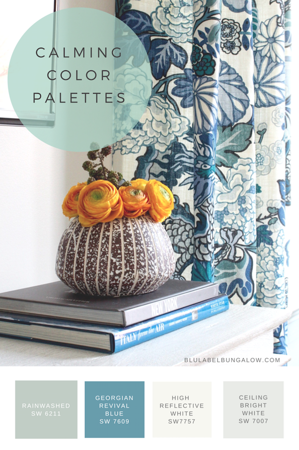
Calming Color Palettes
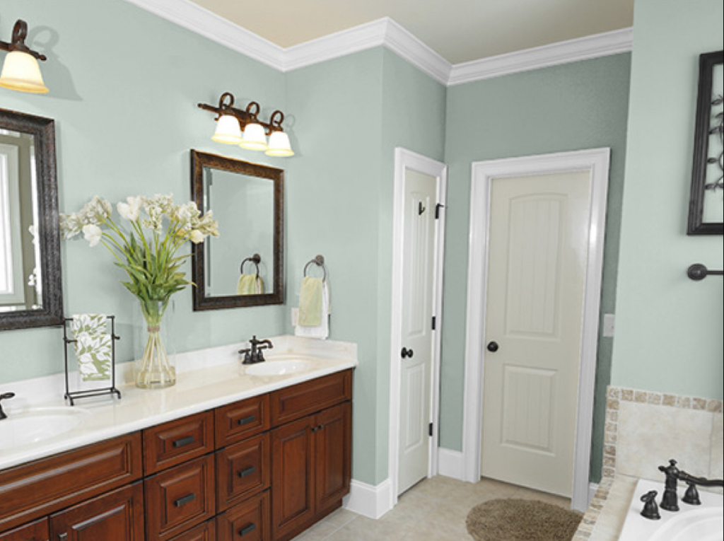
If you gravitate towards sea, sand, or surf then consider a calming palette in the rooms that you use most. Blues, greens, and soft white have an ethereal quality that allows you invite a little slice of heaven into your home.
Soft-hued bathrooms have an air of tranquility. They are the safest option for who love neutral spaces, but still crave moments of color.
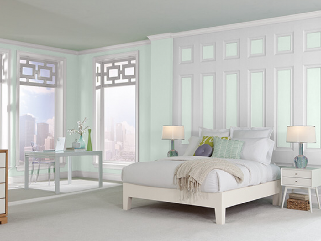 Get into a meditative, worry-free state of mind with a bedroom paint color that encourages rest and relaxation. Reminiscent of the first glimpse of green in the spring, its soft hue is like waking up to fresh morning dew.
This color is would also be soothing in a study or home office, another option available with the Beazer Homes Choice Plans program.
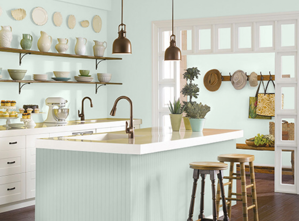 Depending on the light, this color (Rainwashed SW 6211) can appear green, then at times depending on the light, blue. However, it looks fantastic with any metal finish found in a kitchen especially warm brass.
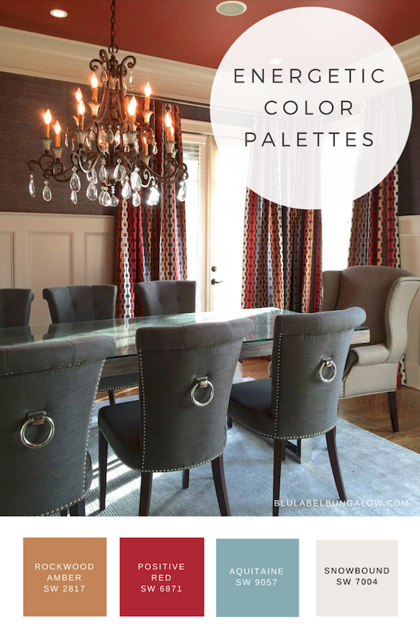
Energetic Color Palettes
A little warm color goes a long way, though most of these examples show color on the wall, you could consider using red in furniture, on a door, or window frames. If you choose to use them on walls, you can often times forgo elaborate window treatments.
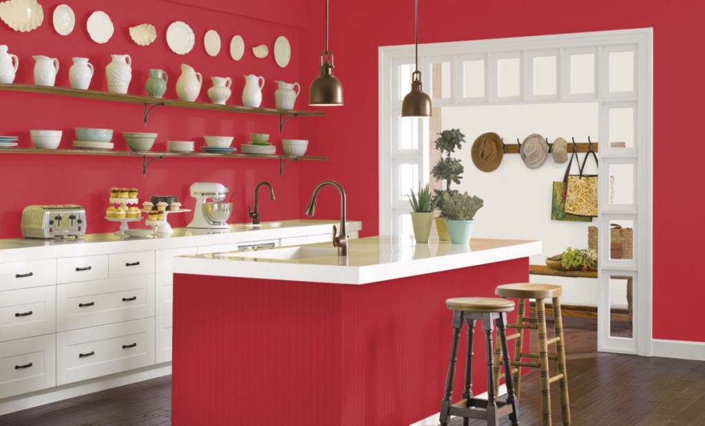
Spice up your kitchen with red for a little farmhouse flavor! It you’re a little but country, say it loud and proud with this cayenne-inspired hue. Add accessories like barstools antique or made of reclaimed wood, and vintage signage to drive home the down home theme.
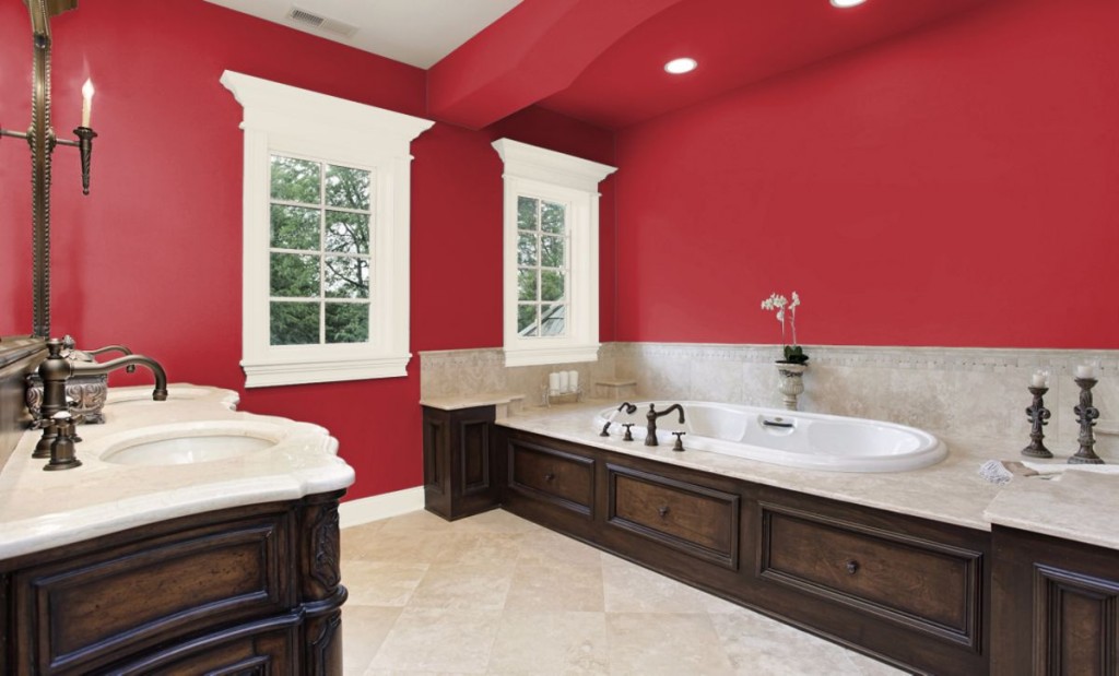
Rich, exotic hues can evoke the feeling of far away places especially when combined with rugs that reinforce the theme. Get the well-traveled look in your bath with decorative candleholders— a great addition to a spa like bath—and featured artwork above the bathtub. Consider also using a wool rug in lieu of a mat to raise the bar in your elegant bathroom.
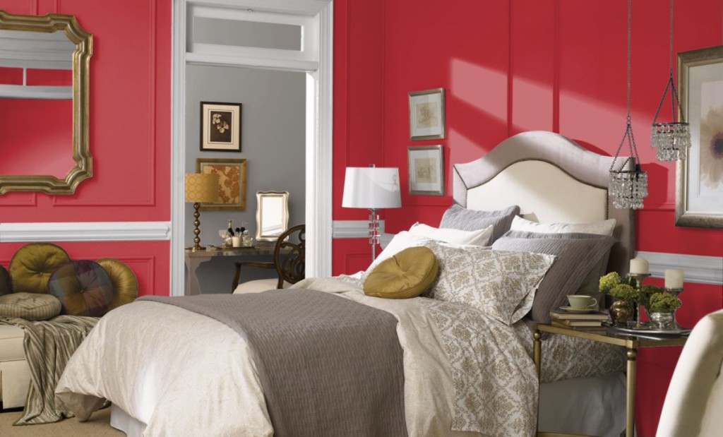
Heat up your boudoir with a little dramatic flair. Whether it is red roses, red lipstick or Sherwin Williams’ Positive Red SW 6871, rouge often equals romance. Temper the flame with neutral bedding and use glass, crystal, or mirror for a touch of glam.
Organic Color Palettes
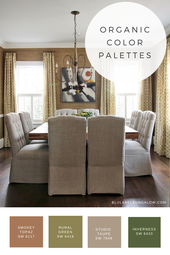
Plants, trees and flowers: from the lush green of a freshly mowed lawn to the hue of earthy, Georgia red clay, nature is filled with a bounty of color. Organic color palettes can range from muted to vibrant so you can’t go wrong with something that’s inherently perfect.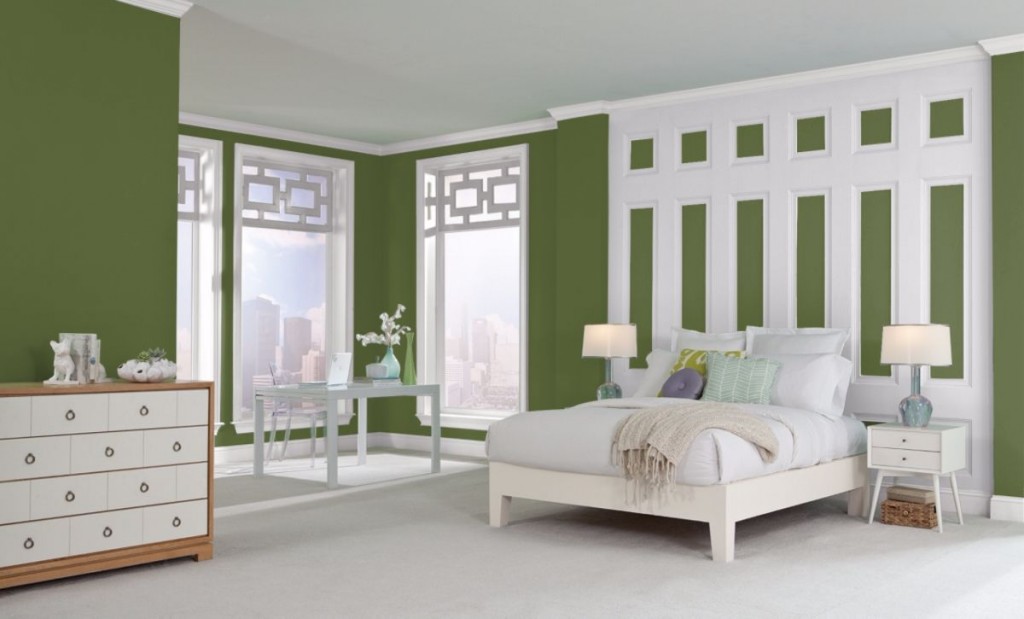
Painting a bedroom in a saturated color like Sherwin Williams’ Inverness SW 6433 hints at the now trending dark, moody palettes but without being somber. Keep this combination light and refreshing by using white furniture or add an air of sophistication by using furniture with deep wood tones and accessories with a touch of sparkle.
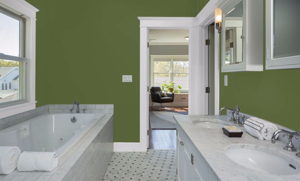
A green bathroom reminds me of being a garden after the rain—cleansing, refreshing, and fragrant. Pristine white, rolled spa towels, candles, and a loofah are all it takes to evoke the wonderful feeling of freshness.
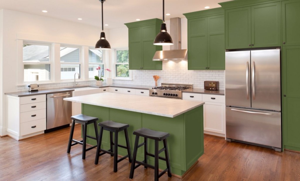
Have you entertained the idea of painting your kitchen cabinets an eye-popping green? Then use this photo as inspiration. What makes this work is the contrast of the white walls and lower cabinets. A soft, off-white like Creamy SW 7012 provides the sunlight a reflective surface to bounce light around the kitchen.
Each of these rooms was created using Sherwin Williams’ Color Visualizer for desktop. They are partners with Beazer Homes in helping you to create the perfect home. Your perfect home is one that is personalized to fit your individual needs.
Need an extra space for a home office, guest room, or loft space? Explore Beazer Home’s Choice Plans option and decide how to customize your home for the way you live.
If you love to host parties, then you know guest like to gather in the kitchen. With the Choice Plan option you can easily craft a kitchen for your entertaining needs at no extra cost.
Interested in creating the spa experience at home? Get the best of both worlds with a tub and a shower. Flexibility is at your fingertips.
You now have the tools you need to create a house that meets your spatial needs as well as the color tools to make it feel like home.
Happy Decorating!
[…] YOU MAY ALSO LIKE THIS: GET INSPIRED BY 3 COLOR COMBOS FOR YOUR KITCHEN, AND MORE […]
[…] + Spice up your kitchen with a red paint color for a little farmhouse flavor! […]
[…] + Spice up your kitchen with a red paint color for a little farmhouse flavor! […]