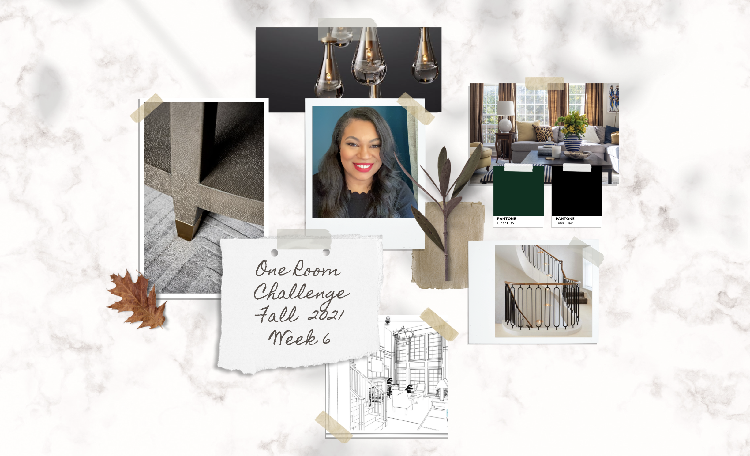
One[vc_row][vc_column][vc_column_text]Welcome back for Week 6 of the One Room Challenge!
If you missed posts from previous weeks, then you can find them here: Week 1 | Week 2 | Week 3 | Week 4 | Week 5
If this is your first time visiting, the One Room Challenge is an eight-week documented home improvement movement started by Linda Weinstein. The event features 20 Featured Designers, hundreds of Guest Participants, and a host of generous sponsors! Readers enjoy following our progress over the eight weeks while also gaining inspiration for their own decorating or renovation projects. Everyone loves a good before and after makeover, I know I do! Better Homes and Gardens is covering this event and has been a long time partner of the ORC and serves as the Media Sponsor.
This season I am redesigning our entry, dining room, and the great room. Last week we gave super helpful advice on how to shop for furnishings during a pandemic. This week’s focus is on the entry![/vc_column_text][/vc_column][/vc_row][vc_row css=”%7B%22default%22%3A%7B%22background-color%22%3A%22%23F5F5F5%22%7D%7D”][vc_column][vc_column_text]
NEW ENTRY CONCEPT
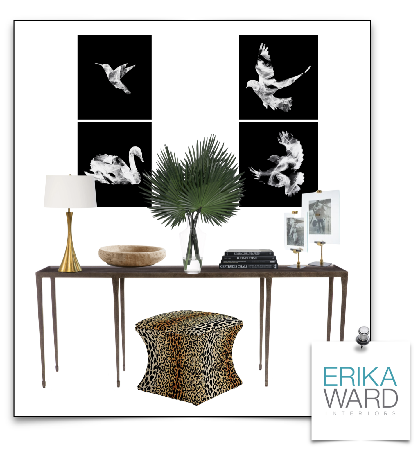
[/vc_column_text][vc_single_image image=”24755″ img_size=”full”][vc_column_text css=”%7B%22default%22%3A%7B%22margin-top%22%3A%2240px%22%7D%7D”]Though the entry is the last room discussed, it doesn’t mean it is the least important. It’s taken some time to decide the right furnishings, art, and accessories to use in this space. The entry is supposed to give visitors a preview of what to expect in the balance of the home. Seems like that would leave a ton of items to display in such a small space but the key to finding the right balance is to display only the repetitive elements found in the home.[/vc_column_text][/vc_column][/vc_row][vc_row][vc_column][vc_column_text] Judging from the vignette you will expect to find metal black accents, greenery/the color green, bird motifs, a nod to island living, candles, animal prints, family photos, warm wood, and brass accents in our home—and you will!
One of the most moving items in this vignette are the Flight Series art prints by Lori Lejeune of Studio Lejeune. I’m drawn to the black and white contrast as well as the whispy silhouettes that seem to bring a calm to the front entry. When I see this series I’m also reminded by one of my favorite bible verses in Matthew 6:26. The believer looks at the birds in the sky, that do not reap nor gather into the barns, and trust that the Father will provide.[/vc_column_text][vc_column_text]Take a look at your entry and decide if it represents the essence of your home. If not, then have some fun in curating a look that is uniquely you. You can find most of these items by shopping within your own home![/vc_column_text][/vc_column][/vc_row][vc_row height=”auto”][vc_column][vc_separator][vc_column_text]
Follow along each week as I take you along my design process from concept to completion. Look out for tips and tricks to use in your own home! Week 7 will be our last post before the big reveal! You don’t want to miss it!
Be sure to also check in with design comrades as they share their plans for upcoming projects.
[/vc_column_text][/vc_column][/vc_row][vc_row][vc_column][/vc_column][/vc_row]

+ show Comments
- Hide Comments
add a comment