From coastal cool to chinoiserie chic, a BLUE and WHITE color combo is both TIMELESS and CLASSIC. Peek behind the curtain to preview our latest decorating project, True Blue, and see why these rooms will stand the test of time.
We Started with a Carpet
During the design consultation we asked our clients, “Show us your stuff!” They answered our demand with a large Persian rug and a 40″ x 50″ painting—both purchased from an estate sale. Not bad…not bad at all.
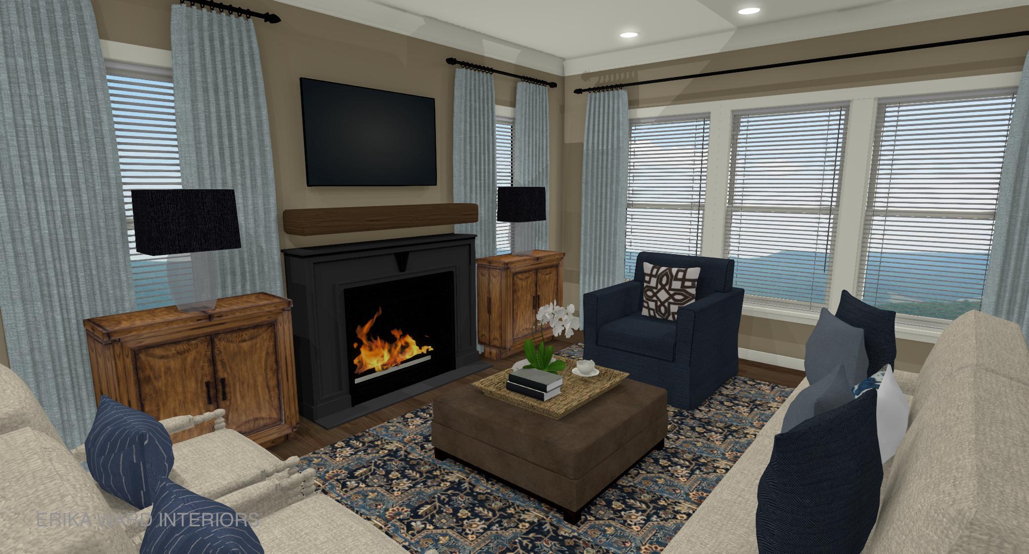
The rug and art in the above design plan are snapshots of the actual items. The rug is clearly “The Boss of the Room” not because of it’s size, but because if it’s ornate pattern and array of colors. It’s a very traditional rug that you’d normally see in a large estate, hence where it came. But for these city dwellers, they appreciate the pedigree of the carpet but needed help from us to give it a fresh perspective.

Let There Be Light
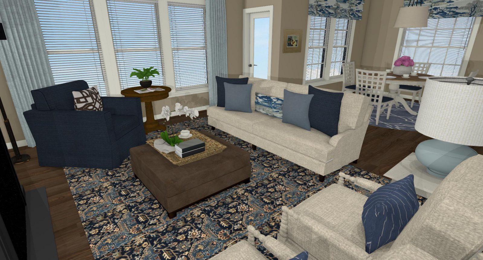
To lighten the mood, we opted for light colored upholstery. The English roll arm sofa upholstered in Belgium linen. It’s one sofa that I recommend time and time again for it’s classic silhouette and not to mention its rounded arms are perfect for lounging and TV watching. The pair of spool chairs provide another comfortable seating option with its classic turned arms and solid wood frame. The third seating option is not another light colored chair but a sophisticated, navy swivel chair fabric that offers a beautiful contrast against the cornflower blue drapery panels.
Open Space Planning
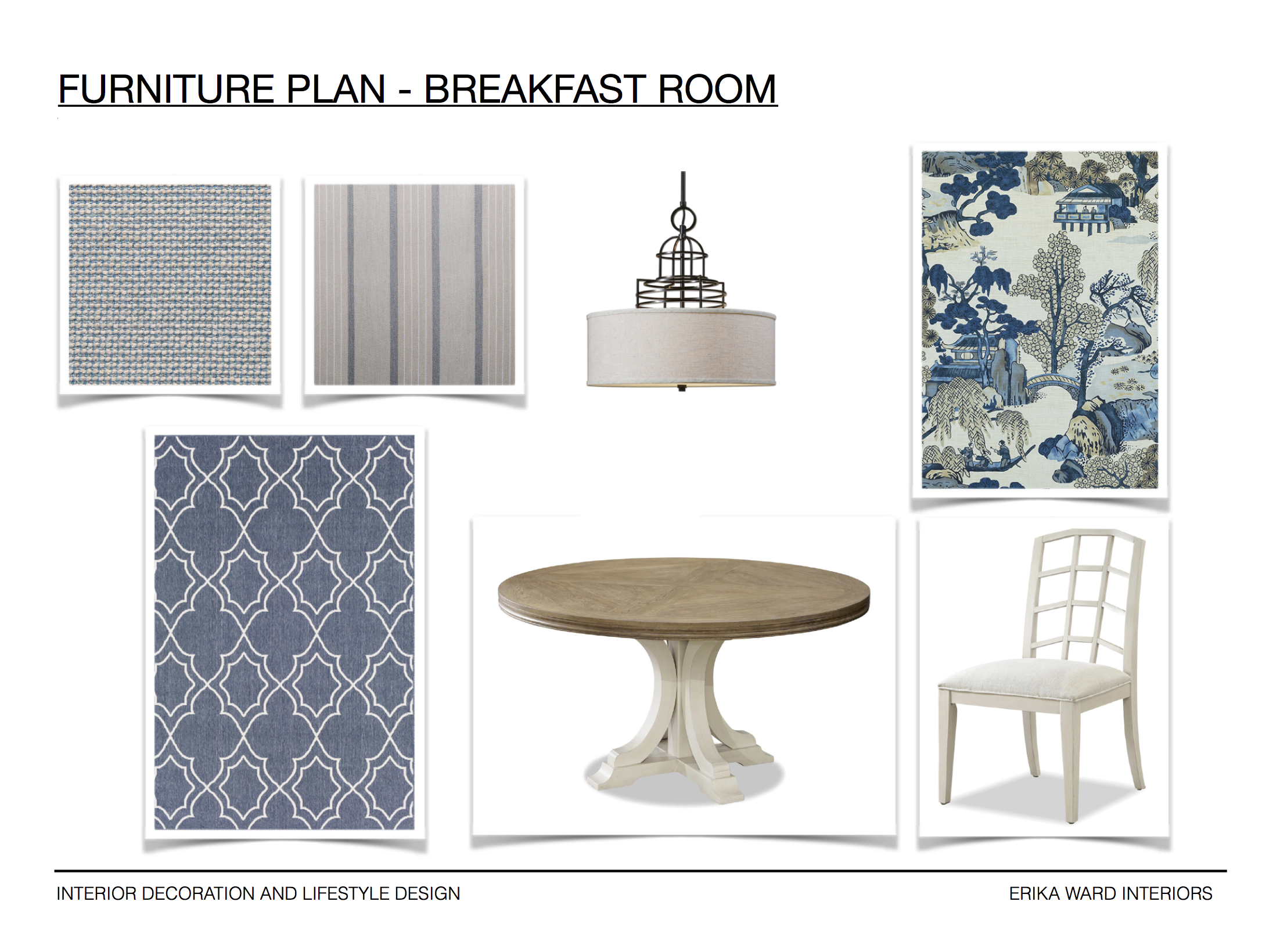
The adjacent breakfast room called for something light and lively. Sandwiched between a kitchen with richly, stained custom cabinetry and the soon to be True Blue living room, it strikes the perfect balance between light and dark. The table does the heavy lifting with a duo toned finish while the faux Roman shades will be the likely showstopper.
The blue and white pattern in the design plan is Macbeth by Thibaut which I absolutely adored!!! However, we went went another selection. You’ll just have to wait for the final reveal to see what we’ve chosen!
We’d originally planned to install this space last week, but got delayed by the hurricane! We hopefully will deliver the final reveal to the homeowners this coming week. Go easy on our coastal friends, Florence!
If you’re looking to take your home’s decor to the next level, then we’d love to design and decorate a home that best suits to your style. Please visit our services page for more information. After deciding which service best fits your needs, please take advantage of our convenient scheduling platform.
We hope to hear from you soon!
xo,
Erika


+ show Comments
- Hide Comments
add a comment