During a recently in-home consultation, I met with a homeowner who needed advice on how to revamp her combined living and dining room.
She, like many others, has been working remotely for the past year. The household also includes a third grader and a college sophomore who have been attending school virtually as well. Growing frustrated with clutter from books, papers, and lack of shelving, we had to deliver some quick ideas she could implement immediately.
FINDING SPACE FOR WHAT MATTERS MOST
Combined living and dining rooms are commonly underutilized especially in homes that already have a family room. For families who don’t require a formal dining room, this space often times remains empty, is turned into a catch-all space, or is handed over to small children as a playroom. However to get the highest, best usage from the area, it takes a mindset shift to see the room as something else other than what the builder labeled it on the floor plan.
After interviewing her more about their needs, interest, and hobbies, here’s what we learned:
- Enjoys hosting small wine tasting parties with friends
- They have an expansive book collection
- The children take music lessons
- Homeowner works remotely
- Children attend school virtually
- New interest in collecting art
- Enjoys antiquing and buying vintage furniture
FROM A NARROW, CLUTTERED LIVING AND DINING ROOM COMBO TO PURPOSEFUL, CULTURED AND REFINED LIVING SPACE
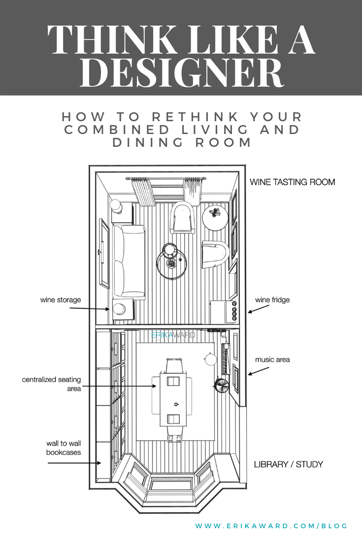
The combined living and dining room is already divided by a wall with a large opening. This allowed us to create a dedicated Wine Tasting Room which will also serve as an evening room and art gallery. The lower room with the bay window faces the front of the house. It’s now the new Library/Study area, morning room, music room, and dining room.
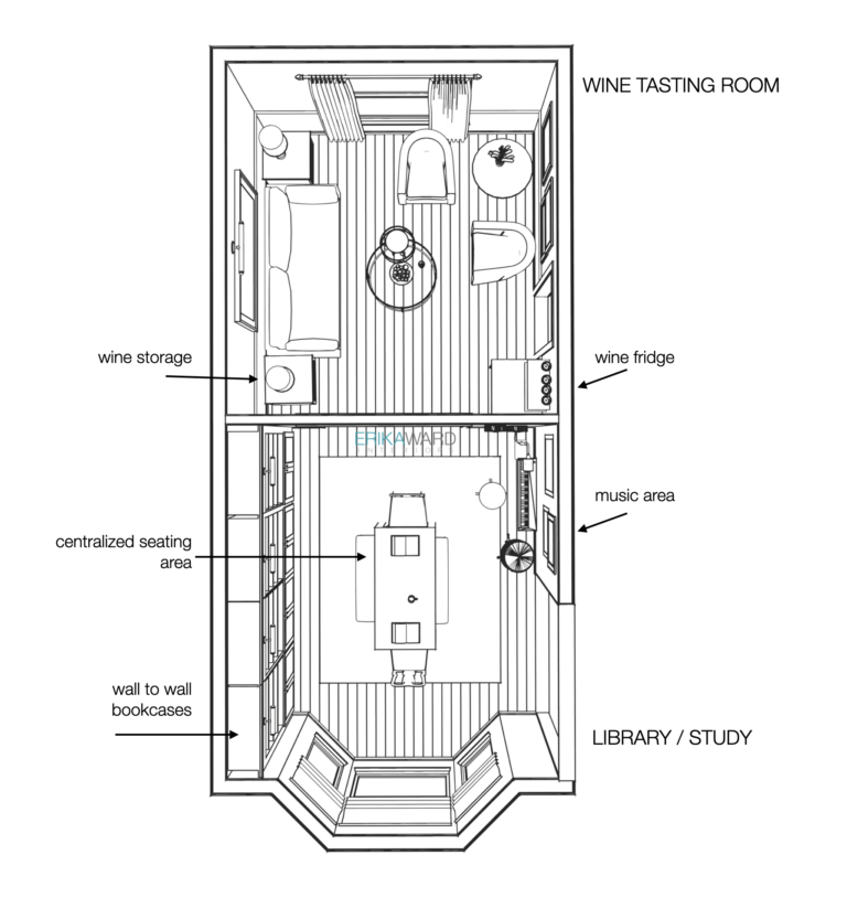
BIRD’S EYE PERSPECTIVE OF THE LIVING AND DINING ROOM COMBO
So I know what you’re thinking, “How did we make two separate rooms function as seven rooms?”
The renderings below tell the entire story.
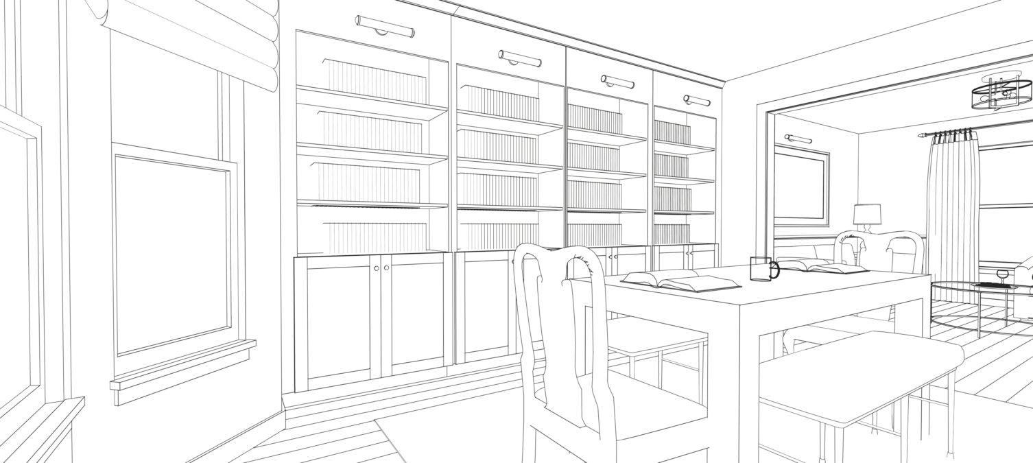
LIBRARY/STUDY PERSPECTIVE, VIEW WHEN ENTERING THE ROOM FROM THE FOYER
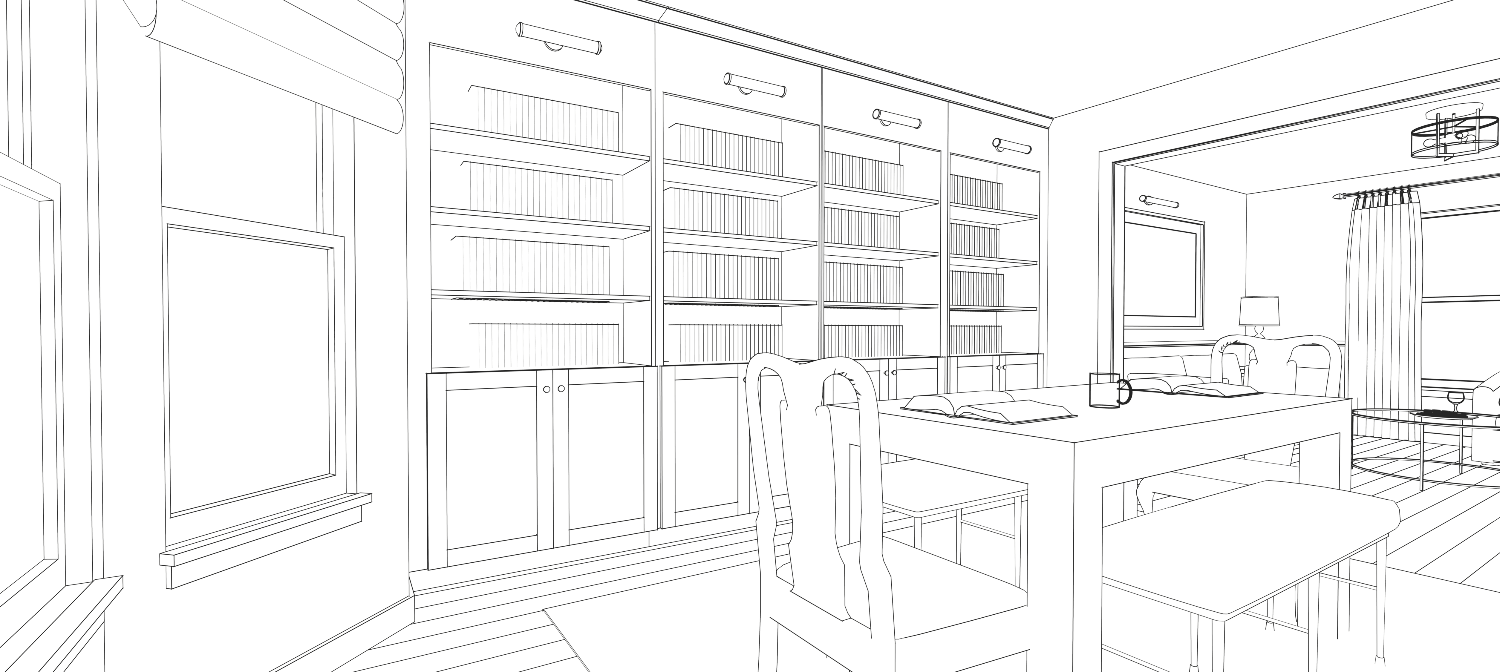
This is the first room you see when entering the home. The focal point in the new library are the handsome stack of bookcases for family’s vast book collection. Notice the bookcases also have ample closed storage underneath for hiding laptops, school and office supplies once the work day is over.
What an impressive backdrop this will be for Zoom calls!
Wired into each stack is a library light that illuminates the books below while also providing impressive mood lighting should the library be also used for dinner parties.
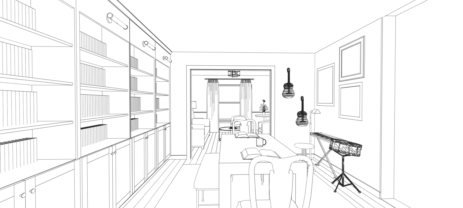
LIBRARY/STUDY PERSPECTIVE, VIEW LOOKING TOWARDS THE WINE ROOM
From this angle you see the family’s existing musical instruments. There’s a keyboard, stool, drum, and a pair of guitars. The floor lamp offers additional lighting for reading sheet music. When the room is big used for a dinner party, the keyboard and drums can be easily moved. The guitars remain on the wall as part of the room’s decor.
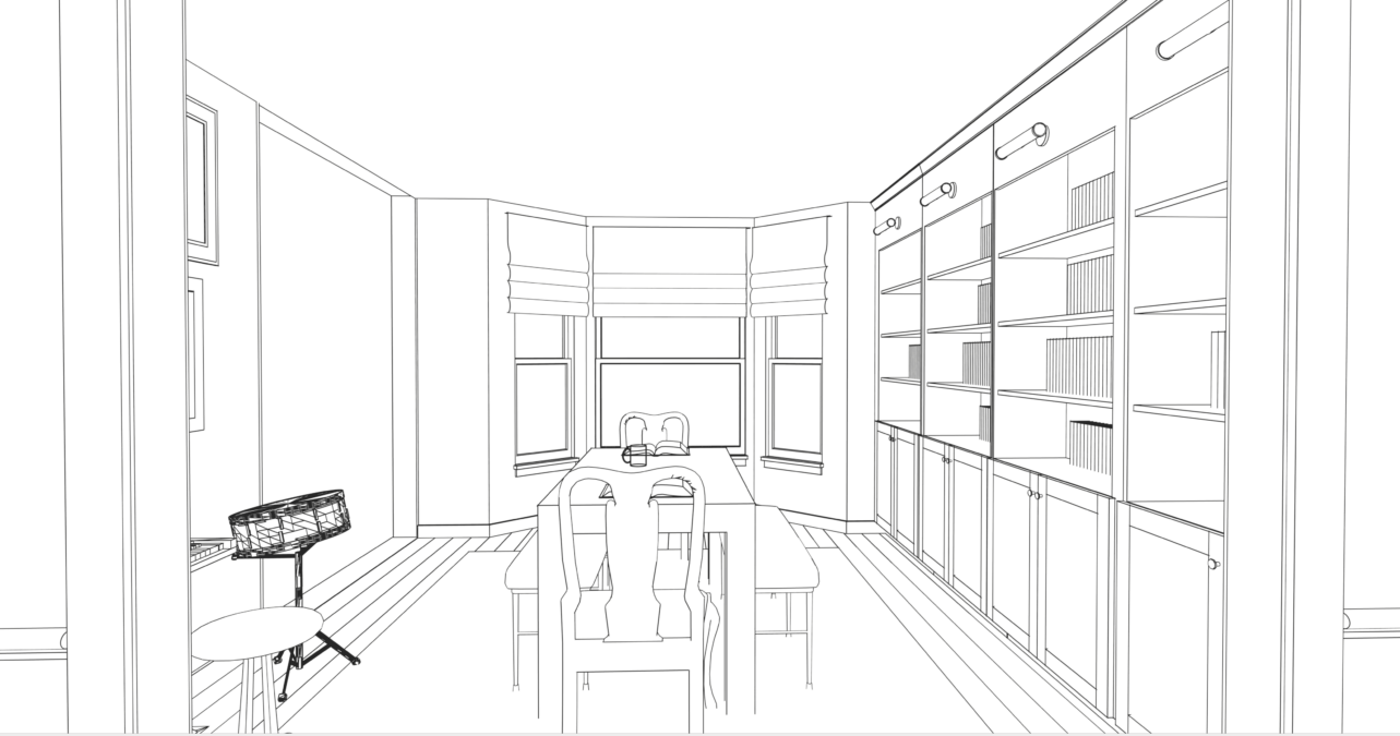
LIBRARY/STUDY PERSPECTIVE, VIEW WHEN ENTERING FROM THE WINE ROOM
Sunlight floods the room thanks to the bay windows in the library. We kept window treatments minimal so each room could benefit from Mother’s Nature’s light source.
WINE ROOM PERSPECTIVE, VIEW WHEN ENTERING FROM THE LIBRARY
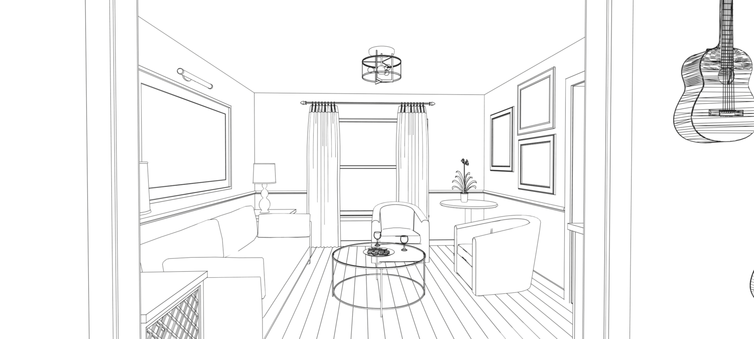
The wine room offers casual seating and has more of a lounge feel vs the library. The wall space above the couch and club chairs provides the client a prime opportunity to display her favorite paintings creating an art gallery of sorts. An art light hung above the largest piece is a design element borrowed from the library lights in the next room connecting the two spaces.
WINE ROOM PERSPECTIVE, VIEW TOWARDS THE LIBRARY/STUDY
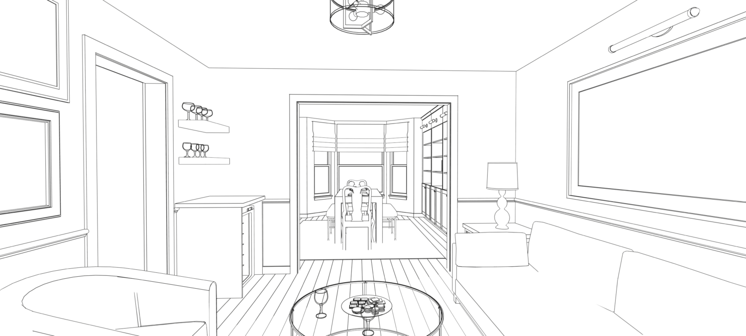
On the left, we enclosed her existing wine fridge to create surface area for tasting prep. Floating shelves above provides easy access to serving glasses when it’s time to “wine down.” The two end tables flanking the sofa double as storage for additional bottles that don’t require refrigeration.
PIN THE IMAGE BELOW TO SAVE TO PINTEREST!
If you’re looking to take your home’s decor to the next level, then we’d love to design and decorate a home that best suits to your style. Please visit our services page for more information. Afterwards please take advantage of our convenient scheduling platform to set up a call to discuss your project with us! We look forward to hearing from you soon! – Erika
+ show Comments
- Hide Comments
add a comment