I love discovering a home with eclectic style and meeting the people who live there. Recently I consulted with clients who struggled to make their existing mix of furniture and global-inspired accessories fit into the new home’s footprint. If you’re having the same problem, keep reading to see how a few tweaks can take a room from being dismal and disconnected to being cheerful and cohesive.
Hi Erika,
My eclectic style is a gift and a curse . It is difficult to bring it all together in a way that makes sense. I don’t want to continue spending money and not liking what I get. Please help! D.G., Atlanta, Georgia.
Answer:
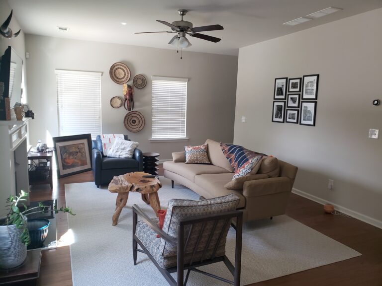
You’re starting off with an excellent foundation. I love the silhouette of your curved sofa and the structure of your accent chair. The leather chair in the background works in this room because it’s not another structured piece fighting for attention. Its traditional style is familiar and provides somewhere for the eye to rest alongside the other eclectic seating. Your dilemma lies in bringing cohesiveness into the room and here’s an important rule to remember as you continue into other areas of your home.
A great way to bring cohesiveness to a space is by using repetition.
Currently nothing in this room has common characteristics. And because you already have furniture, let’s focus on what you don’t have–window treatments and accessories.
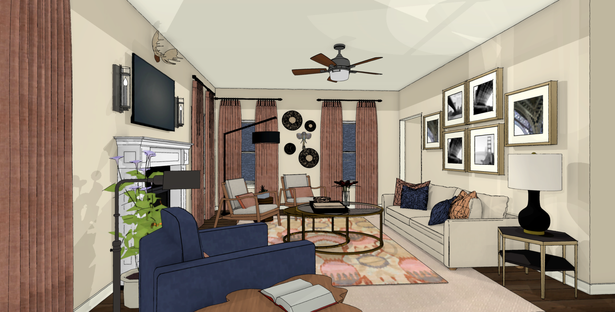
The neutral walls need a burst of energy and when I say energy I mean color! Pattern would only create more visual noise. I can see from your existing pillows and textiles that you like the warmth of burnt orange. Go bold and consider using burnt orange fabric for your window treatments. This one change alone makes this room instantly feel pulled together.

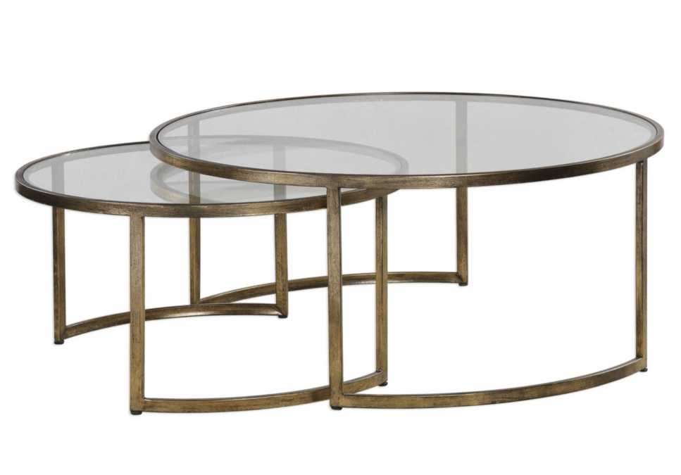
If you desire additional seating, considering moving the sofa back against the wall to make room for a nesting coffee table and a matching accent chair. I love nesting coffee tables because they allow more surface area. This means you have more room for your favorite coffee table books, small plates, and glasses when you are entertaining friends and family. However, when you need more floor space they slide under one another for easy storage.
SHOP THE LOOK
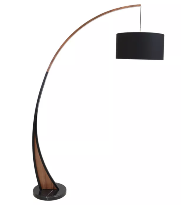
Lighting is also very important in creating a cohesive space. Notice we’ve provided three additional light sources, one for each corner of the room. Floor and table lamps give you the ability to create an intimate mood or signal that it’s time to wind down. When entertaining at night, each sitting area is properly lit and no one is left in the dark. For a touch of sophistication, choose a black finish for the floor lamps and the table lamp.
SHOP THE LOOK
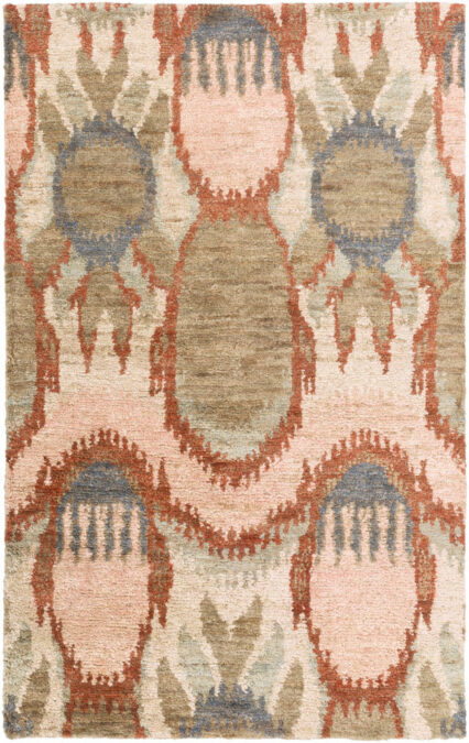
Layering rugs is something that we do every now and again to up the color quotient without making a huge commitment. It’s not a must, but consider layering this jute rug on top of the existing neutral rug. The jute repeats the textural element found on the grain sifter baskets between the two windows as well as the root coffee table. This vibrant rug plants a healthy dose of color into the center of the room.
SHOP THE LOOK
From this view, you see I’ve moved your navy chair to the opposite side of the room. It’s big enough to stand alone, but when you allow the existing coffee table to become a side table and add a pharmacy-style floor lamp you further anchor this seating arrangement.
Peek into the neighboring breakfast area and see where I continued the burnt orange window treatments. Consider adding a rug with a geometric pattern under your existing dining room.. A rug with a linear pattern will not visually fight with the rug in the family room that has a more fluid pattern.
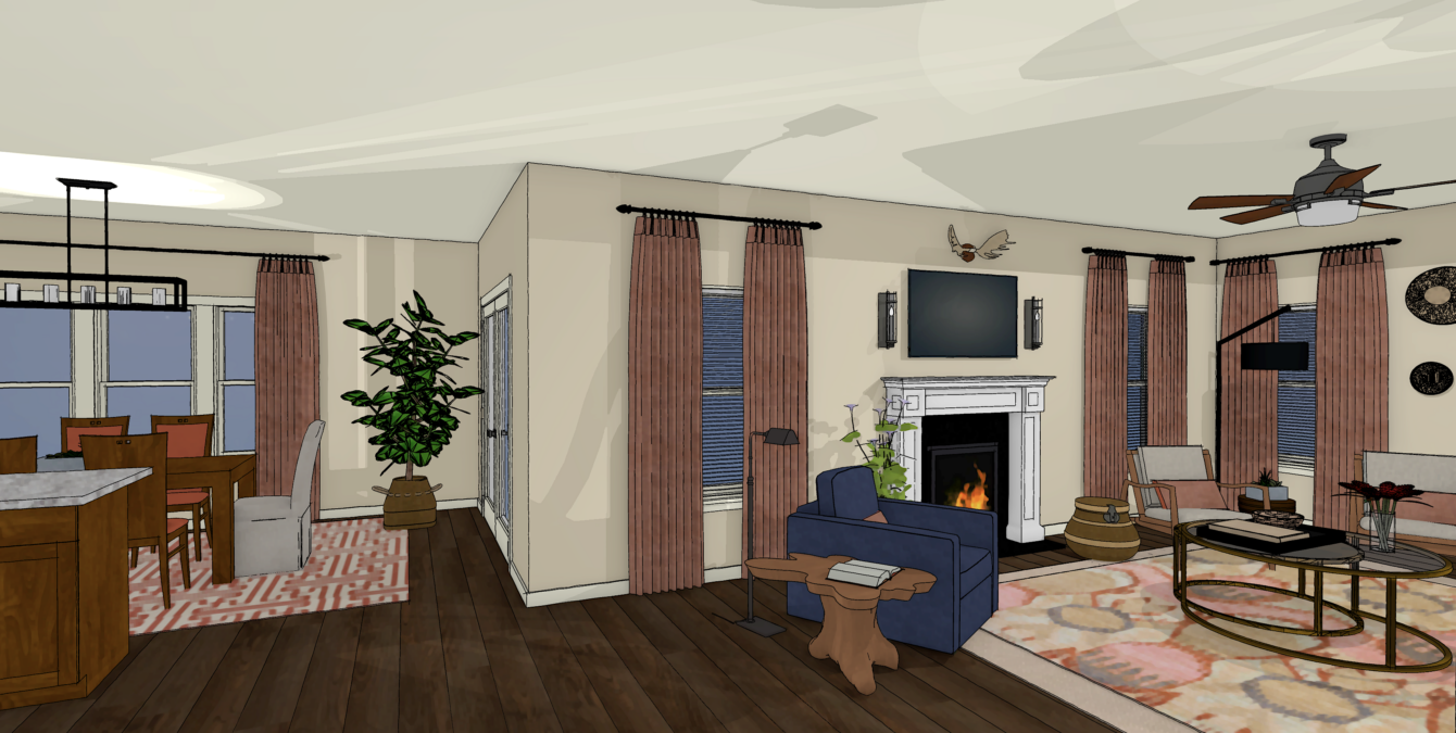
A thoughtful furniture plan with the addition repetition of colorful window treatments, accent tables, and a new rug produces a cohesive room for an eclectic design aesthetic and any other design style for that matter.
If you need expert advice for your toughest dilemmas, feel free to reach out to us by clicking here. We’d love to set up a design discovery call and get you steps closer to a home you love.
Take Good Care,
Erika

+ show Comments
- Hide Comments
add a comment