White kitchens may be all the rage, but our Main Street project shows that wood stained kitchens are equally fabulous!
I’ve been working with my Main Street clients for over a year now. As mentioned in a previous post, they made a big move from a townhouse to a single family home three times its size. Before the ink was dry on the closing documents, there were talks about painting the kitchen cabinets and other costly updates. I imagine most designers would’ve jumped at the opportunity, however I felt there were a few easy kitchen updates we could make immediately and if those weren’t enough we could move forward with the sledgehammer.
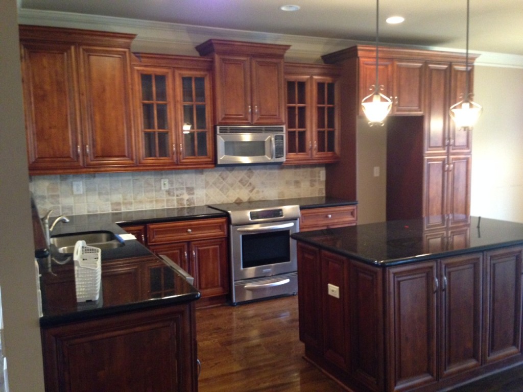
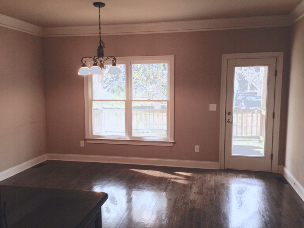
Here’s a before photo of the kitchen and breakfast area:
The wood stained kitchen cabinets are traditional in style and in perfect condition.The black granite countertops added a modern edge which probably was the saving grace in keeping the redesign costs low(er). The clients’ style is best described as a hybrid of global, traditional, and modern design. They love print, pattern, and a bit of urban edge. Woven textures, slick surfaces, and bold colors only begin to describe what makes their collective heart sing.
In order to weave in their signature style, I used the following easy kitchen updates to satisfy their global chic decor craving:
PAINT
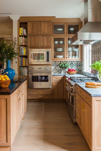
If I’ve said it a million times before, let me say it a million and one. The RIGHT paint color is a game changer in any space. The existing color was beige but we needed an even brighter backdrop to make all of the decor elements pop. So my suggestions was to paint it all white, Sherwin Williams’ Greek Villa to be exact. I was reluctant to share because it looks much creamier on their website. . Here’s an example of what white wall paint does for wood stained cabinets:
LIGHTING
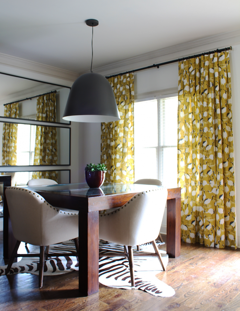
We brought the capitol pendant light over from the townhouse to use in the breakfast area. Its oversized bell shape added industrial flair and was a pivotal element making the style transition.
There are numerous opportunities to add personality using lighting. Island pendants, chandeliers, sconces, under-cabinet lighting, accent lights for the inside of cabinets, the list goes on.
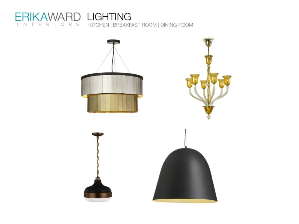
Below are the island pendant selections I presented alongside the breakfast area pendant. Any of these five pendants would have complemented the existing fixture it was just a matter of selecting the most perfect candidate for the kitchen crown.
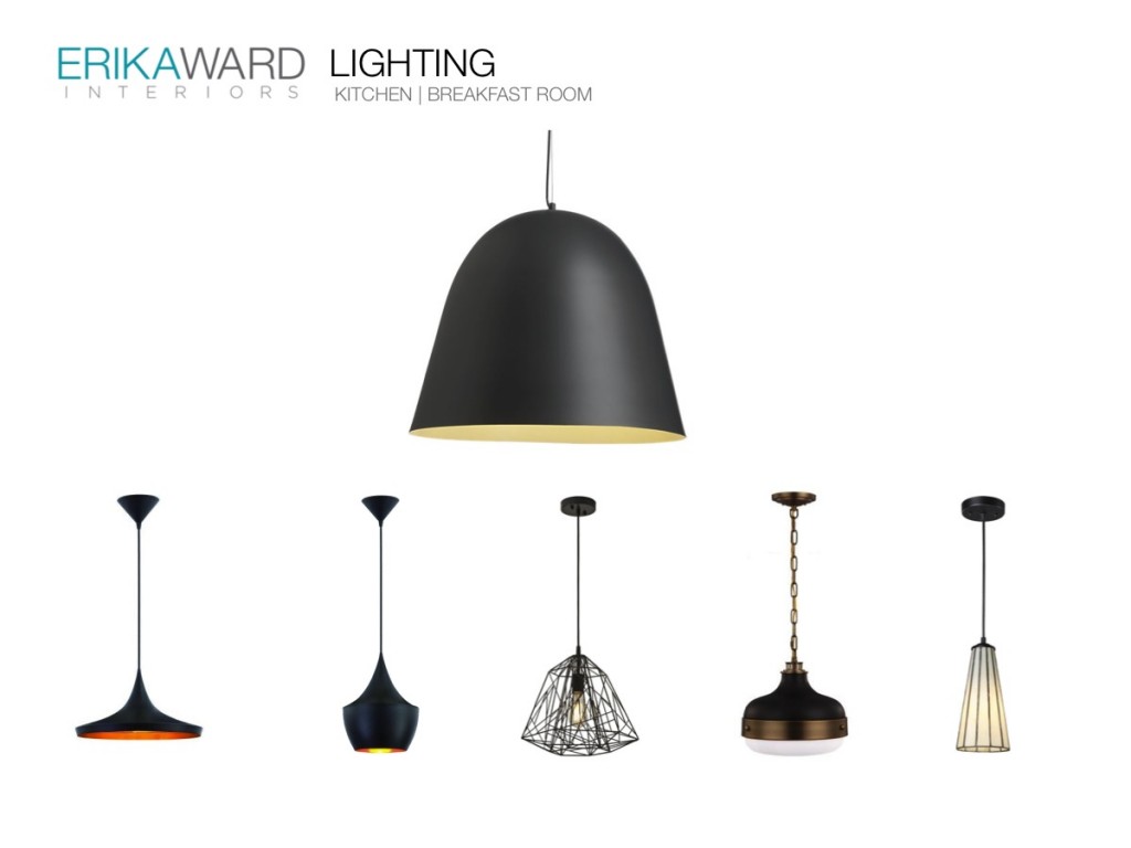 When making your lighting selection, consider the lighting style in the adjacent rooms. The first floor of the home is an open concept plan so you can also see the living room and dining room fixtures when standing in the kitchen. I placed the four fixtures alongside the other so the client could see how they all work together. The key elements that make the fixtures work together are color, shape, scale (size), and finish.
FURNITURE AND ACCESSORIES
When working in a space that isn’t your design style, be sure to incorporate more of the furnishings that are your style. Repetition is key. In order to successfully merge styles, you must borrow something from the existing decor to make the new stuff feel cohesive.
For example, the traditional-style kitchen cabinets are wood stained and the counters are black granite. When adding in the global edge look I also used black and brown in the furniture and accessories.
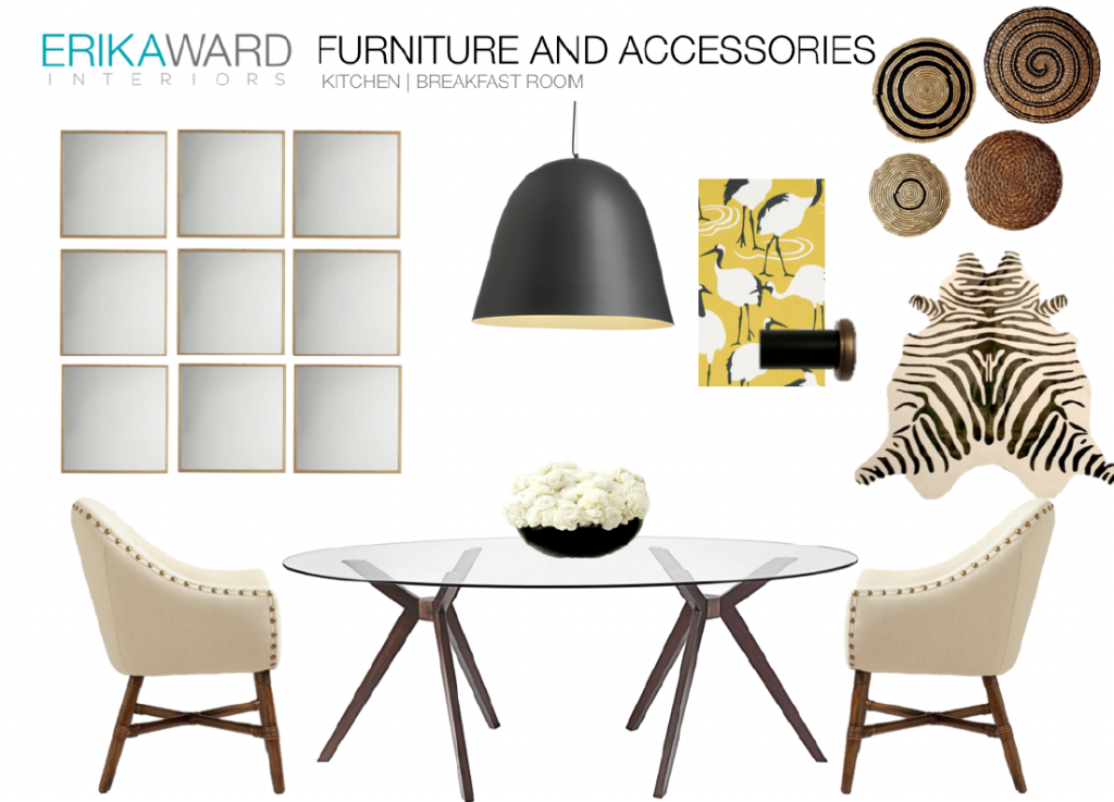
Here’s a progress photo after the furniture and paint, but before the drapery:
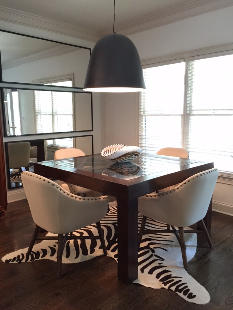
Notice I decided on a large trio of mirrors instead of the grid. The reason was to keep the corner from feeling cluttered. On the opposite wall, I hung the round baskets. The larger mirror helped to better reflect what was on the other side of the room.
WINDOW TREATMENTS
Ok, so here’s my favorite part, the drapery. My God, the drapery…On the far side of the house we installed luxurious yellow silk drapery (I can hardly wait to show you). In the kitchen, I wanted something in the same color, but cheeky and fun. I presented the client with Robert Allen’s Winter Crane pattern in Goldenrod.
I was CERTAIN she was going to call me crazy, but guess what? She loved it!
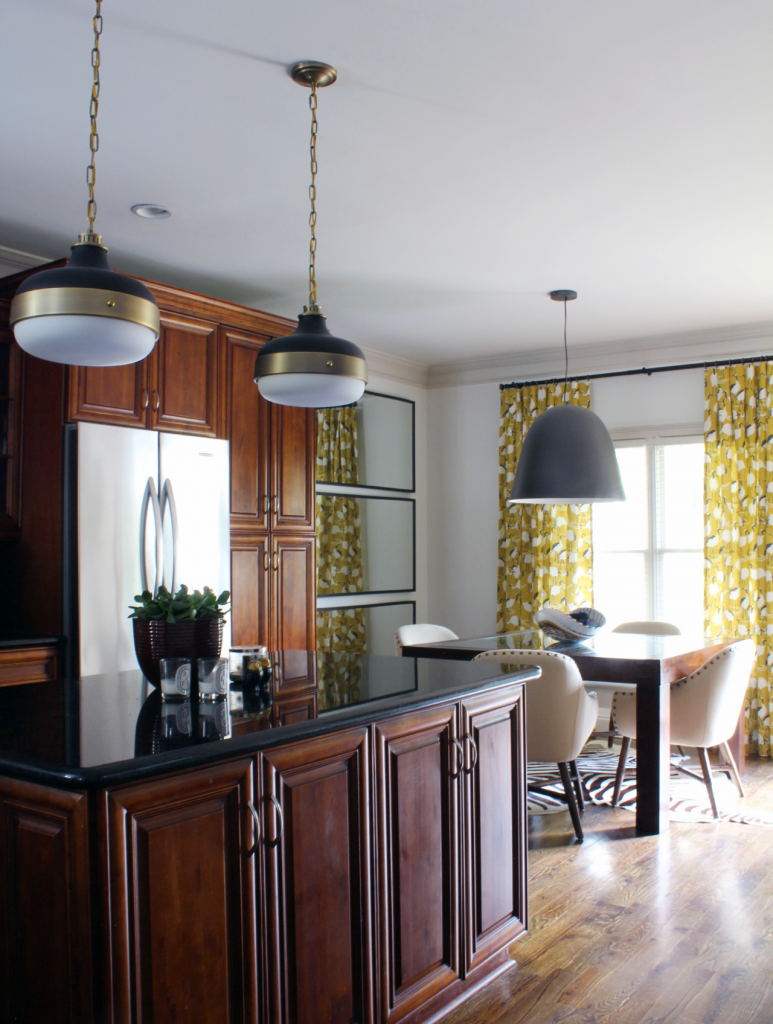
Here’s the after shot. All I could say was DAMNN Gina!!!
BTW, her name isn’t Gina, but still…
Here’s an even closer look at the breakfast area. If winter cranes weren’t your thing, I bet they are now.
So have I made my case regarding easy kitchen updates? What first step will you take in transforming your kitchen to fit your signature style?

I was blessed with the ever narrow NYC kitchen and have NO idea where to start but I’m thinking the floors. Now that I see a creamy white works with stained cabinets that just might be my new start!
It wouldn’t hurt to give it a chance Candace especially if you love this design style. Be sure to hang sample boards first before pulling the trigger!
Absolutely Gorgeous!
Many thanks for reading Gena! Wishing you and the family a Blessed New Year!
Wow! Very nice! I love how the drapery pulls it all together.