


“Turquoise transports us to an exciting, tropical paradise while offering a sense of protection and healing in stressful times.” – Pantone, Inc.
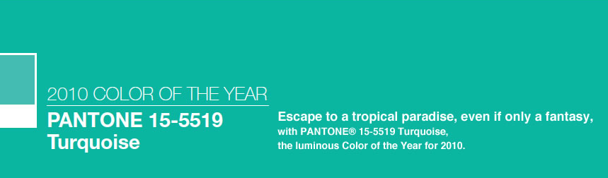 In case you’ve never heard of Pantone, Inc. they are the global authority on color and provider of professional color standards for the design industries. Pantone believes turquoise is a color that most people respond to positively and is one that is universally flattering. To learn more, click here to check out their press release regarding the 2010 color of the year, turquoise.


+ show Comments
- Hide Comments
add a comment