Recently we tackled the most puzzling design dilemmas for homeowners with corner fireplaces.
Where do I put my television?
How do I find the best furniture arrangement?
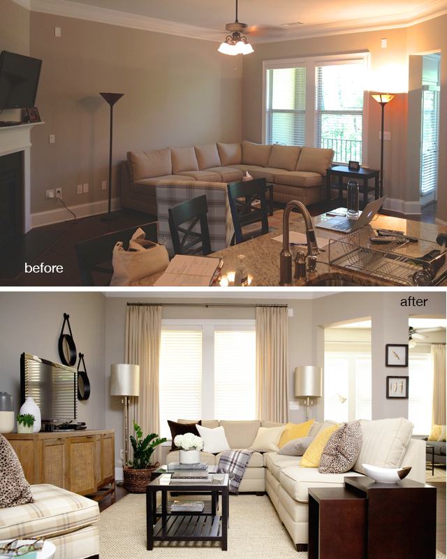
Living Room Makeover: Before
In its original state, the television was mounted over the fireplace and the sectional was facing the kitchen. This arrangement hardly did this room any justice nor did it work for the person sitting in the room attempting to watch the television. The main level of this home is an open concept plan and the living room needed to be identified as a separate room. Before it just looked like a “sectional in the kitchen” and did not function independently as living room.
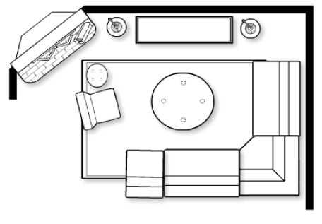
The Revised Floor Plan:
In order for the room to function properly, I made the following adjustments:
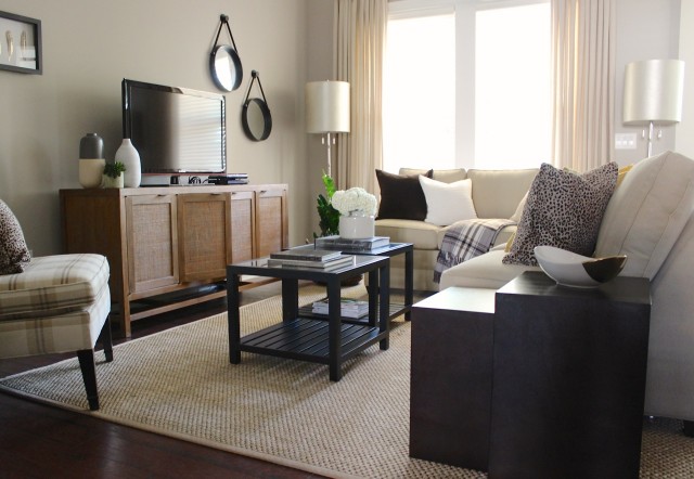
- Reconfigured the existing sectional and placed it on the opposite side of the room
- Used a sisal rug to help delineate the space and identify this as a living room and not an extension of the kitchen
- Purchased media console for needed storage.
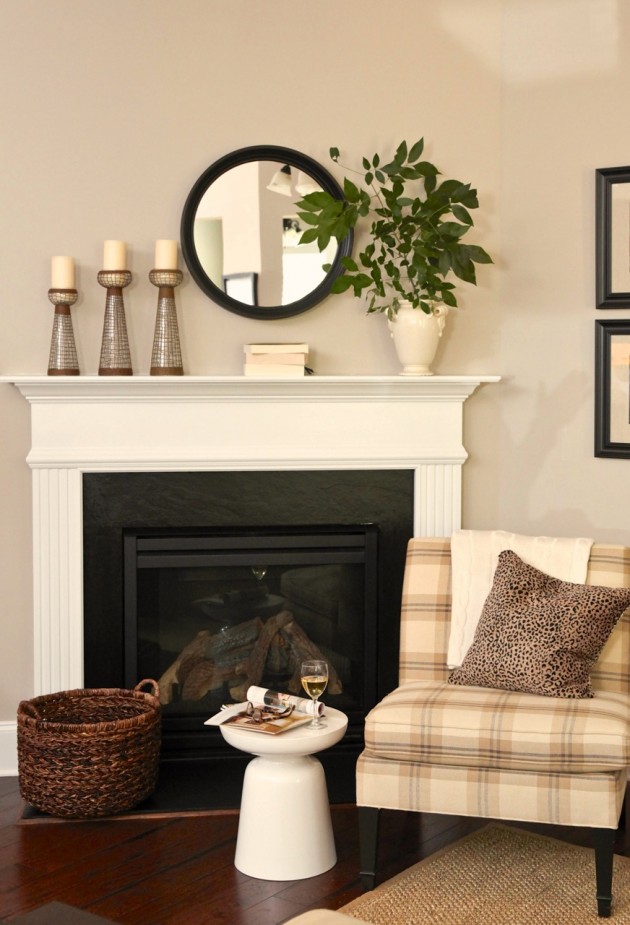
- Removed the television from the fireplace and placed it on media console.
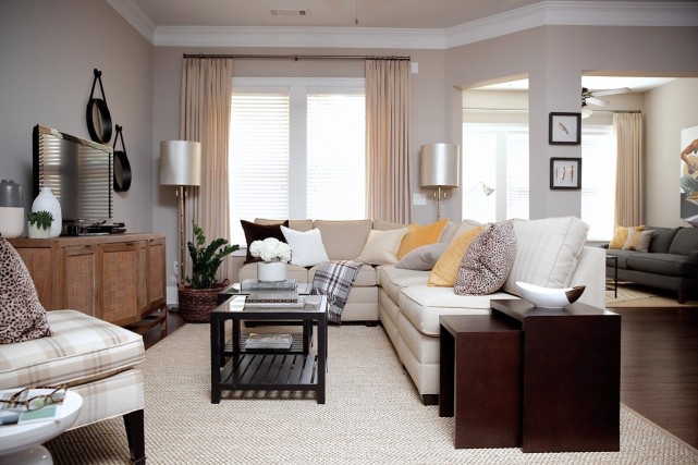
- Hung custom linen drapery to soften hard lines on the window
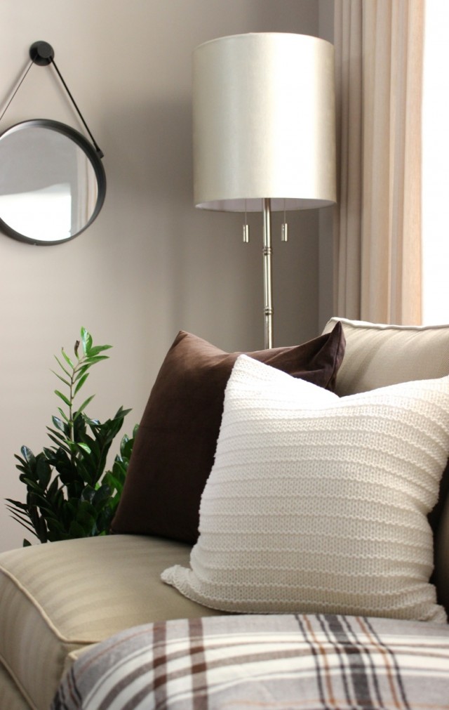
- Accented room with wall decor, new throw pillows, and accessories.
- Used client’s existing coffee table, but added new side tables for additional surface space for guests.
- Added floor lamps for additional lighting.
Living Room Makeover: After
My client was beyond happy with the end result. Friends even questioned if this was the same furniture! It’s remarkable the difference proper space planning makes! Try a few different furniture arrangements and see what you can do to transform your space. It won’t cost you a dime, just a little time, muscle, and some elbow grease. Go for it!
[Tweet “Don’t let your room boss you around. Take charge & design the space how you want to live in it.”]
**Need help with fresh ideas and solutions for your home?
Email me at info(at)erikaward.com or simply call (404) 507-6110 to schedule an in home consultation. Take courage friends, and be empowered once again to decorate a home you will love.
I had been waiting to see the end result after seeing a sneak peak! Beautiful work Erika!! Way to whip that room into shape lol
Awesome and oh so clever!!!
Wonderful new look for that room. What a great job!
I love it Erika! Great job 🙂
Good space planning. It looks beautiful
and works perfectly.
Really nice space Erika. Your client must be really proud of it.
What a great transformation. I often think my furniture is sitting in the kitchen. I was wondering how far from the island in the before picture is the new arrangement?
[…] consulting client had the Vinings living room makeover in her inspiration […]
Cleaver lady! Great transformation. I love it.
Amazing transformation. You are awesome!
Wondering where your furniture is from??
Fabulous makeover! Love it!!!!!
i need some ideas of wall pictures in our living, hallway diner and bedrooms and wall leading up to stairs.
any help would be appreciated
thanks
great transformation i love it
good work,good planning
I LOVE the media stand. Would it be possible to find out where it’s from?
Hi Katherine, the media stand was purchased from Crate and Barrel.
Hi Erika 🙂
May I pls know where you purchased that gorgeous armless sofa?
This room has inspired me!!
Hey! Could you tell me where the two porthole type mirrors are from?
Hi Virginia, I sent you an email.
Oh I just ran across this room and love these mirrors as well. Where did you get them? I can’t seem to find any that are similar
Thanks!
Hi Sarah, this pair was purchased at Target some time ago. If you search “leather strap porthole mirror” you will find quite a few. Happy Decorating and thanks for your comment!
I need to know what to do when you have a corner fireplace, but 3 feet over is a door to bedroom, past that is the laundry room and across from the fireplace is the bathroom.
I just moved the TV a few feet to the left of the fireplace (opposite the bedroom) and put the furniture across from the TV, with enough space to still get to the bedroom (and don’t get me started on the awful support pillars in the middle of the room. It’s the basement.)
This room is stunning. The first thing that caught my eye were the window coverings, plus the superior lighting.
[…] The first thing you need to do, before starting to plan a layout for your living room, is to determine which are the essential pieces of furniture, the ones you absolutely must include in your design. Once you know what you need to work with you can start developing a plan.{found on blulabelbungalow}. […]
Such a common problem. So great to see the solution to it. So much more beautiful, as a separate area. Beautiful pictures.
I just LLLLOOOOVVEEE what you did here I need some input on my space. I am thinking a sectional but i have a window wall and would luv to keep it open just not sure if i can do a sectional in my space. I would luv your feedback
Wonderful transformation! Love the furniture placement! Do you think this same scenario would work if the front door was in a similar place as the darker sofa in the background? Just trying to picture what it would be like to walk in to the room and the back of the sectional is what you see. Going to explore your site some more!
Hi, love this room! I am using it as a guide to style our new living room. Could you share where the sisal rug was purchased please?
Suggestions for rooms in which you have to place the TV above the corner fireplace? No nother options in my room, it is open to the kitchen and nook on 2 sides and other 2 have full width windows and sliding door on the other. I am lost for furniture placement!
Looks great! What’s the paint color?
Wow, this is beautiful! I live in a small townhouse and I love browsing and getting inspiration from photos of nice living spaces, but most are way beyond my means. It’s so great to see what a huge difference small changes can make without spending a fortune on very expensive furniture, décor, and renovations! It also says a lot about a designer who can work on a budget and do such an amazing job. 🙂
p.s. I am a bit confused about the diagram. It seems different from both the before and after photos, and some of the after photos seem different from each other (ex: the round white table beside the chair).
Do you know what the name of the color on your walls in called? It is exactly what I am looking for! Thanks!
Hello Courtney, the wall color is Anew Gray by Sherwin Williams.
Just amazing! Where is te tiered side table from?
Where is this apartment located? I’m moving to Vinings soon, and would love to tour this place in person. Thanks
Hi Angela, the client doesn’t live in an apartment community however there is a beautiful establishment called West Village located off 285 and S. Atlanta Rd. You should check it out. Happy Hunting!
Thank you Erika. I really appreciate your prompt feedback.
I love what you’ve done with this room and im wondering if I could do the same with mine.. but my living room is a teeny 12 x 13.. Do you know what size that room was? 🙂
Thank you
where was the couch purchased?
Hello Nataly, the sofa is from Ethan Allen
[…] Source: blulabelbungalow.com […]
Hi, Erika:
Do you offer online design services? I would like to send photos of my room and existing pieces to get suggestions for furniture placement and small purchases to update.
[…] room from BluLabel Bungalow is another good example of how furniture placement making an impact on the size of the […]
Hi Erika,
I love the new makeover, but I have a few questions…where is the kitchen bar and the two doorways look completely different. Can I see an image of the after picture taken at the same angle as the before picture to give me an exact comparison? I really love it, but it doesn’t even look like the same rooms to me…I’m really struggling with a living room/dining room combo space that is long and narrow with multiple doorways…Thanks so much for your response! Please feel free to email me@ griffi18@nsuok.edu
[…] Vi AQUI […]
[…] A simple room with a lot of unused space going to waste is now lavishly decorated with whites and browns. The addition of wooden cabinet gives it a homey look because it is situated along with the kitchen it needed the extra elements of tables and chairs to be added. blulabelbungalow. […]
I would like ideas on placing pictures on walls.
Like family pictures.
Good!
[…] foto: Blulabel Bungalow […]
[…] A simple room with a lot of unused space going to waste is now lavishly decorated with whites and browns. The addition of wooden cabinet gives it a homey look because it is situated along with the kitchen it needed the extra elements of tables and chairs to be added. blulabelbungalow. […]