[vc_row height=”auto”][vc_column][vc_column_text]Hi There!
If this is your first time visiting, welcome! I’m Erika Ward, owner and principal designer of Erika Ward Interiors. Our Atlanta-based firm uses our concierge-level interior design services to help busy professionals make their homes their sanctuaries. This is my third season participating in the One Room Challenge where I am designing the entry, dining room, and great room in my family’s home. I’m thrilled to reveal the completed spaces today!
If you missed posts from previous weeks, then you can find them here: Week 1 | Week 2 | Week 3 | Week 4 | Week 5 | Week 6 | Week 7

Before I get into the big reveals, I have to take a moment to thank Linda Weinstein, the founder and organizer of the One Room Challenge (ORC) and writer of Calling It Home blog for inviting us to participate. As stated on their website, “The ORC is not a competition, but rather a celebration of creativity, inspiration, and original ideas.” Linda’s vision for us documenting our design process over the last eight weeks has given us a welcomed distraction from the heaviness we are experiencing in our world right now. I’ honored that I get to transform my client’s homes into beautiful safe havens. I can’t think of a better time than now to create nurturing spaces for my own family.
I bid a heartfelt thanks to the official sponsors who partnered with me on this season’s projects, Hudson Valley Lighting, Novo Building Products, Couture Lamps, Milton and King and Fabricut. Your support and generosity will never be forgotten!
So without further ado, first up is our new entry…[/vc_column_text][vc_single_image image=”24789″ img_size=”Full” alignment=”center”][vc_column_text]
Make Home Your Sanctuary
I wanted to reimagine our home to feel like a grand vacation destination. Each year our family travels to various rental homes to get this relaxed, welcoming atmosphere. Now when entering our home, you get this same feel of arriving to your own personal sanctuary. The materials seen are reflective of my personal signature style, while also providing clues to the people who reside here. What guests first notice is the gorgeous trim molding from Novo Building Products which is painted a beautiful warm white. The natural sunlight streaming into the room from the floor to ceiling windows in the adjacent great room is symbolic of Mother Nature’s hand in the entry design. Our new entry way is indicative of what you will see in the balance of our home. Greenery/the color green, metal black accents, bird motifs, animal prints, a nod to island living, candles, warm wood, and brass accents.[/vc_column_text][vc_single_image image=”24790″ img_size=”Full” alignment=”center”][vc_column_text]
Art that Speaks to Your Soul
When designing your home’s entry, consider a streamlined console table, scented candle, a table lamp, family photos, and artwork that speaks to your soul. I was instantly drawn to the Flight Series by artist Lori Lejeune. When I see this series I’m also reminded by one of my favorite bible verses in Matthew 6:26. The believer looks at the birds in the sky, that do not reap nor gather into the barns, and trust that the Father will provide.[/vc_column_text][vc_single_image image=”24805″ img_size=”Full” alignment=”center”][vc_column_text]
Dining Along the Coast
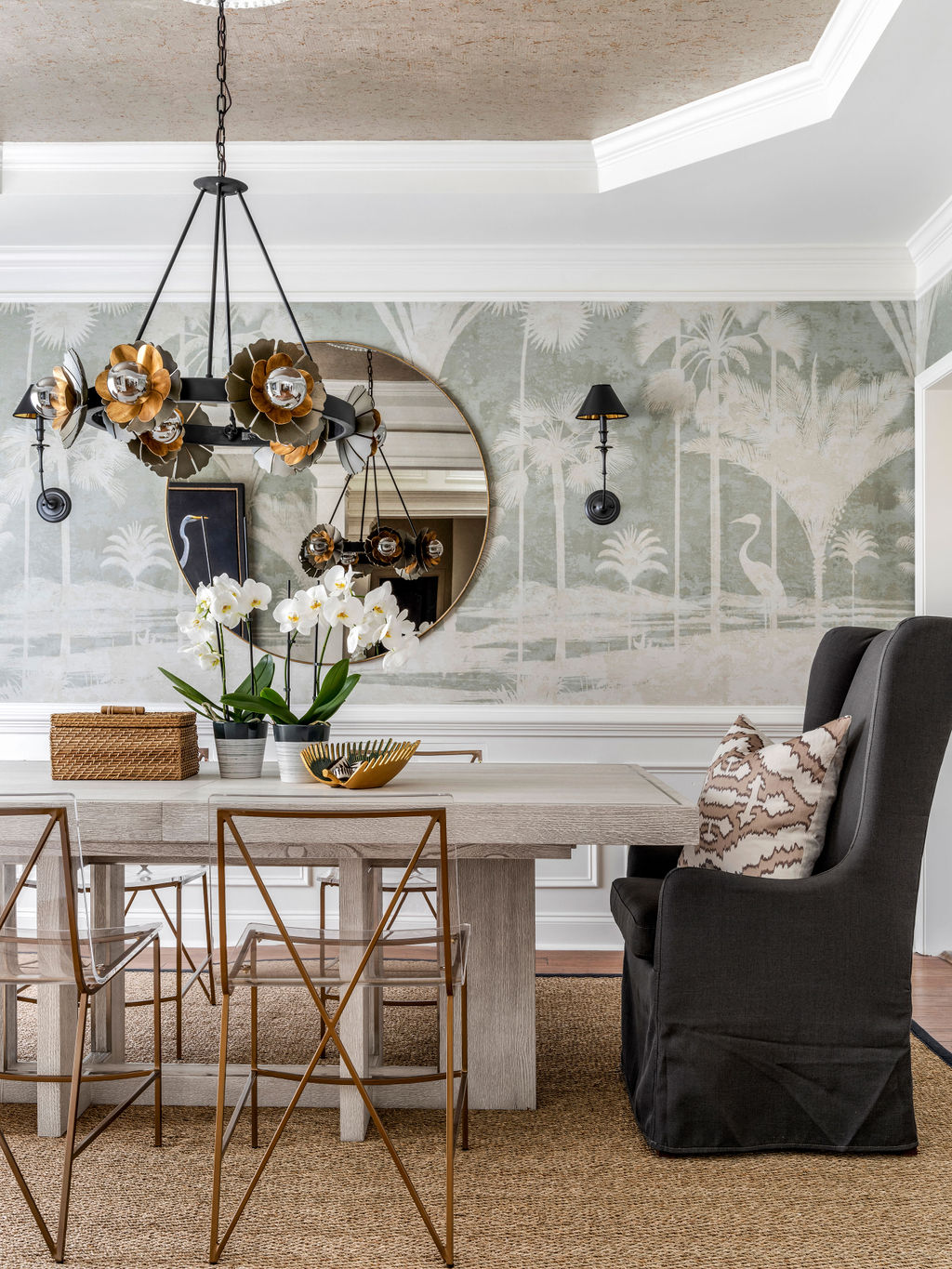
The dining room is right off of the entry, serving as a place for our family to gather for Sunday dinners. Warm, glorious sunlight streams through the windows and is filtered through a pair of sheer custom drapery panels. To achieve this look we used the face fabric by Fabricut also as the lining. The walls are elegantly wrapped in Milton and King’s Shadow Palms Mural. One of my favorite details in this paper are the soft silhouettes of palm trees and cranes which instantly transports me to a tropical destination. Both modern and timeless, it serves as an interesting backdrop. It plays so well with another focal point in the room, the Magic Garden Chandelier.[/vc_column_text][vc_single_image image=”24810″ img_size=”Full” alignment=”center”][vc_column_text]
Flower Power
What intrigues me the most about this chandelier? It’s both a work of art and a functional light fixture! I can’t get over the mouth-blown smoked glass diffusers at the core of the flower petals nor the flower petal themselves that are constructed of mixed metals. The iron flowers contrast satin black, graphite, and bronze leaf for a dramatic, yet whimsical chandelier.
Feels like I’ve won the lighting jackpot.
 Illuminating the rear wall is a pair of Jasper Wall Sconces that brings in a touch of tradition![/vc_column_text][vc_single_image image=”24819″ img_size=”Full” alignment=”center”][vc_column_text]
Drinks Are Served
While the dining room doesn’t allow space for a sideboard, I was able to incorporate a bar cart which holds refreshment essentials. My cart is styled with a set of vintage drinking glasses, jade grapes, bone shaker and wine bucket I picked up during weekly antiquing outings.[/vc_column_text][/vc_column][/vc_row][vc_row height=”small” us_bg_overlay_color=”#f5f5f5″][vc_column width=”1/3″][vc_single_image image=”24822″ img_size=”full”][/vc_column][vc_column width=”1/3″][vc_single_image image=”24824″ img_size=”full”][/vc_column][vc_column width=”1/3″][vc_single_image image=”24823″ img_size=”full”][/vc_column][/vc_row][vc_row height=”small” us_bg_overlay_color=”#f5f5f5″][vc_column][vc_column_text]
Stop and ‘Stair
Our staircase divides the entry area from the great room. We gave it a much needed facelift by replacing the old newel posts with these hearty and handsome posts by L. J. Smith Stair Systems. Also notice the clean lines of the new metal balusters. The juxtaposition of the transitional posts combined with the streamlined balusters breathes new life into our staircase. Along each side of the staircase we added trim moulding to polish the entire look.[/vc_column_text][/vc_column][/vc_row][vc_row height=”small” us_bg_overlay_color=”#f5f5f5″][vc_column width=”1/2″][vc_single_image image=”24842″ img_size=”Full” alignment=”center”][/vc_column][vc_column width=”1/2″][vc_single_image image=”24840″ img_size=”full”][/vc_column][/vc_row][vc_row height=”small”][vc_column][vc_column_text]
A Good Room Turned Great
Two story great rooms are some of my favorite to decorate. What I love most about these larger than life spaces are the challenges they present. First I took on the biggest challenge and that was,
“How do we address the expansive wall space?”
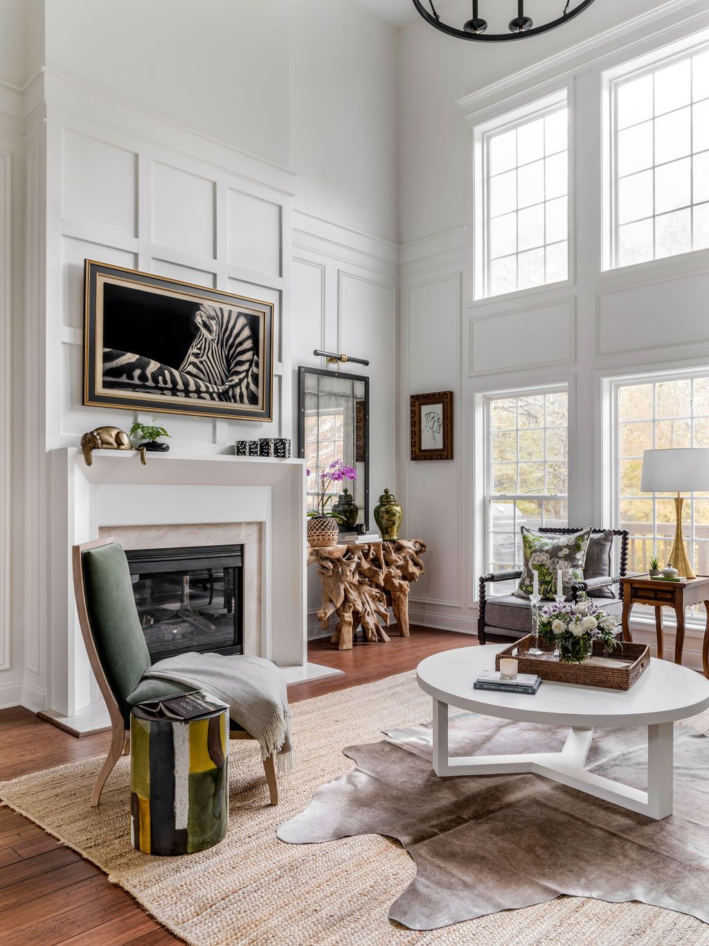
If you guessed architectural trim moldings—then you are absolutely correct! We used three different trim molding profiles to produce this grand gesture in our great room. I still can’t believe the transformation! It’s a wow-factor that stays with you. Trim is EVERYWHERE between the three rooms in this open floor plan but combining the farmhouse style trim work on the fireplace bump out makes it all feel more approachable.[/vc_column_text][vc_single_image image=”24846″ img_size=”Full” alignment=”center”][vc_column_text]
The Perfect Disguise
While I adore captivating artwork above the fireplace, we also needed a television on the main floor. I met both wants with the The Frame TV by Samsung. But what really makes this design mind blowing is the custom 55″ Antique Gold and Black Frame by DecoTV Frames that surrounds it!! It’s the most incredible design I’ve seen and so easy to install. If you hang on until the end of this post, save 10% with a special discount code for our readers! Enter ERIKAWARD7 at checkout with purchase of Samsung Frame TV or one of the 23 frame styles!![/vc_column_text][vc_single_image image=”24848″ img_size=”Full” alignment=”center”][vc_column_text]
Bright Ideas
Lighting plays a crucial part in the great room design. At 18 feet high, the builder’s grade ceiling fan seemed to emit as much light as a taper candle. Without table lamps, at night you could barely see your hand in front of your face. We’ve added not one, but two twenty-light, two-tier chandeliers by Hudson Valley Lighting. The other new Allendale chandelier hangs in the entry. At eye level we installed the Baruch wall sconce on dimmers and two uber stylish Drape table lamps.[/vc_column_text][vc_single_image image=”24833″ img_size=”Full” alignment=”center”][vc_column_text]
Mother Nature as a Design Partner
How can a room like this feel so stunning yet approachable?
The secret is by adding down-to-earth elements made from natural materials. The tree root console table, woven grass rug, and a layered cowhide work in tandem to add warmth and comfort to our great room. These items allow the room for have a casual elegance which is perfect for my family’s lifestyle.[/vc_column_text][vc_single_image image=”24858″ img_size=”Full” alignment=”center”][vc_column_text]“Erika, where are the window treatments?”
As the self-professed Queen of Window Treatments I decided to keep the windows bare.
Insert gasp here…
For now, I’m enjoying an unobstructed view out of the window into the backyard. Don’t you love how the green accents in the room mimic the greenery outside. It’s not by happenstance. It’s totally by design!
There’s still so much I want to say about this transformation that I will share more design advice in future posts. Even if now isn’t the time for you to hire a professional designer, there’s still so much inspiration and tips you can glean from our blog as well as our free ebook, Windows That Wow – Design Inspiration for your Two Story Great Room.[/vc_column_text][vc_column_text]Be sure to visit my fellow 19 One Room Challenge Designers as they also debut their newly renovated spaces. Thank you for following along!
[/vc_column_text][/vc_column][/vc_row][vc_row][vc_column][/vc_column][/vc_row][vc_row][vc_column][/vc_column][/vc_row]

I knew this would blow me away! I was in eager anticipation and you did not disappoint! What an amazing result!! Love every ounce of it. Congrats Erika
I The art ..the staircase..the rooms..the chandelier…Well done Erica!!…
Thank you!! So proud to call this place home.
Thank you Veronica! Feels so much like me!
Beautiful!!
Thank you so much for stopping by!
Absolutely stunning!! Your entry set the tone and once inside the full ambiance you’ve created feels like walking into paradise… like saying….ahhhhhh… this is the best feeling in the world ..
It’s stunning and I love reading about why you made all of your choices. Every detail is perfect!! Definitely a vacation at home!!
I couldn’t wait for the reveal and you did not disappoint! Absolutely love it!!
Erica I have been waiting for this reveal! This is absolutely beautiful! That chandelier! WOW! A-m-a-z-i-n-g! I love it all! Feels like another world, how nice to go on an exotic vacation in your own home. And of course my other favorite part, your storytelling, always so compelling. You are phenomenal!