“Architecture is a continuing dialogue between generations which creates an environment across time.” – Vincent Scully
Have you ever fell in love with a model home’s decor and visited time and time again trying to discover how to recreate the look? You practically stalked the place by taking pictures, inquiring about paint colors used, furniture dealers, rug selections, etc.? C’mon, I know I’m not the only one! You may not realize that even if you have the exact same furnishings and paint colors, your home will not have the same feeling of grandeur without a few architectural details. Sounds expensive right? Wrong. In this post, I will discuss four design tricks for creating architectural interests that prove to be easy on the wallet, but big on style.
Design Trick #1 – Create a Focal Point with Ceiling Medallions
Ceiling medallions are a quick and inexpensive way to create instant drama. A few quick points:
- They are available in plaster (which are heavier, pricier, and more fragile) and urethane-based (which are lightweight, pre-primed, and easy to install). Purchase them from your local home improvement store in the lighting section or from online retailers.
- They can be painted, glazed, or faux finished. Not feeling crafty? A wide selection of pre-finished medallions are available for purchase here.
- The general rule suggests you divide the ceiling’s square footage by seven to determine the medallion diameter for your space.
Want one? This Old House provides detailed instructions (and great photos) on how to install a ceiling medallion…see here.
As an alternative, diyideas.com suggests painting the medallions and using them as wall art as shown above. What a great idea!
So, on the ceiling or on the wall? What is your preference?
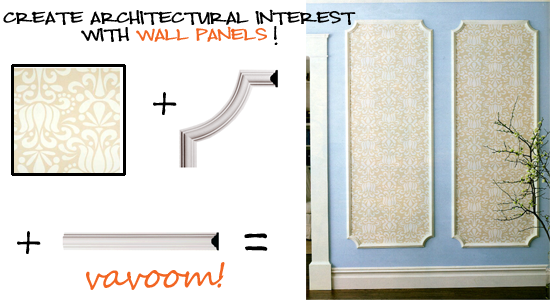
Design Trick #2 – Decorative Wall Panels
This second trick leaves me a bit nostalgic. Back in the 60’s, my oh, so stylish Grandmother installed wall panels with black velvet flocked wallpaper (very similar to this) in the foyer. Fast forward 30 years later, she still received many compliments on its stately and elegant appearance. Framing wallpaper in decorative moldings as seen in the image below is a great design trick that instantly adds panache to a hallway or large wall. Inviting Home gives a wonderful tutorial on completing this look on your own. Click here for project details.

Looking for something more contemporary? Visit B & N Industries and have a look at their sleek, modern Iconic Panels Collection. Helinski (shown below) “…is a clean interpretation of the natural bends and patterns of bare birch branches.”
 These durable panels are formed laminate over a carved wood core can be sawn, nailed, glued, or screwed into the wall.
image commentary by Erika Ward for BluLabel Bungalow}
Looking for a place in your home to try out the DIY wall panel project? Yes, so am I!
Design Trick #3 Crown Molding
Design Trick #4 Wainscot Paneling
The last two design tricks featured in this series are conveniently illustrated in this one photo. I had to look no further than my personal design inspiration file. This dining room is one of my favorites (right now) because of its sophisticated and elegant, yet kid-friendly and unpretentious design. I believe a dining room should reflect how you live and not be treated like a one-room museum…I digress. Back to today’s subject, the two design tricks for creating architectural interest in this room I have to say are the use of crown molding and wainscot paneling (sometimes referred to as judges panels). Craftsman-pioneer Gustav Stickley wrote that molding should
“have each room so interesting in itself that it seems complete before a single piece of furniture is put into it.”
After World War II, the American housing boom ushered in mid-century modern which eliminated molding in its minimalist design. Today, due to the popularity of renovating and neighborhood revitalization, moldings have made a comeback. Increasingly, we are seeing rooms that illustrate the perfect marriage of modern and traditional decor (more on this tomorrow). The above photo is the perfect model of this concept.
Final thoughts using moldings to create architectural interest:
- The use of moldings enhances a room’s proportion and scale.
- It reflects the wealth and taste of its owner.
- It makes the most sparsely decorated room feel dressed.
- Molding options are much more affordable and user friendly for self-improvement projects.
- Timeless, it brings higher resale values to the homeowner.
For more inspiring spaces, please visit my latest ideabook at Houzz!


+ show Comments
- Hide Comments
add a comment